In the history of the Space logo, it plays a special role, as viewers recognize the channel precisely by its symbol, which is constantly located in the corner of the screen. In this case, it is a yellow inscription consisting of uppercase bold letters and complemented by a round emblem resembling a target or keyhole.
Space: Brand overview
| Founded: | 11 March 1991 |
| Founder: | Warner Bros. Discovery Americas |
| Headquarters: | Buenos Aires, Argentina |
| Website: | canalspacela.com |
Meaning and History
The name Space should not be taken literally, as there are no scientific programs about space on the channel’s air. It is more of a hint at the boundless universe of content – an entertaining space that viewers can immerse themselves in. The broadcast grid includes a huge number of films in the genres of science fiction, suspense, horror, and action, as well as sports shows – mainly boxing competitions.
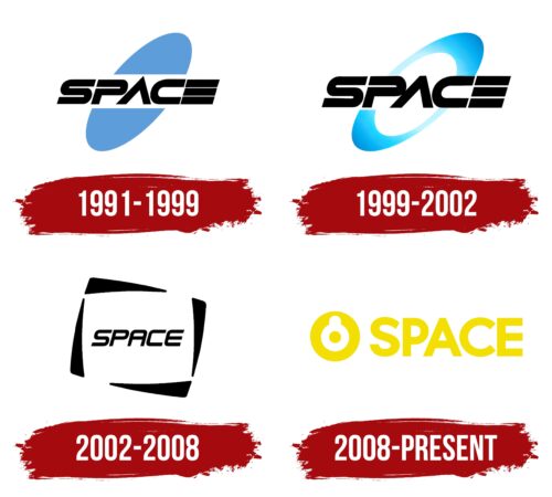
The Space logo is as abstract as the channel’s name. It used to contain an ellipse divided into two parts, which was a clear reference to elliptical galaxies. In 1999, the geometric figure turned into an elongated ring and then disappeared altogether as the designers decided to create a negative space effect. Meanwhile, the traditional blue color was replaced with bright yellow, and this shade is used for both the emblem and the wordmark.
What is Space?
Space is the name of one of the popular TV channels in Latin America. It broadcasts series, movies, and sports events (basketball competitions, soccer matches, professional wrestling, and boxing). The main languages of broadcasting are Portuguese and Spanish. The channel was created in 1991 and initially belonged to the company Imagen Satelital, managed by an Argentine citizen Alberto González. Now the owner of the Space brand and everything related to it is Warner Bros. Discovery Americas.
1991 – 1999
In the early 1990s, the main element of the Space logo was a black inscription located in the middle on a white background. Designers presented the channel’s name in a futuristic style. The most unusual was the “E,” which consisted of three long parallelograms. They were lined up in a column so that the side edges coincided. The “A” lacked a central stroke, making it resemble an inverted “V.” In turn, the “C” with horizontally stretched lines looked like a “U” rotated 90 degrees. The inter-letter space of “P” was not only very narrow but also open, as the glyph was missing a fragment. Above and below the inscription were two halves of a blue ellipse. Apparently, the artists depicted a galaxy because it is associated with the word “Space.”
1999 – 2002
After the redesign carried out in the late 1990s, the ellipse turned into an elliptical ring. The geometric figure was positioned diagonally and divided into two parts by the channel’s name – just like in the very first version of the emblem. The developers kept the letters black and preserved the font style but increased the size of the inscription. Moreover, they cut off the sharp tip of the “A” and shortened the distance between the “A” and “P” so that the glyphs touched. A blue gradient was used for the ring – lighter in the center and darker at the edges. This made the emblem appear three-dimensional.
2002 – 2008
In 2002, the Space channel underwent another graphic rebranding. The channel’s name was placed in the center of a large white screen, created by negative space. The frame, made of four irregular black triangles, looked as if it would start rotating in a spiral. A dynamic font with thinner and more legible letters than before was used for the inscription. The missing crossbar appeared in the “A,” and the “E” started to look like a “C” with a horizontal stroke in the middle. Overall, the glyphs acquired smooth and streamlined outlines, which harmoniously complemented the surrounding geometric shapes.
2008 – today
In 2008, a new era began in the Space channel’s identity. The main symbol of the channel is now a yellow ring with a yellow dot in the center. The inner part of the image is white, with a small white notch in the ring, making the abstract design look like a stylized rondel, target, crosshair, or keyhole. The inscription is on the right side and is set in a bold sans-serif font. All letters are uppercase and yellow.
The creators of the Space logo sought to convey the idea of empty space to play on the channel’s name. To achieve this, they used a combination of simple geometric shapes: rings and circles. The small yellow circle in the center of the abstract image looks as if it had broken free from the wide frame and moved downward. Thus, the emblem has a hidden dynamic.
Font and Colors
The bold font of the word “SPACE” has several approximate analogs, including Sentic Text Black by HeadFirst, Neutro Heavy by Durotype, and Cartograph Sans CF Extra Bold by Connary Fagen Type Design. They differ in the shape of some glyphs. The inscription is easily visible thanks to the uppercase letters. Readability is only reduced due to the yellow color of the logo, as in the primary version, it is combined with white and “dissolves” against a light background.
Space color codes
| Dandelion Yellow | Hex color: | #f3df04 |
|---|---|---|
| RGB: | 243 223 4 | |
| CMYK: | 0 8 98 5 | |
| Pantone: | PMS 108 C |


