The Spanair logo seems to embrace the world. The emblem conveys freedom and the company’s boundless opportunities, allowing passengers to travel to any part of the world. The symbol includes the sun, warmth, and friendliness, resembling a large smile that radiates a positive attitude.
Spanair: Brand overview
Founded in 1986 as Scandinavian Airlines Spain, the airline experienced growth and success over 26 remarkable years until its sad closure in 2012.
Spanair was born out of a unique collaboration between the Scandinavian Airlines System (SAS) and various Spanish organizations and began its journey as a charter carrier.
In 1988, Spanair received its first scheduled airline license, marking an important milestone in its emergence as Spain’s largest airline. The following decade saw the airline’s significant development, creating an extensive route network connecting Spain with numerous European destinations.
In 2003, Spanair joined the prestigious Star Alliance global alliance, allowing the airline to reach new heights.
Facing financial difficulties in the early 2000s, Spanair experienced a turning point in 2009. Scandinavian Airlines cut its stake, resulting in the airline becoming an independent Spanish carrier.
Unfortunately, Spanair’s closure in 2012 ended an entire era. The airline faced insurmountable financial difficulties and eventually ceased operations.
Meaning and History
What is Spanair?
It was a Spanish airline based in Barcelona. It operated domestic and international flights, mainly within Europe, connecting major cities with popular destinations. Known for its quality of service, the company offered various classes of service, including economy and business class, targeting both leisure and business travelers. The airline was a member of Star Alliance, which expanded its network through partnerships with other international airlines. Despite its popularity, it ran into financial difficulties and ceased operations.
1986 – 1999
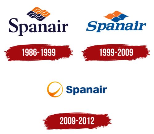
Founded in 1986, Spanair used its logo as a visual means to unite various cultural and geographical elements that represented its operations. The logo’s dark blue and orange streams symbolized the convergence of two worlds and cultures, reflecting the airline’s layered identity.
The first interpretation of the symbol relates to the company’s beginnings, which resulted from a collaboration between a Spanish company and Scandinavian Airlines, known for its blue logo. Spanair’s orange and blue logo represented warm, sunny Spain and cool Scandinavia, highlighting these regions’ historical and cultural partnership.
The second meaning of the logo depicts the bright sun and blue sky, characteristic features of Spain. These elements attract tourists and symbolize excellent weather and the beautiful Mediterranean Sea. Additionally, the blue sky symbolically relates to the space where the company’s airplanes fly.
The third interpretation of the logo pertains to the geography of the company’s flights. Spanair’s main routes were within Spain and to European Union countries, making the tandem of blue and orange colors a reflection of the shades of the flags of these regions.
Beneath this symbolic image, the company’s name was displayed in dark blue, almost black. The elegant letters with sharp serifs added dynamism and elegance to the design and demonstrated the speed of flights and the high level of service. The font was specifically chosen to highlight the company’s ability to offer various services and bonuses that attract passengers and create a sense of uniqueness and prestige when flying with Spanair.
1999 – 2009
The orange and blue colors continue to work together seamlessly. The multiple waves of air and sea currents have been replaced by four patches, forming a diamond shape. These four parts correspond to Castile, Leon, Aragon, and Navarre—four kingdoms that formed the foundation of the Spanish state and whose emblems are engraved on the coat of arms of Spain. This analogy makes the airline’s logo symbolic and profound.
The division of the diamond into four parts with white stripes suggests a Scandinavian cross, linking the company with Scandinavian Airlines. The blue and orange halves retain their original meanings. By switching from dark blue to a lighter shade, the stripes now look more like the sun and sky that the company’s airplanes aspire to.
Smooth waves passing through the sign convey a sense of lightness and airiness as if a flag were fluttering in the wind.
The Spanair inscription has been tilted to the right, symbolizing continual development. The letters have become thicker as the carrier’s flights and destinations significantly increase.
2009 – 2012
A Spanish airline that ceased operations in 2012 had a minimalist logo. The emblem consisted of a name (right) and a symbol (left). The first element was an orange circle with a light center, separated by a curved band extending beyond the circle. This band divided the space into two unequal parts. Next to it was the blue inscription “Spanair.” The letters harmoniously combined rounded and straight edges. The letter “i” stood out, resembling two rectangles – large and vertical, small and horizontal.
The orange circle symbolizes unity or global reach, while the bright center could represent the company’s focus on customer satisfaction. The curved stripe could have indicated air transportation routes or dynamic traffic. The blue text added corporate identity, and the unique “i” design added originality, subtly setting the brand apart.


