The Spar logo represents the company’s values. The emblem is filled with comfort and homely warmth. Every visitor to the shops feels at home. A friendly attitude and an abundance of offers await customers.
Spar: Brand overview
| Founded: | 1932 |
| Headquarters: | Amsterdam, Netherlands |
| Website: | spar-international.com |
Meaning and History
The Spar company has a rich history, and therefore it is not surprising that with the development of the brand, its logo has also been modernized. Its creators took into account current trends, and therefore the supermarket chain has always been in demand among the target audience. The key message in the formation of the logo was to draw the attention of buyers to the main values of Spar, namely the quality and heritage that the company has. It should be noted that the company’s identity for some countries was different in certain periods. For example, since 1960, slightly modified logos have been used in Italy and Austria.
What is Spar?
This is an international organization. The geography of the company’s activities is impressive. At the same time, given the volume of sales and authority in the market, the management of a chain of stores needs to approach the issue of creating an identity with great responsibility.
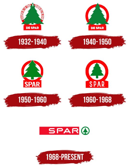
1932 – 1940
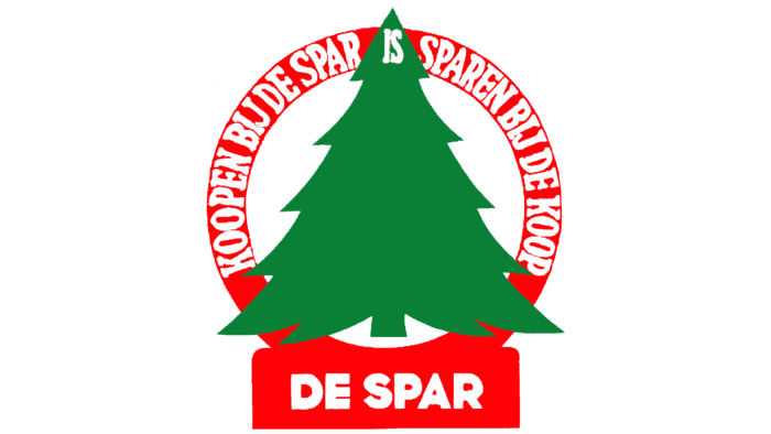
The first version of the logo was presented to the public when the company was founded. Its basis was the use of lettering technology, drawing letters and not writing them. The key element was the branded Christmas tree placed inside the circle. Spar’s name and slogan are depicted in white letters on a red background. For inscriptions, the author used bold capital letters.
1940 – 1950
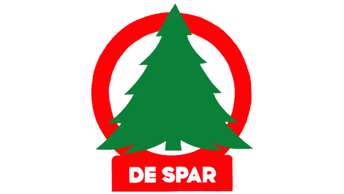
The original logo lasted in identical style for eight years. Already in 1940, the contours of the emblem were refined. The authors removed the slogan, which was imprinted in the logo frame. In turn, the name of the company De Spar remained the same, made with bold capital letters. Minimizing the text load made it possible to increase the tree directly, making it more voluminous and powerful in the eyes of the target audience.
1950 – 1960
In 1950, the company’s management decided to change the name, removing “De.” As a result of these actions, the logo was also redesigned. In addition to shortening the name, changes have also taken place in the image of the tree. It was created using a geometric method, straight lines, sharp corners, and somewhat enlarged dimensions. However, the change in the scale of the main image was compensated by increasing the company’s name on the logo because, in this way, the frame also succumbed to thickening. The color scheme remained identical.
1960 – 1968
During this period, the authors significantly reduced the size of the tree, while the framework, on the contrary, succumbed to a significant increase. The font of the name Spar, in turn, has become thinner, and the spacing between the letters is more significant. Thus, the company logo at this stage looks fresher compared to previous versions.
1968 – today
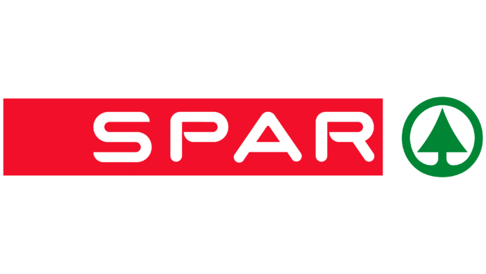
The most notable redesign in the company came in 1968. Until this period, the green tree was the key element of the logo, consisting of only one triangle and a border made in green. To the left of the image is directly the name of the company, made in white letters on a red background. It takes up approximately 70% of the total size of the logo. The name and the tree are independent elements from each other.
Font and Colors
The logo of the international Spar chain of stores is made in a font as close as possible to Consilio Bolde and Nedian Bold. As a rule, bold capital letters were used, and the lines were slightly pointed at the end. In this case, the contours in the letters “P” and “R” are open.
White, green, and red backgrounds were used as the color scheme. The changes at each stage were minor, but they adapted the company logo to modern realities.
Spar color codes
| Pigment Red | Hex color: | #f2102a |
|---|---|---|
| RGB: | 342 16 42 | |
| CMYK: | 0 93 83 5 | |
| Pantone: | PMS Bright Red C |
| Forest Green | Hex color: | #008534 |
|---|---|---|
| RGB: | 0 133 52 | |
| CMYK: | 100 0 61 48 | |
| Pantone: | PMS 355 C |
