The Spirit Airlines logo is designed in a minimalist style. It represents a simple and reliable company that allows for affordable flights. The lowercase letters of the emblem indicate local flights connecting major American cities.
Spirit Airlines: Brand overview
Spirit Airlines is a small Florida airline that serves North and South America. It flies in 83 directions and has a fleet of 200 airplanes. Spirit Airlines positions itself as a carrier with low fares due to separate payments for each service on board, including baggage.
The company launched its journey in 1983. Originally named Charter One, it operated as a regional charter airline based in Macomb County, Michigan. Initially, it focused on providing vacation packages to popular destinations like Las Vegas, Atlantic City, and the Bahamas.
The pivotal moment came in 1990 when Charter One transitioned from offering only charter services to scheduling regular flights, marking a significant evolution in its business model.
A rebranding occurred in 1992, transforming the company into Spirit Airlines and relocating its headquarters to Miramar, Florida. This shift represented a strategic move to broaden its passenger service operations.
In 1994, the airline embarked on its first scheduled flight, connecting Detroit to Atlantic City using DC-9 aircraft, thereby beginning its scheduled operations.
Through the late 1990s, the brand expanded its reach, establishing routes to major cities such as Los Angeles and New York, enhancing its domestic network significantly.
At the turn of the millennium, in 2000, the company embarked on a fleet modernization journey, replacing older DC-9s with more advanced MD-80 aircraft to improve efficiency and service quality.
The company’s international expansion began in 2003 with the inauguration of flights to San Juan, Puerto Rico, marking its entry into international markets.
In 2006, a dramatic shift to the ultra-low-cost carrier model took place. The airliner drastically cut base fares and introduced fees for additional services, pioneering a new operational approach.
A major leap forward came in 2007 with a substantial order for Airbus A320 aircraft, supporting the brand’s fleet expansion and modernization strategy.
The aviation firm introduced its now-iconic bright yellow livery in 2009, creating a distinctive brand image.
The company went public in 2011 with an initial public offering (IPO) on the New York Stock Exchange, signaling its growth and stability in the market.
In 2012, the airline enhanced its operational efficiency by adding its first Airbus A320 with Sharklets, improving fuel efficiency and performance.
2013 marked further international expansion as the brand introduced routes to various destinations in Latin America, broadening its service area.
By 2015, the air operator had integrated the Airbus A320neo into its fleet, becoming one of the pioneering North American airlines to operate this advanced aircraft model.
Leadership transitioned in 2016, with Ted Christie taking over as CEO from Bob Fornaro. Christie guided the airline through its subsequent growth phase.
By 2018, the company had extended its network extensively, offering flights to over 60 destinations across the United States, the Caribbean, and Latin America.
In 2019, the aviation firm committed to future growth with an order for 100 new Airbus A320neo aircraft, reflecting its expansion ambitions.
By 2020, the brand had emerged as one of the leading ultra-low-cost carriers in the United States, continually expanding its route network and upgrading its fleet to meet increasing passenger demands.
Meaning and History
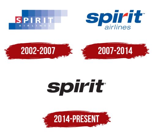
Spirit Airlines emerged in 1980, and the first known logo was created in 2002. The process of the company’s formation and its visual symbol was long and gradual. Initially, the company itself was founded. Its first name was Charter One, and its main task was selling tour packages and tourist transportation. Only ten years later, the owners changed their course, deciding to engage in air transportation. Two years later, they purchased a new fleet of jet aircraft and changed the name to Spirit Airlines (1992). The final transformation was completed after moving the headquarters to Florida and expanding transportation beyond the U.S. It was then that the first known visual mark appeared. The history of transforming Spirit Airlines’ logos is a path to minimalism, which speaks of globalization and the company’s growth.
What is Spirit Airlines?
This American ultra-low-cost airline based in Florida is known for its radical low-price model and additional fees. The carrier operates an Airbus A320 family aircraft fleet, ensuring high operational efficiency. The company is known for its “bare fare” strategy, where the base price includes only transportation and a small carry-on. At the same time, all other services, including seat selection and baggage, are paid separately. It is notable for its $9 Fare Club program, offering exclusive discounts for club members.
2002 – 2007
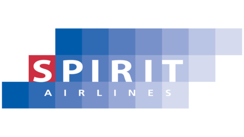
The first logo consists of three lines with a blue gradient. The lines are divided into conditional squares, each with its shade. The gradient moves from dark to light and transparent. This technique refers to the sky’s surface, whose colors constantly change. The lightness of the shades conveys the air space – the main roadway for the movement of aircraft.
The offset of the lines by one square forward forms a figure resembling a soaring cloud. The construction talks about the movement of air streams. Conveys the idea of flight.
The first square on the central line is painted red—the first letter of the inscription Spirit is placed in it. Below, on the third line, in small letters independent of the squares, Airlines is added.
The carrier’s name appeared after the aircraft fleet was changed to modern jet models. The name Spirit speaks of a fast as the wind movement. The name also hints at the work of a jet engine, which is associated with air compression.
The special emphasis on the initial figure conveys the striving for leadership. The energy that makes the company develop and move forward. The choice corresponds to the city’s slogan, where Spirit Airlines’ headquarters are located, and the red color – the leading one on the Florida flag. The shade also indicates speed. Since 1992, the company’s fleet has only consisted of jet aircraft, so the flight takes a minimum of time.
The capital white letters of the name convey lightness.
2007 – 2014
In 2006, the company received investment from Indigo Partners, which allowed it to purchase 30 Airbus aircraft. Ben Baldanza, who facilitated the deal, took up the post of CEO.
The rebranding marked expansion and a change of management. The emblem was reduced to the name. Large, massive letters with a slight tilt spoke of the company’s growth and development. The blue color embodied the sky. The red element “r” was like the path of an aircraft soaring upwards.
The color hinted at jet engines and speed. It suggested the bright fuselages of airplanes making flights to Latin America. The change in design occurred in 2007 when the DOT allowed commercial flights to Costa Rica, Haiti, and Venezuela.
The absence of capital elements in the logo spoke of local flights without crossing the ocean.
2014 – today
The company’s image has undergone another transformation. The new logo, named Bare Fare, speaks for itself. Advertising and promoting itself as a carrier with ultra-low fares, Spirit Airlines has incorporated advertising into the exterior design of the planes and the company logo.
The emblem features a minimalist style—a brief black inscription, “Spirit”—a bare title without decoration, and the addition of “Airlines” and color elements. The image represents a fare where the passenger pays only for travel with a small bag. Other services, such as drinks and baggage, are paid separately as desired. This approach allows for the minimum cost of the flight.
The updated design emphasizes simplicity and clarity, aligning with the airline’s focus on providing affordable travel options. The black inscription ” Spirit” stands out clearly, reinforcing the airline’s straightforward and no-frills approach. Without unnecessary decoration, the bare title symbolizes the basic service provided, where passengers can choose and pay for additional services.
Font and Colors
The logo’s black color suggests a low, basic fare for travel and indicates the company’s reliability and consistency. Passengers can get basic services, but each is at the highest possible level.
The font is reminiscent of Neue Helvetica Paneuropean with full round letters, conveying comfort on board and reliability on the way.
