


![]() SpongeBob Logo PNG
SpongeBob Logo PNG
The SpongeBob logo is like a small ocean. The emblem opens the door to a magical underwater world where plants and animals come to life, and words can be formed from sponges. The sign tells the viewer about the fun adventures that await them behind the veil.
SpongeBob SquarePants grew out of Stephen Hillenburg’s unusual path. Born on August 21, 1961, in Lawton, Oklahoma, he grew up in Anaheim, California, studied marine science, and later taught biology at the Ocean Institute in Dana Point. While teaching, he created the educational comic The Intertidal Zone, led by a sea urchin narrator named Bob the Sponge.
In 1989, Hillenburg left the institute and studied animation at the California Institute of the Arts, earning his master’s degree in 1992. Nickelodeon noticed his student films and hired him for Rocko’s Modern Life, which began airing in 1993. By 1994, he was reworking ideas from The Intertidal Zone into a TV project set in the underwater town of Bikini Bottom.
In 1997, Hillenburg pitched a seven-minute pilot to Nickelodeon. The first episode aired on May 1, 1999, after the Kids’ Choice Awards, and the official run began on July 17, 1999. Hillenburg expected a small cult audience, yet SpongeBob SquarePants passed Rugrats and became Nickelodeon’s top animated series, competing in a period when Cartoon Network was pushing Dexter’s Laboratory and The Powerpuff Girls.
Production paused in 2002 while Hillenburg focused on The SpongeBob SquarePants Movie, released on November 14, 2004, with about $140 million worldwide. He treated it as a possible ending, but Nickelodeon continued the series, and he stepped back to an executive producer role. He returned for The SpongeBob Movie: Sponge Out of Water in 2015. By 2019, the franchise had earned over $13 billion from licensed products. Hillenburg died on November 26, 2018, while SpongeBob remained Nickelodeon’s longest-running original animated series.
Meaning and History
![]()
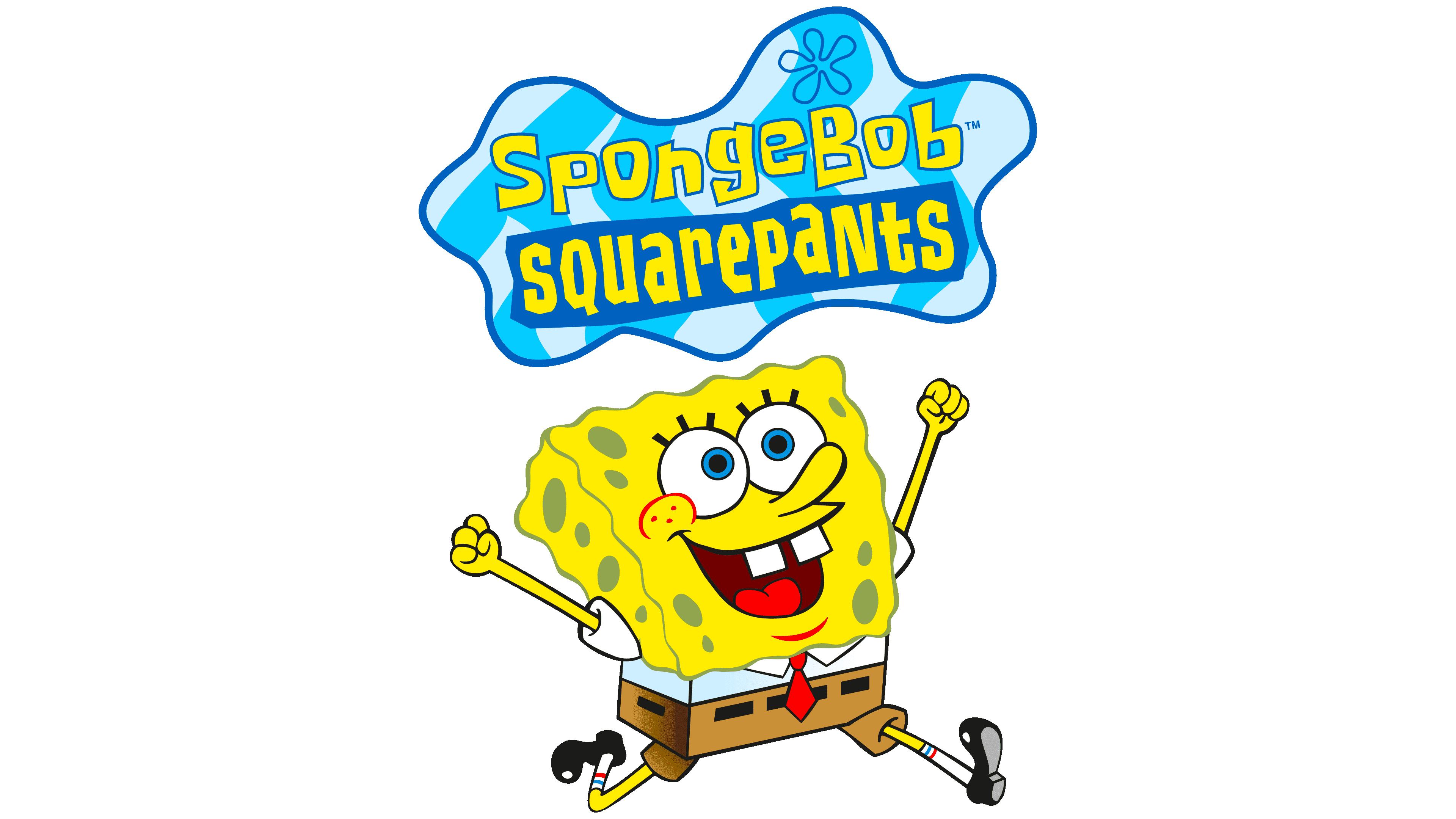
The SpongeBob SquarePants character and cartoon of the same name have spawned a multimedia franchise spanning 13 seasons, video games, music compilations, multiple films, merchandise, and even a Broadway musical. The original storyline was invented by Stephen Hillenburg, an oceanography instructor who created a comic strip about underwater life to introduce students to the inhabitants of tidal basins. But not a single publisher wanted to publish it.
Stephen decided to become a professional animator and graduated from the institute. Joe Murray liked his graduation film so much that the famous producer invited him to direct. So Hillenburg got into the Nickelodeon animation studio. A colleague read his old comic strip and said it was a great base for a cartoon. The oceanographer seized on the proposed idea and set about developing the characters. He gave the main character the appearance of a rectangular kitchen sponge. The SpongeBoy name was taken, so the creator had to find a replacement quickly. He kept the first part of the name so that no one would mistake the character for a piece of cheese and added the last name, SquarePants.
One of the cartoon’s sources of inspiration was Polynesian culture, in which images of pineapples are common. Therefore, the main character lives in an exotic fruit, which also reflects his optimistic nature. At the end of season 3, Hillenburg stepped down as showrunner, which affected the animated series’s style. The fans didn’t like the changes. They even decided that SpongeBob had died in the movie, and now someone else is playing his role. Despite the project’s gradual decline in popularity, Nickelodeon is in no hurry to close it. After all, this is the longest-running animated series and the highest-rated in all of America.
Its logo is well known to billions of people in the United States and around the world. It matches the show’s cartoon style and includes its full title. In total, there were three trademark versions, the first of which appeared in 1999 and the last in 2018.
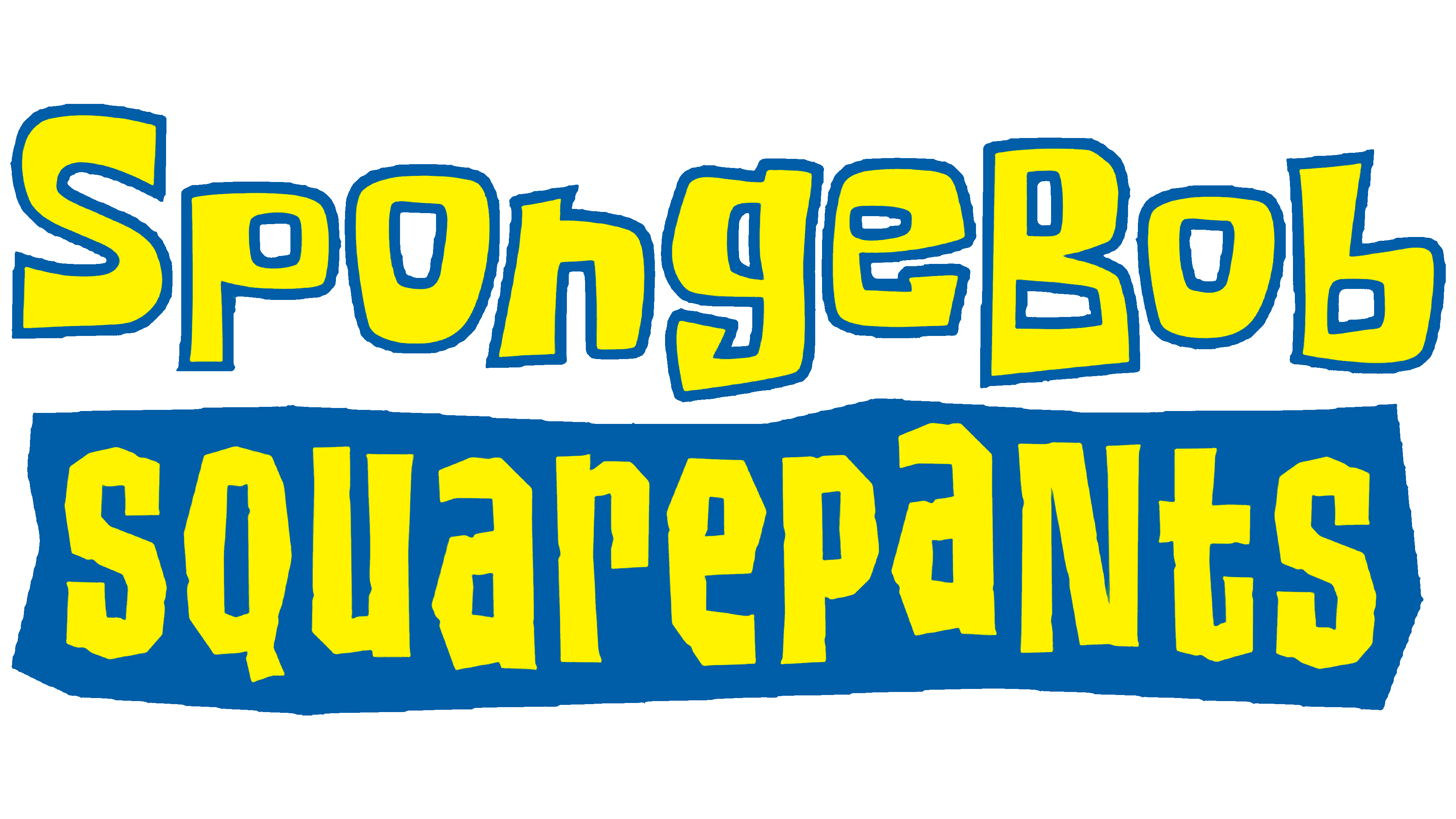
1999 – 2008
![]()
The franchise’s early logo was 2D. It consisted of “SpongeBob SquarePants” in yellow, set against a blue cloud-like shape with a dark blue outline. If we consider the specifics of the plot, then it was not a cloud but a diffuse drop of water. The first word was at the top. A custom hand-drawn font with jagged, bouncing letters was used. The second part of the title has been placed in the blue rectangle at the bottom. It contained randomly mixed uppercase and lowercase characters with jagged edges. The blue “cloud” was not monochrome: it was crossed by vertical waves of varying shades, complemented by a dark-blue flower silhouette.
2008 – today
![]()
After using the 2D logo for a long time, the designers decided to create a 3D version because the animated series’ style had changed. First of all, they modernized the word “SpongeBob” so that each element looks like a small kitchen sponge with a porous structure. For this, oval “holes” and protruding sides were added, which gave the lettering volume. As for the second line (“SquarePants”), it has become more streamlined. The developers converted all letters to uppercase and changed the old font to a bold sans serif with rounded inner corners.
The multicolored waves are gone, the base is now a single shade of blue, save for the darker contours and shadows that the show’s title casts aside. There are also light elements, such as flower silhouettes on both sides of the text and white reflections along the border. In 2018, this emblem became secondary.
2018 – today
![]()
On the eve of the show’s twentieth anniversary, the developers updated the logo, adding the Nickelodeon trademark and the famous orange lettering in a round sans serif font. At the same time, the rest of the structure has not changed, except that the main shades have become an order of magnitude lighter.
Polynesian motifs can be traced in the emblem’s design, primarily through the color palette and the unusual five-petal motif. The background designer, Kenny Pittenger, explained that the flowers would act as clouds if the characters weren’t living in the underwater world. And so it’s just an unusual pattern in decor, reminiscent of a Hawaiian shirt.
Font and Colors
While everything is clear with the word “nickelodeon” (the Nickelodeon TV brand font is used), the rest of the inscriptions raise many questions. The first half of the animated series’ title consists of individual glyphs. Fans have developed quirky cartoon-typefaces based on it: Blob Spongey Lowercase by Heaven Castro, Spongeboy by SoulfurFTG, and Krabby Patty by Seil. The word “SquarePants” is written using a modified version of the Las Vegas Jackpot. The designers changed only the capital “Q,” turning its diagonal stroke into a long horizontal bar.
The SpongeBob SquarePants logo follows the animated series’ color scheme. The letters in the first word are painted in two shades of yellow and generally resemble the protagonist. And the base is as blue as the surrounding space in the underwater world. Only the traditional orange “Nickelodeon” inscription and a dark blue plaque with white text stand out from the overall picture.