 SpongeBob SquarePants Logo PNG
The SpongeBob SquarePants logo is vibrant and nautical. The emblem uplifts the mood with pleasant shades and the friendly character of the story. The sign is very animated and immediately indicates that it represents a children’s show.
SpongeBob SquarePants: Brand overview
| Founded: | May 1, 1999 – present |
| Founder: | Stephen Hillenburg |
| Headquarters: | United States |
| Website: | nick.com.pl |
SpongeBob SquarePants – an American animated series about the underwater town of Bikini Bottom and its inhabitants, which has become a franchise. It includes three series, three full-length films, video games, comics, toys, a musical, and attractions. And it has brought about 13 billion dollars to Paramount Consumer Products. The original series airs on Nickelodeon and consists of 13 seasons.
Meaning and History
The series’ logos can be divided into preliminary and commonly known ones. During the development and release of the pilot episode, the emblem was not thought out in detail; therefore, the developer’s variant and the first video version differed from each other. The creator of the franchise considered SpongeBob an adult, and chose a verbal emblem. But in the first season, the main character of the series was included in the logo, which gave the sign harmony and completeness. The final version has become the embodiment of the cartoon for many years. A minor rebranding did not change any detail of the logo except for the color palette.
What is SpongeBob SquarePants?
A cartoon about SpongeBob and his friends: to date, about 300 episodes have been released. Their author is Stephen Hillenburg. The cartoon has received four Emmy awards, six Annies, twenty Kids’ Choice, and eight Golden Reels. It ranks as the 5th longest-running animated series in the US.
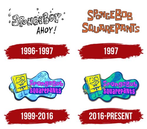
1996 – 1997
In 1996, the show for which Hillenburg was drawing was canceled, and he began developing a new one. SpongeBob was born out of an educational comic called Intertidal Zone, which the author devised for his marine biology students.
During the development phase, the show’s logo existed in the form of a pencil sketch. These were voluminous letters, which according to the author’s idea, were made of sponge – the main material of the protagonist. The elements were not arranged evenly but as if swaying on a wave, indicating the cartoon’s underwater setting. The arrangement also resembled underwater seaweed.
Hillenburg intended to name his creation SpongeBoy. The words are written together to indicate that this is a name. Around the inscription are bubbled to show the porosity of the sponge and reinforce the underwater theme.
Below is the addition of “ahoy,” reflecting the hero’s friendliness and desire to tell about himself and his life.
1997
In 1997, the pilot episode was introduced. The logo for it retained the swaying element in the form of letters at different levels. However, the series name was changed to SpongeBob, adding a similarly nonsensical surname, SquarePants. The font remained similar, but it lost its volume and the holes like in a sponge. The orange color of the letters hinted at the sandy bottom and the feeling of life’s celebration that filled Bikini Bottom. The same color was also the pineapple where the main character lived.
1999 – 2016
In 1999, the first season of the series was launched. It gained great popularity, which did not diminish all the years of the show.
In addition to the inscription, the final logo received additional ambiance. The entire emblem is set against a water background. Its contours resemble a puddle or a cloud in reverse. Usually, clouds reflect in the water, but here the water is reflected in the cloud. Light green-blue and lilac stripes run across the background, indicating small waves on the surface. The technique shows that in the series, the main world is located underwater.
On the left is a large figure of the main character, who is always optimistic and smiling. The title is written in bright raspberry letters. SquarePants is on a dark blue background. There are also images of sea hydras in the background, which resemble flowers.
Overall, the shades of the logo convey the colors of the underwater city and its inhabitants. They create a cheerful mood.
2016 – today
Starting from the 10th season, the show’s logo has slightly changed. At this time, the founder Hillenburg fully returned to work on the project. The water in the emblem got darker colors, showing the maturation of the series, its 10th anniversary part.
Font and Colors
For the logo, a bright palette of the real ocean and its underwater inhabitants in warm waters was chosen. All episodes include these shades in the walls, bottom, seaweed, and objects.
- Blue-green – the color of a sea wave.
- Dark blue – the color of the water at depth and in the night stories about Sponge.
- Raspberry – the shade of Bob’s best friend – Patrick Star, and jellyfish present in many episodes.
- Yellow – the color of the main character.
The title font is unique and made of angular letters of different sizes. Each symbol has square elements, which indicate the shape of the hero.
SpongeBob SquarePants color codes
| Caribbean Green | Hex color: | #10ce9d |
|---|---|---|
| RGB: | 16 206 157 | |
| CMYK: | 16 206 157 | |
| Pantone: | PMS Bright Green C |
| Blue | Hex color: | #0688c2 |
|---|---|---|
| RGB: | 6 136 194 | |
| CMYK: | 97 30 0 24 | |
| Pantone: | PMS 640 C |
| Royal Azure | Hex color: | #0038a8 |
|---|---|---|
| RGB: | 0 56 168 | |
| CMYK: | 100 67 0 34 | |
| Pantone: | PMS 286 C |
| Magenta | Hex color: | #ff33ff |
|---|---|---|
| RGB: | 255 51 255 | |
| CMYK: | 0 80 0 0 | |
| Pantone: | PMS 807 C |
| Cadmium Yellow | Hex color: | #f6f111 |
|---|---|---|
| RGB: | 246 241 17 | |
| CMYK: | 0 2 93 4 | |
| Pantone: | PMS 396 C |
| Black | Hex color: | #000001 |
|---|---|---|
| RGB: | 0 0 1 | |
| CMYK: | 100 100 0 100 | |
| Pantone: | PMS Black 6 C |


