The Spotify logo, a streaming service for legal listening and downloading of audio content, is simple and recognizable. The two-component emblem of text name and sign creates an association between wave motion and sound.
Spotify: Brand overview
| Founded: | 23 April 2006 |
| Founder: | Daniel Ek, Martin Lorentzon |
| Headquarters: | Stockholm, Sweden |
| Website: | spotify.com |
Meaning and History
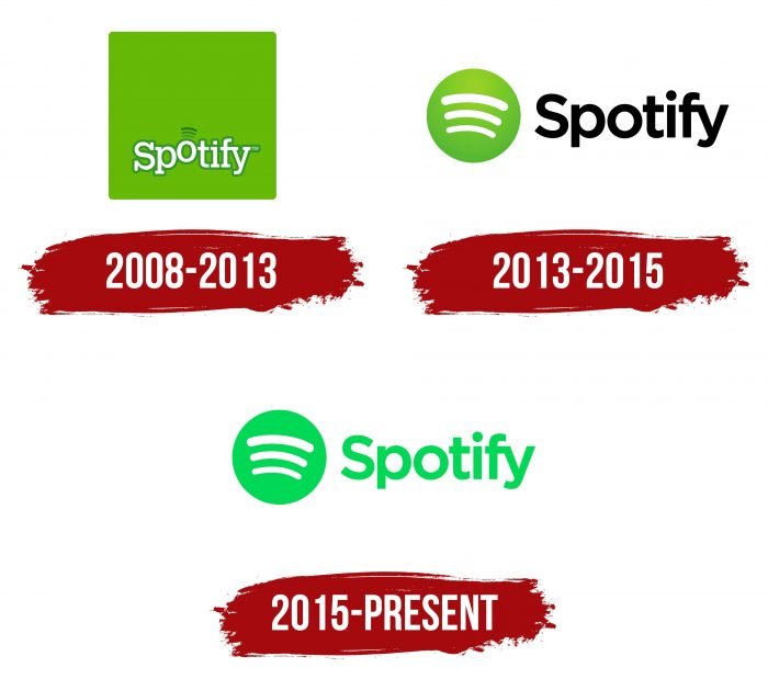
Spotify Technology S.A. was founded in 2006. Its service quickly became popular, and in 2008, it was launched in many European countries. It was then that it acquired a logo, which subsequently underwent several redesigns and acquired a modern look.
What is Spotify?
It’s a Swedish online service for listening to music, books, and podcasts without downloading them to your device. It exists in several forms – as a company, as a website, and as an app for all types of operating systems.
2008 – 2013
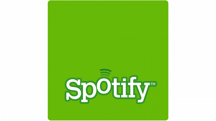
The first emblem was a green square with rounded corners. In the lower half, “Spotify” was written with a raised letter “o.” Above the “o” were three arc-shaped lines, similar to a Wi-Fi symbol.
2013 – 2015
In 2013, designers removed the bulky square and changed the font and color of the word “Spotify.” They chose a black palette and a standard sans-serif font. The symbol of three curved lines remained: it was made white and placed in a green circle with a gradient.
2015 – today
Logo developers chose a new shade of green – with a neon color rendition. It became the main color for both the word and the circle, from which the gradient disappeared.
Spotify: Interesting Facts
Spotify started in Sweden in 2008 and changed how we listen to music, podcasts, and more. Interestingly, it grew and made a big splash in the music world.
- Beginning: Two guys, Daniel Ek, and Martin Lorentzon, created Spotify in Stockholm to stop people from illegally downloading music by offering a legal way to listen to it and ensuring artists get paid.
- Free and Paid Options: You can use Spotify for free if you don’t mind ads and cannot pick songs directly. If you pay for Spotify, you get no ads, you can listen offline, and the sound is better.
- A New Way to Listen: When Spotify started, it was one of the first to let you listen to many songs whenever you wanted without buying them.
- Growing Fast: It got popular quickly, first in Europe and then in the U.S. in 2011. Now, it’s available in over 180 countries.
- Huge Selection of Music: Spotify has over 70 million songs, podcasts, and audiobooks for all kinds of listeners.
- Big on Podcasts: Lately, Spotify has been focusing on podcasts, buying up companies, and becoming a big name in podcasting.
- Personal Playlists: It uses your music habits to suggest new songs and make special playlists just for you, which is neat.
- Spotify Wrapped: Every year, Spotify tells you what you listened to the most, your favorite artists, and other fun facts that people love to share online.
- Working with Artists: Spotify works directly with musicians and creators to create special and exclusive content content.
- Helping Musicians: Spotify has a special section just for musicians, where they can see how their music is doing and learn about their fans.
- Changing the Music Business: Spotify helped the music industry grow again by offering a way to listen to music that pays the artists. After many people did not buy as much music, Spotify helped the industry grow again.
- Leading the Way: It’s one of the biggest music streaming services with millions of users and has helped shape how we find and enjoy music today.
Spotify started with the idea of making music easy to listen to legally and has grown into a huge service that lets people discover and enjoy tons of music and podcasts worldwide.
Font and Colors
In the first Spotify logo, the letter “o” was depicted jumping. In subsequent versions, only a hint of this letter remained: a large circle on the right side containing three arc-shaped lines.
The modern logo uses a sans-serif font, similar to Gotham. The letters are very tight, especially “f” and “y,” connected to each other. The primary color is neon green; the secondary is white.
Spotify color codes
| Bice Green | Hex color: | #1db954 |
|---|---|---|
| RGB: | 29 185 84 | |
| CMYK: | 84 0 55 27 | |
| Pantone: | PMS 354 C |
FAQ
Why is the Spotify logo crooked?
Creative Director Christian Wilsson said the logo turned out crooked because it looks individual. They tried using perfectly straight waves, but in that variant, the lines looked standard and impersonal.
What should the Spotify logo be like?
The logo should be clean, minimal, and simple. That’s why it consists of a green circle, in which three frequency waves create an association of movement and sound.
Is it allowed for you to use the Spotify logo?
As Spotify indicates in its guide, no outsider can use its logo for personal purposes.
How to get the Spotify symbol?
The Spotify symbol can be found on the Internet using any search engine.

