


![]() Square Logo PNG
Square Logo PNG
The emblem presents the buyer with an invention that hits the mark, occupying a global niche in the financial market. The Square logo is like a terminal-like reading mechanism, promising users an easy, simple way to pay for their purchases.
Square began in 2009 after Jim McKelvey lost a $2,000 sale because he could not accept an American Express card. He shared the issue with Jack Dorsey, who framed it as a structural gap in small business payments. They developed a compact card reader that plugged into a smartphone and worked with a simple app. Square, Inc. was founded in 2009, first in St. Louis and later in San Francisco.
The product launched in 2010 with a flat 2.75 percent fee, no contracts, and no monthly charges. This model contrasted with systems like Verifone, which required hardware purchases and service agreements.
In 2011, Square partnered with Starbucks, which invested $25 million. The deal expanded visibility but ended in 2016 when Starbucks built its own payment infrastructure. In 2012, Square introduced Square Register, turning tablets into point-of-sale systems with inventory and analytics. In 2013, Square Market enabled merchants to accept payments online.
Square went public in November 2015 at $9 per share, below prior private valuations. In parallel, Square Capital issued loans using transaction data, exceeding $1 billion in volume by 2018. In 2013, Square launched Square Cash, later Cash App. By 2021, it generated about half of the company’s revenue. Competition with Stripe remained limited due to different focus areas. In December 2021, the company rebranded as Block, Inc., reflecting expansion beyond payments into Cash App, Tidal, and bitcoin-related infrastructure.
Meaning and History
![]()
Both Square’s old and new logos reflect the symbolic name associated with the Square Reader’s square shape. It was the firm’s first product to accept payments. It connected to any smartphone’s audio jack, read information from the card, and transmitted analog data to the application.
What is Square?
This is the name of Block, Inc., a manufacturer of special devices for accepting credit card payments in the past. Card readers plug into your phone’s audio jack or Lightning input. The firm was founded in 2009 and renamed in December 2021. Square’s name now only applies to its core product.
2009 – 2011
![]()
The first emblem creators decided not to complicate the task and depicted a figure that vaguely resembles a card reader. But it is worth noting that this is not an ordinary square, but a cube, a regular hexagon, each side of which is a square. Usually, hexahedra are three-dimensional, but the designers have presented their 2D version. It seems flat due to the lack of ribs. Imagination completes them, so the visual effect of volumetrics occurs only at the level of associations.
The main part of the geometric shape is colored green. At the front edge, a large white square stands out, within which a green mini-square is located. Some of the corners are rounded, which makes them less rigid.
2011 – 2016
![]()
In 2011, the logo finally lost its volume and became two-dimensional. The developers left three concentric squares, one inside the other. They alternate in color and size: the largest quadrangle is gray, the middle one is white, and the smallest is gray as well. The same geometric pattern, in a green-and-white palette, adorned one of the cube faces of the first Square emblem.
To the right of the multicomponent figure is the name of a company that provides financial and payment services. A sans-serif font is used for the word, reflecting a minimalist concept.
The designers depicted the Square Reader as three superimposed squares. This vision was too schematic – in reality, the device looked a little different. But the company’s owners thought the abstraction would make an excellent corporate symbol because it is simple, memorable, and looks good at any scale.
Round sans-serif letters are combined with the rounded corners of three squares. This is another manifestation of the geometric logo. The selected font is vaguely similar to Rutan Regular and Seconda Soft Light, but they share little because the designers developed a custom typeface.
The first emblem was green and white. The second is more faded than the first, though the palette still combines two colors. The background and middle Square are the same white as before, and the main elements are colored light gray.
2016 – today
![]()
At first glance, the redesign seemed to bring about minor changes, but they affected all elements. The icon now has a different color (no longer gray-black), and the text uses a modified typeface (with sharp letters replacing rounded ones). At the same time, the marks remained subtle. The only significant difference is the spelling of “a”: the new version uses a different form, although it is also lowercase.
Font and Colors
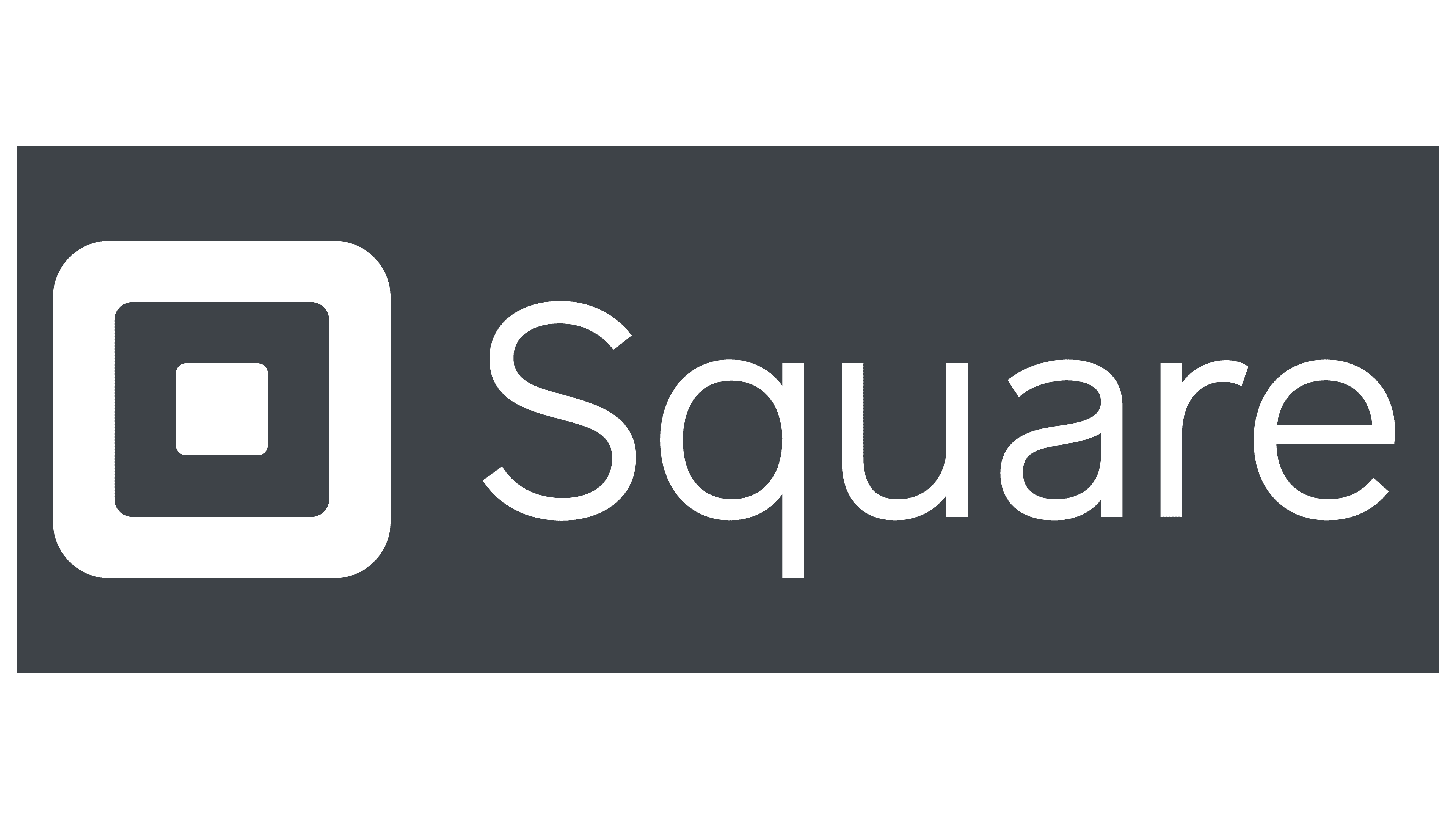
The previous logo featured typeface lettering that resembled the Avalon Book from FontSite Inc. The name is now typed in a font that echoes the Museo Sans Cyrillic 300 and Aramis SemiLight. Certain details are taken from each. As a result, the text part consists of “Square,” where the lowercase “a” is in Cyrillic form. The redesigned color palette belongs to the pastel spectrum, so it is muted rather than bright.

![]()
FAQ
Why is the logo a square?
The logo of Square, known as Block, Inc. since December 10, 2021, was a square shape before its rebranding. This design mirrored the shape of the company’s card reader used for accepting credit card payments. The logo wasn’t an exact illustration of the card reader but a minimalistic and abstract representation to create a visual link.
The square shape was chosen for its simplicity and clarity. Its clean, straightforward design aligns with the company’s goal of making financial transactions easy and accessible. The minimalist approach emphasized the company’s commitment to efficiency and ease of use.
Using a square for the logo helped connect the brand’s visual identity with its core product, the card reader. This made it easier for customers to recognize and remember the company. The abstract style made the logo versatile and adaptable across different platforms.
What is the logo of the square?
Before renaming to Block, Inc., the company used a two-part logo: a graphic symbol and the word “Square.” The graphic symbol had three concentric squares with rounded corners. The middle square was white, and the other two were gray, creating a visually appealing icon.
Next to the graphic symbol, the word “Square” was set in a thin sans-serif font, giving it a modern, clean look. This font choice matched the symbol’s minimalist design.
The logo’s overall design was simple yet effective. The concentric squares highlighted the company’s name and focus on easy-to-use financial solutions. The clean lines and modern font conveyed professionalism and reliability.