There is a solution for every problem, according to the Squarespace logo. We will fill in the field of any site and offer the necessary templates and blanks. It is enough to take them on the platform and arrange them on the pages. The emblem demonstrates the variety of offers and their flexibility.
Squarespace: Brand overview
| Founded: | January 2004 |
| Founder: | Anthony Casalena |
| Headquarters: | New York City, New York, U.S. |
| Website: | squarespace.com |
Meaning and History
The logo and the associated Internet resource appeared almost simultaneously. But at first, it was just a student project, when the future founder was studying at the University of Maryland. In 2004, he single-handedly set up a blog hosting service. For the first two years, he managed it independently and was its only employee.
By 2006, Anthony Casalena had made $ 1 million himself. And at that time, the student ran the web service right from his dorm room. No office was even discussed. He appeared a little later. In 2010, the project had already turned into a company and consisted of 30 employees, and by 2015 – about 550. It was in 2010 that a full-fledged company began with its logo and other attributes of visual identification.
Interestingly, when establishing the company, Anthony Casalena offered to launch a service for independent logo design, he received harsh criticism from professional designers. They felt that Squarespace was deliberately undermining their industry to disrupt it and turn it from artistic to automatic.
For the entire existence of the web service, it has had two official emblems. During the redesign, they almost did not change, which cannot be said about the very first – unofficial. The icon was made in shades of green, complemented by black and white, with the unusual writing of the letter “Q,” the tail of which was in the middle, not on the right.
What is Squarespace?
Squarespace is a company founded in the United States in 2004. Its main product is a platform for creating websites of any type, from online stores to personal blogs. It is a website builder with a wide range of tools and features that don’t require programming or coding knowledge. Hosting, SEO optimization, and analytics services are also available.
2003 – 2004
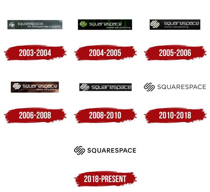
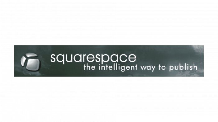
The very first version of the logo contained almost all the iconic symbols that indicate the direction of the Internet company. So, a long rectangle with background clouds in the sky was taken as a basis. They testified that this is cloud storage of information. It contained a geometric figure in an oval shape, divided into three parts, which must be assembled to obtain a solid figure. This hinted that the service is also a website builder. The full name of the service was also written there, typed in thin lowercase letters. Below is the slogan. The main palette of the emblem consisted of a monochrome combination of the white and black muted spectrum.
2004 – 2005
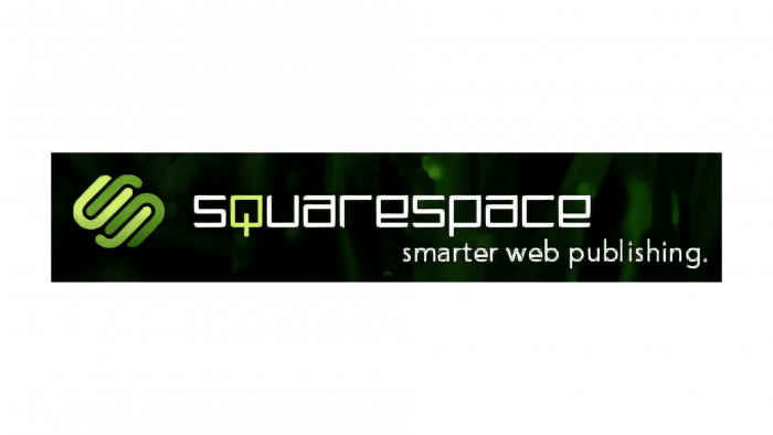
This version is decisive because it has a color and a brand name. The oval, disassembled into three parts, was replaced by the symbol of a hyperlink – a “chain” consisting of an encrypted “S.” The links are assembled in such a way that they also resemble “u,” “r,” “Q.” Moreover, the designers focused on the “Q,” using a capital letter instead of a lowercase letter and painting it in olive color, while all other signs are white. The monogram also consists of elements of two shades of green – dark olive and light olive. The letters are geometrically shaped and look like semi-enclosed squares. The developers have intensified the background: they darkened it and added a mysterious green glow to the black rectangle.
2005 – 2006
After the introduction of the new concept, the emblem was simplified. The authors removed the game of green and black, leaving only the last of the two. The designers aligned the motto and the name to the left, whereas these lines varied in length before.
2006 – 2008
In 2006, there were only two changes. First, the tagline and title were right-aligned. Second, there are brown, wave-like EQ-style bands on the black background.
2008 – 2010
During this period, the Internet company abandoned the motto on the emblem, so it acquired a laconic look – an icon on the left, a name on the right. To highlight the links of the hyperlink chain and emphasize its resemblance to the first letter of the service name, the developers added a gray color. As a result, half of the elements became light ash, while the other remained white. The background looked much simpler than before: the rectangle was narrow and black.
2010 – 2018
At first glance, it may seem that this is the most simple emblem. However, it is not. It contains the whole concept because each element in it is a link in the “chain” that users are used to seeing in the standard “Hyperlink” icon. This allegory speaks of the company’s core business – website development and hosting services.
Also, the double “S” is encrypted in the logo. The letter is formed by negative space: it is white and located between dark curved strokes. On the right is the uppercase word “Squarespace.” Its highlight is the “Q” sign in an unusual spelling. The tail is made in the form of a short line, making it seem like the “O” rests on the stopper.
2018 – today
The current version is an almost complete copy of the first logo. The designers made only a few amendments to it: they made the letters thick (changed thin ones to bold ones) and corrected the spelling “Q.” It meets grammatical standards because the bottom stroke does not cross out the circle and does not go inside – it has become much shorter. As before, the lettering is serif free: it is crisp, clear, and simple, located to the right of the corporate icon with curved lines.
Squarespace: Interesting Facts
Squarespace is a web development and hosting platform that’s changed how people build and run websites.
- Student Startup: Anthony Casalena, a University of Maryland student, launched Squarespace in 2003 as a side project to improve his website. It’s now a major platform powering millions of websites globally.
- Early Days: Casalena got Squarespace off the ground with a $30,000 loan from his dad and some university grant money. The company didn’t seek outside funds until 2010, seven years after starting.
- Everything You Need: Squarespace offers a full package for online presence, including website templates, hosting, e-commerce tools, domain services, analytics, and SEO help. It’s a hit with businesses, creatives, and personal site owners.
- Top-Notch Designs: Known for award-winning, stylish templates, Squarespace helps users create professional websites without knowing coding or design.
- Big Ads: Squarespace’s creative ads, especially its memorable Super Bowl spots featuring stars like Keanu Reeves and Winona Ryder, have put it on the map.
- Arts Supporter: The company supports the arts and creative fields by sponsoring events and working with organizations like the New York City Ballet and the Tribeca Film Festival.
- Squarespace Circle: This program supports the community of people who build websites for clients on Squarespace, offering benefits like longer trial periods, better support, and exclusive content.
- Stock Market Debut: In 2021, Squarespace went public, listing on the New York Stock Exchange under SQSP, showcasing its growth and presence in the market.
From its beginnings in a college dorm to becoming a big name on the stock exchange, Squarespace’s story is a testament to the power of innovation and entrepreneurship in the digital world. It’s made it easier and more stylish for anyone to have an online presence.
Font and Colors
The company has chosen a laconic logo for itself, which, at first glance, has nothing complicated. But this impression is deceiving because the graphic sign consists of two spaces. The first presents strokes – curved and semi-curved. In the second, double “S” are encrypted, denoting the initial letter from the service’s name. They have never been changed – only the lettering has been redesigned. The lines that make up the word have become much wider. Also, “Q” has been changed.
When creating the Squarespace logo, the developers settled on the Gotham Book typeface. It’s smooth, simple, chopped up, and well readable. As a result, the text part is ideally combined with the graphic, forming a balanced image.
Similarly, there are no extra elements in the color scheme – there is only a monochrome of two opposite tones (black and white). They contrast well, so the negative space hidden in the logo is visible. Moreover, both dark letters on a light background are used, and vice versa, which depends on the environment.
Squarespace color codes
| Black | Hex color: | #000000 |
|---|---|---|
| RGB: | 0 0 0 | |
| CMYK: | 0 0 0 100 | |
| Pantone: | PMS Process Black C |
