


![]() Ssoap2day Logo PNG
Ssoap2day Logo PNG
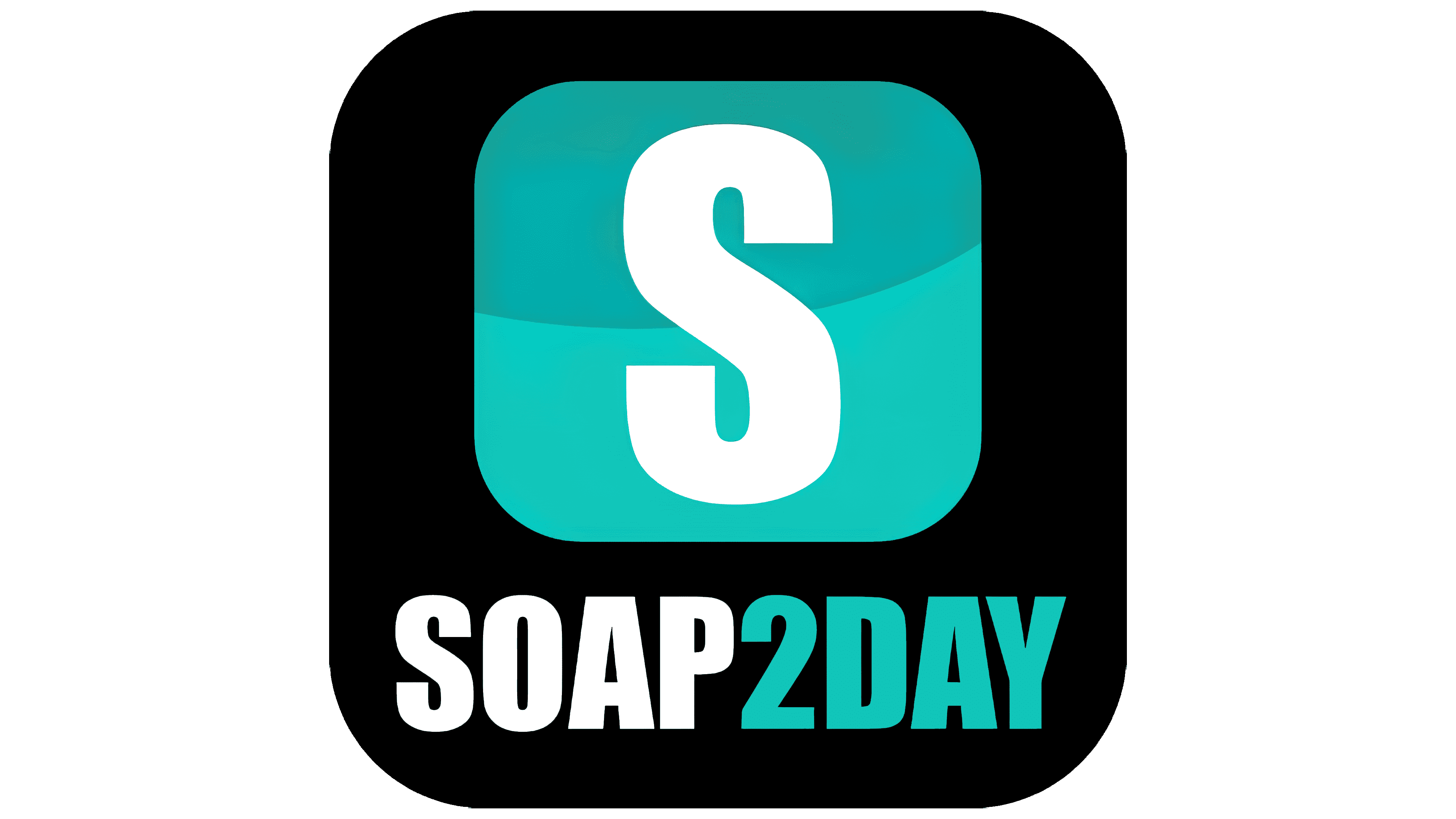
The designers have designed the Ssoap2day logo that brings out the best in this streaming platform. The logo seems weightless due to the shape and arrangement of the elements. Such an emblem symbolizes the ease and high speed of watching movies, the simplicity of the interface, and a huge catalog of content for every taste.
Meaning and History
Ssoap2day stands out not only for its extensive collection of films but also for its user-friendly interface, which even beginners can use to easily find a suitable film. It is a system for classifying films by year and genre. Therefore, if the resource client is a fan of 80s horror, then it will not be difficult for him to find a suitable film. Moreover, you can browse the site without authorization. The user does not need to provide personal data; therefore, all system operations are performed anonymously.
In the site sections, a person will find both cult films of the silent film era and modern multimillion-dollar bestsellers. Resolution can be selected based on the speed of the Internet connection to ensure the picture downloads smoothly and without interruptions.
What is Ssoap2day?
This project greatly simplifies the lives of global network users. Thanks to this site, there is no need to spend time finding your favorite movie in high quality.
Throughout the web resource’s existence, the target audience was presented with a single logo version, which at the moment did not lend itself to redesign. Consequently, the brand’s visual identity is strong. The emblem is fresh and bright, which once again attracts the target audience’s attention. In project management, the logo is not the primary promotional element, as the focus is on the content.
The SSoap2Day logo relies solely on word-of-mouth in a modern, progressive style. The first capital “S” in white is inside a blue square with rounded corners. Visually, this element resembles the “Skype” logo. The rest of the brand name is in blue capital letters. Against the background of other symbols, the number “2” stands out, with its lower part consisting of six horizontal blue lines.
The classic, bold sans-serif font and vibrant color scheme keep the emblem top of mind for users. As a result, the logo looks airy and modern. The fact that the name doesn’t fully convey the project’s direction only adds to SSoap2Day’s mystique, prompting users to visit the site to assess the quality of its content.
Font and Colors
The brand name is made using a classic sans-serif font. Capital letters and thick lines only add scale to the verbal inscription, indicating the project’s global nature.
SSoap2Day decided not to use cycles in a varied color palette, focusing on bright colors. As a result, the blue-and-white gamma looks stylish and modern. With blue letters on a white background, the company aims to attract users’ attention, interest them, and motivate them to visit the project’s official website.