The company’s products are in demand, and the Staples logo conveys confidence. The emblem shows the fast turnover of goods and the high revenue of stores. The symbols add the idea of simplicity and practicality, and the design of the products is fully consistent with their purpose.
Staples: Brand overview
Meaning and History
Thomas G. Stemberg had the idea of opening a stationery store in 1985 while working on another project. Then, he urgently needed a ribbon for the printer, but he could not find it anywhere since all points of sale were closed on the weekend due to Independence Day. His despair became the platform for the concept of specialty supermarkets.
A pilot store was set up in Boston’s Brighton, where Staples began operations with financial support from private equity firms. In 1991, she created a subsidiary of Business Depot in Canada, after which she began to open stores under this name. But after ten years, she renamed them Staples. The first overseas supermarket originated in Vaughan, Ontario. The opening of points of sale in Europe started in the British city of Swansea. The development of the network moved at such a pace that after ten years of operation, Staples crossed the three billion dollar sales threshold and entered the Fortune 500 list.
Over the entire period of operation, the American company actively sold office supplies and everything related to them and continuously expanded, acquiring competing firms. Since 2014, she has repeatedly cut the number of employees as she initiated the transition to e-commerce. This allowed her to optimize costs. In addition, the chain of stores now has several trademarks. In 2021, it sold almost all its European subsidiaries, focusing on commercial services for three countries – the United States, Canada, and the United Kingdom. Each serious step of her activity was accompanied by a change of logo, of which she has three.
What is Staples?
It is an American retail chain that sells stationery and other office supplies. Some outlets also provide photocopying services, the printing of texts and documents. The first store appeared in Brighton, Massachusetts, in 1983.
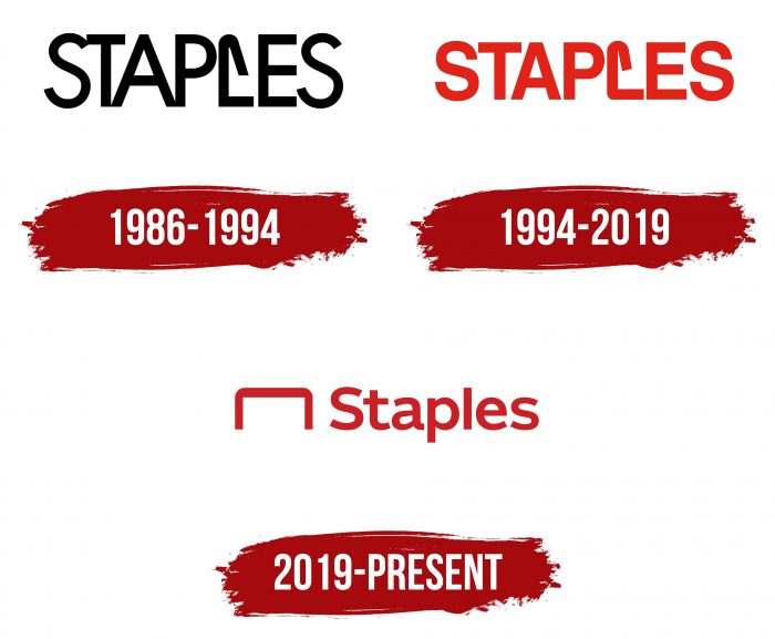
1986 – 1994
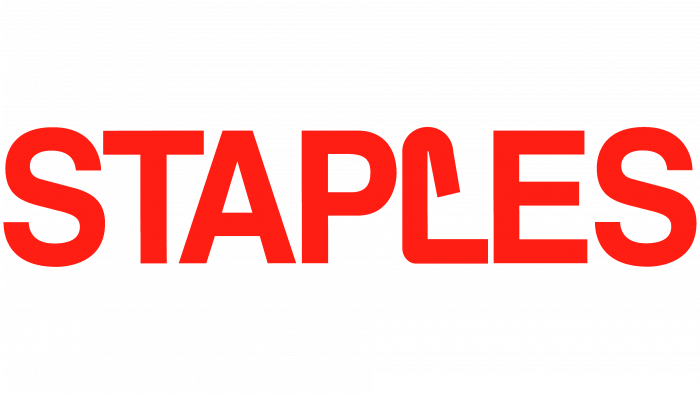
The debut emblem combined text and graphic elements. The visual identity sign served as a sign at the store’s entrance, so it primarily consisted of the name. To beat him, the developers turned the “L” into a paperclip. It was vertical and bent at one end. The lower part of the letter represented an unbent bracket. Such paperclips are usually used to fix papers and notebooks.
The word “Staples” was executed in uppercase font with smooth, elongated characters, half of which were connected (“S,” “T,” “A,” “P”). Whereas “L,” “E,” and “S” did not touch each other. It was a bold sans serif with a single serif as a parenthesis.
1994 – 2019
A red emblem with a bold typeface was used for the next few years. Moreover, the designers separated all the letters, placing them at a minimum distance.
2019 – today
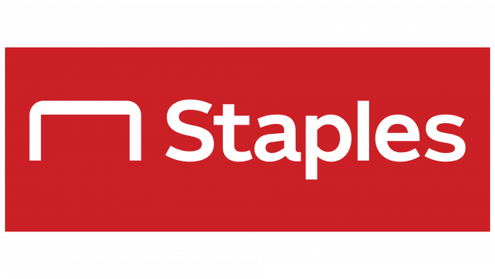
After the transition of the trademark to a new commercial level, the management approved a different logo. The developers removed the similarity of “L” with a paper clip and transferred the font to lowercase, leaving only the first letter in the title in the capital. But they still kept the paperclip, just giving it a different look. Now, it is in front and has an inverted shape, visually resembling a table. This was done deliberately since stores switched to the massive sale of office furniture and equipment.
Staples: Interesting Facts
Staples, Inc., is a prominent American retailer specializing in office supplies, technology, furniture, and other services.
- Origins and Expansion: Founded by Thomas G. Stemberg and Leo Kahn in 1986 in Brighton, Massachusetts, Staples emerged from a vision for a retail outlet dedicated to office supplies. The concept quickly took off, with the first store opening in May 1986, leading to rapid growth as it fulfilled the demand for a comprehensive source of office supplies.
- Retail Revolution: Staples introduced the office supply superstore concept, revolutionizing how businesses and individuals purchase office necessities. This innovative approach combined a broad selection of products with competitive pricing in spacious stores, setting a new standard in the retail industry.
- International Presence: Initially rooted in the U.S., Staples broadened its horizon with stores across several countries, including Canada, the United Kingdom, Germany, and Australia. Its international ventures have evolved following strategic business decisions.
- E-commerce Adoption: In 1998, Staples ventured into e-commerce, establishing an online platform that expanded its reach and solidified its status as a frontrunner in the digital office supplies market.
- Business-to-Business Services: The establishment of Staples Advantage marked the company’s foray into tailored services for businesses, providing customized products, services, and pricing to meet diverse business needs.
- Commitment to Sustainability: Staples has actively pursued sustainability by selling eco-friendly products, recycling programs for ink and toner cartridges and electronics, and implementing energy-saving measures.
- Staples Center Association: The Staples Center, a renowned sports and entertainment arena in Los Angeles, is named after the company due to a naming rights agreement. It hosts major sports teams and events.
- Rebranding Initiative: Responding to shifts in the retail landscape, Staples began transforming select stores into “Staples Connect,” focusing on solutions for contemporary work and learning environments, including coworking spaces and tech support.
- Strategic Acquisitions: Staples has expanded its offerings and services through acquisitions, such as Office Depot’s European operations and tech service companies, enhancing its business services division.
- Transition to Private Ownership: In 2017, Staples embarked on a new phase under the ownership of Sycamore Partners, transitioning from a public to a private enterprise in a deal worth about $6.9 billion.
Staples continues to innovate and adapt, addressing the dynamic needs of its customer base in the shifting realms of retail and business, affirming its role as a vital player in the office supply sector.
Font and Colors
Staples corporate symbols are visually similar because each new version of the logo is based on the previous one, so the changes are not striking. The designers adjusted the style of the text, which, despite the corrections, always remained chopped up.
The brand identity primarily uses the Helvetica family typeface. The emblem and signage use the Helvetica Neue Bold font, and the slogan, which often complements the logo, is by Helvetica Roman. Its developer is Max Miedinger.
The palette is distinguished by restraint. As the brand sells office supplies, educational materials, and other items that require serious attention, the emblem is dominated by the classic black and red color scheme.
FAQ
What is the Staples slogan?
The company used the slogan “That Was Easy” for over ten years, demonstrating how simple it was to buy office supplies. This slogan assured customers they could find what they needed quickly and effortlessly.
The company recently introduced a new slogan, “Do More,” developed by advertising agency McGarryBowen. This slogan aims to help customers be more productive with the supplies they buy, encouraging them to achieve more.
Some people may prefer the directness of “That Was Easy,” which promises quick and easy shopping. This slogan appeals to those who value convenience and speed.
Others may find the “Do More” idea more appealing because it aligns with customers’ goals. These customers see their purchases as essential to their success and productivity. This tagline encourages customers to think beyond purchasing supplies and how these tools can help them achieve more.
Is the L in Staples a staple?
Yes, the “L” in the logo looks like a staple. The top of the “L” curves inward, making it resemble a staple. This design choice ties the logo to what the brand sells – office supplies. This simple but thoughtful detail helps the logo grab attention and convey the brand’s essence. It makes the logo more interesting and meaningful, showing how well it matches the brand’s identity.
What font is the Staples logo?
The logo uses the Helvetica Neue Bold font, created by Max Miedinger, for the network’s name. This font has clean and crisp lines, giving the logo a modern and professional look that complements the brand image. When a tagline is included in the logo, it is displayed in Helvetica Roman, which is less bold than Helvetica Neue but maintains a consistent style. These fonts maintain the logo’s integrity and convey the brand’s personality clearly and effectively.
Did Staples change their logo?
In 2019, the brand updated its logo. The main change was in the design of the “L,” which previously had a semi-curved bracket-like shape. A separate paperclip icon with smoothly rounded corners appears before the brand name. This new design adds modernity and updates the brand’s look, making it more relevant in today’s market.
Why did Staples change their logo?
The brand updated its logo to better suit its growing product range and evolving identity. This change aims to keep the brand modern and relevant in a fast-changing retail environment. The original logo featured a semi-curved staple-like design, clearly indicating the brand’s primary focus on office supplies. However, as the company expanded its offerings beyond staples and simple office supplies, it needed a logo representing that broader scope. The updated logo now includes a paperclip icon.
