The “Star Wars” logo demonstrates the global reach of the franchise. The symbols allow room for imagination to soar. The emblem reminds us that despite the importance of the events, they are just a flash in the endless journey of the Universe.
Star Wars: Brand overview
| Founded: | 1977 |
| Founder: | Lucasfilm Ltd. |
Meaning and History
The “Star Wars” media franchise has existed for several decades. It has evolved with the new era, and with it, the logo has changed. What was in demand in the mid-20th century is no longer relevant. At the same time, designers tried to preserve the iconic style associated with the space opera.
What is Star Wars?
Star Wars is an American media franchise that began in 1977 with a film of the same name and grew into a space epic. Its creator is director George Lucas. It quickly became one of the highest-grossing works on the planet. Currently, it includes films, comics, novels, video games, TV series, theme park attractions, and much more.
1976 (pre-release)
The story of the emblem began in the second half of the 1970s when director and screenwriter George Lucas conceived the legendary science fiction saga of the Jedi. After the launch of the first film, the team of concept artist Ralph McQuarrie began developing the debut “Star Wars” sign.
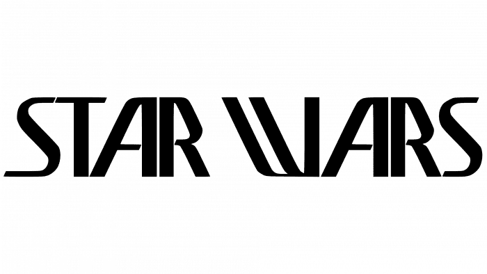
They proposed many different options. One of them was the phrase “STAR WARS” written in stylized letters. Particularly notable were the flattened right-side letter “R,” and the unusual “W.” This version became the prototype for the main logo.
1977
In 1977, typographer Dan Perri was involved in creating the logo. He also proposed the idea of animating the logo: the movement of STAR WARS from the viewer into open space towards the horizon. The author chose a bold font and made the words bright yellow, which did not fit the concept of a sci-fi saga. Perhaps that is why a black background with numerous stars was added (this is how the movie title looked on the poster).
The inscription was made in the form of a cone. Dan Perri borrowed it from the opening titles of the 1939 film “Union Pacific.” This version was used in promotional materials, particularly on the first poster for the movie “Star Wars: Episode IV: A New Hope.” It did not make it into the film itself.
1977 – today
The logo that appears in the titles of all episodes of the “Saga” was created by artist Suzy Rice. Originally, it was to adorn the brochure cover, packaging, and promotional materials. George Lucas approached the Seiniger Advertising company for its development. The designers were not very interested in the project, and only Suzy, as a young specialist, enthusiastically took on the implementation of the idea.
Lucas’s main requirement was for the emblem to be as “fascist” and frightening as possible. The artist brought this idea to life using a large drawing board, papyrus paper, and a simple pencil. Since her task was to make an emblem for a brochure, she focused on its size.
The proportions of the cover reminded Suzy of a projection screen, so working on the “STAR WARS” inscription, she thought about how the final result would look on a cinema screen. But the designer never expected her logo to be featured in the film’s titles. The directors rejected Dan Perri’s version because it was difficult to read in animated form.
Star Wars: Interesting Facts
“Star Wars,” made by George Lucas, started with a movie called “A New Hope” in 1977. It’s a big story that lots of people love, and it’s not just about space battles and cool aliens but also has been a big part of movies, books, video games, and TV shows.
- The Beginning Words: The movie starts with words scrolling up the screen to tell the story. This idea came from the old “Flash Gordon,” which shows that Lucas liked it when he was little.
- New Movie Tricks: “Star Wars” was so new and different that Lucas had to make a company called Industrial Light & Magic just to create the effects needed for the movie. This company now makes special effects for many other movies, too.
- Lightsaber Sounds: The noise a lightsaber makes when it turns on is made by mixing the sound of an old movie projector and a TV. It’s one of the most famous sounds from movies.
- The Millennium Falcon: This famous spaceship resembles a hamburger with an olive on the side. Han Solo and Chewbacca fly through space.
- Yoda Talks Funny: Yoda, the wise old character, talks in a special way, with words in a different order than we usually speak. It makes him sound old and wise.
- Big Surprise: The movie’s biggest surprise is that Darth Vader is Luke Skywalker’s dad. They kept it a secret by telling the actors a different story while filming.
- The Force: The Force is a special power good guys and bad guys use. It’s like magic and is supposed to remind us of inner strength and being good.
- Toys: “Star Wars” toys became popular and changed how movies sell toys. They’ve made a lot of money over the years.
- More Stories: Besides the movies, books, comics, video games, and TV shows tell more about the Star Wars universe. Even after Disney bought Star Wars, fans still love the old stories.
- Big Influence: “Star Wars” has affected many other movies, TV shows, and everyday sayings. Phrases like “May the Force be with you” are known by almost everyone.
“Star Wars” is a big deal because it changed how movies are made and told a story many people can connect with. It mixes adventure, cool space, and right and wrong lessons.
Font and Colors
The current logo is the result of Suzy Rice’s meticulous work. In creating it, the artist studied reproductions of political works from the 1930s, as fascism became one of the forms of state structure at that time. She also focused on the Art Deco style and used the enlarged Helvetica Black font as a reference.
Thus, the first version appeared: a two-line inscription, “STAR WARS,” outlined in white lines. Later, director Joe Johnston slightly altered the emblem, making the contours bright yellow.
Star Wars color codes
| Black | Hex color: | #000000 |
|---|---|---|
| RGB: | 0 0 0 | |
| CMYK: | 0 0 0 100 | |
| Pantone: | PMS Process Black C |


