


![]() Stark Industries Logo PNG
Stark Industries Logo PNG
Even fictional companies from comics need visual identification. The Stark Industries logo adds a touch of realism to the Marvel universe, making it authentic and engaging. Despite its simple structure, the emblem appears progressive. Its strict, minimalist design emphasizes the influence of the arms and military technology manufacturer, while its dynamic shape reflects the brand’s forward-looking perspective.
Stark Industries is a fictional corporation in Marvel Comics, so its history reflects how Marvel writers have built and revised the Iron Man myth. Tony Stark first appeared in Tales of Suspense #39 in March 1963. He was created by Stan Lee, Larry Lieber, Don Heck, and Jack Kirby as a wealthy Cold War industrialist and weapons maker, a type of hero that Stan Lee wanted to make compelling despite the era’s politics.
In early comics, Stark’s company first appeared as a broad industrial conglomerate, and the name Stark Industries gradually became fixed during the 1960s. Later stories used names such as Stark International, Stark Enterprises, Stark Solutions, and Stark Resilient, usually tied to bankruptcies, takeovers, ownership changes, or Tony Stark’s personal crises. Hammer Industries, run by Justin Hammer, entered the comics in 1979 as a weapons rival.
The comic version of Tony Stark inherited the company from his father, Howard Stark. The idea of Howard as founder developed in later retrospective stories. A major turning point came with Armor Wars in 1987-1988, written by David Michelinie with art by Bob Layton, where Stark discovers that his technology has been stolen and used by villains. The story made responsibility for weapons a lasting theme of Iron Man.
In cinema, Stark Industries became widely known through Iron Man, the first Marvel Studios film, released in May 2008. The movie tied Howard Stark to World War II and S.H.I.E.L.D. At the same time, Robert Downey Jr.’s Tony Stark reshaped public perception of the brand. After Avengers: Endgame in 2019, the company ceased operating in the MCU story after Tony’s death, but it remained active through Marvel merchandise, comics, and related media.
Meaning and History
![]()
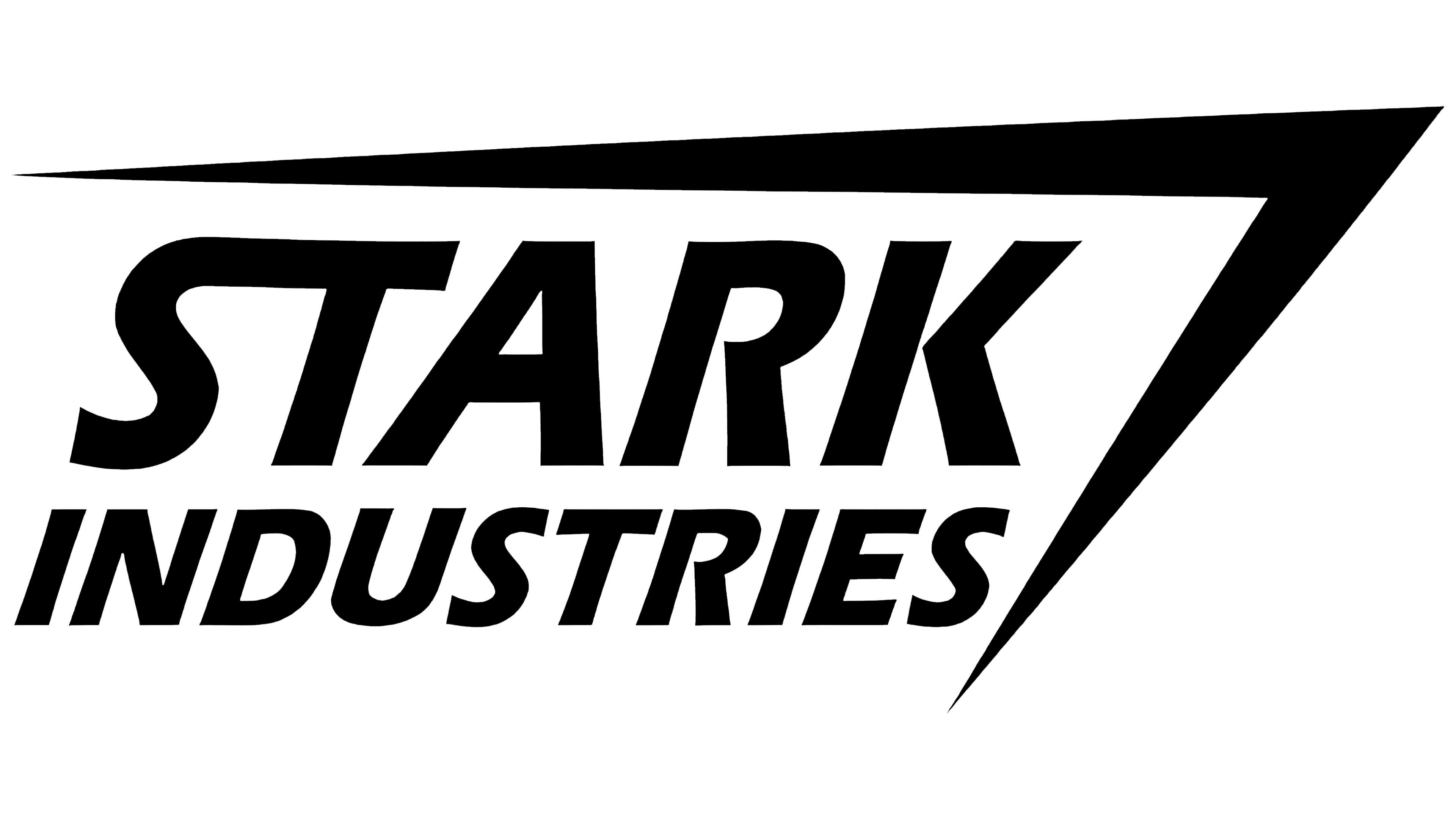
The widely recognized Stark Industries wordmark was created for the 2008 Iron Man movie and subsequently incorporated into the comics. Before this, the company had no official emblem, or it might have hypothetically existed but was never prominently displayed. After designers crafted a recognizable logo for the fictional arms manufacturer, it appeared across various franchises in the Marvel Cinematic Universe. For instance, it can be seen on the sonic cannon used by the military to shoot at Hulk.
Interestingly, the Stark Industries graphic symbol was inspired by emblems from two real defense contractors:
- The font style, including its boldness, shape, and slant, was borrowed from Northrop Grumman.
- The idea of placing a long horizontal stripe above the wordmark, bending it to the right to form a sharp angle, was taken from Lockheed Martin. Originally, this was part of a star because Lockheed was instrumental in advancing the U.S. aerospace sector.
These subtle nods to real company logos enrich the Marvel universe and add a layer of realism.
What is Stark Industries?
Stark Industries is a fictional conglomerate first introduced in Marvel comics in 1962. Its founder is believed to be Isaac Stark, Sr., with Tony Stark, who leads a double life as Iron Man, as the owner. The company specializes in producing weapons, military equipment, armor, and other defense materials, supplying superheroes and terrorist organizations worldwide.
1962 – today
![]()
The Stark Industries emblem wasn’t created in 1962 (when the arms manufacturer first debuted in comic books) but much later. It was crafted by the graphic designers of the Iron Man movie to provide a fully fleshed-out fictional universe.
Centered is the company’s name, written in a bold italicized font. Some letters are connected, giving the wordmark a sense of motion and glide. This imparts a more modern and futuristic look, fitting for a corporation linked to cutting-edge technologies.
Above the inscription, a long, thin line is drawn, forming a sharp angle on the right. It, too, symbolizes a drive for progress and innovation, and its dynamic shape is associated with perseverance, confidence, and power. All these qualities can be attributed to Tony Stark: he displays his leadership as a businessman and a superhero.
Font and Colors
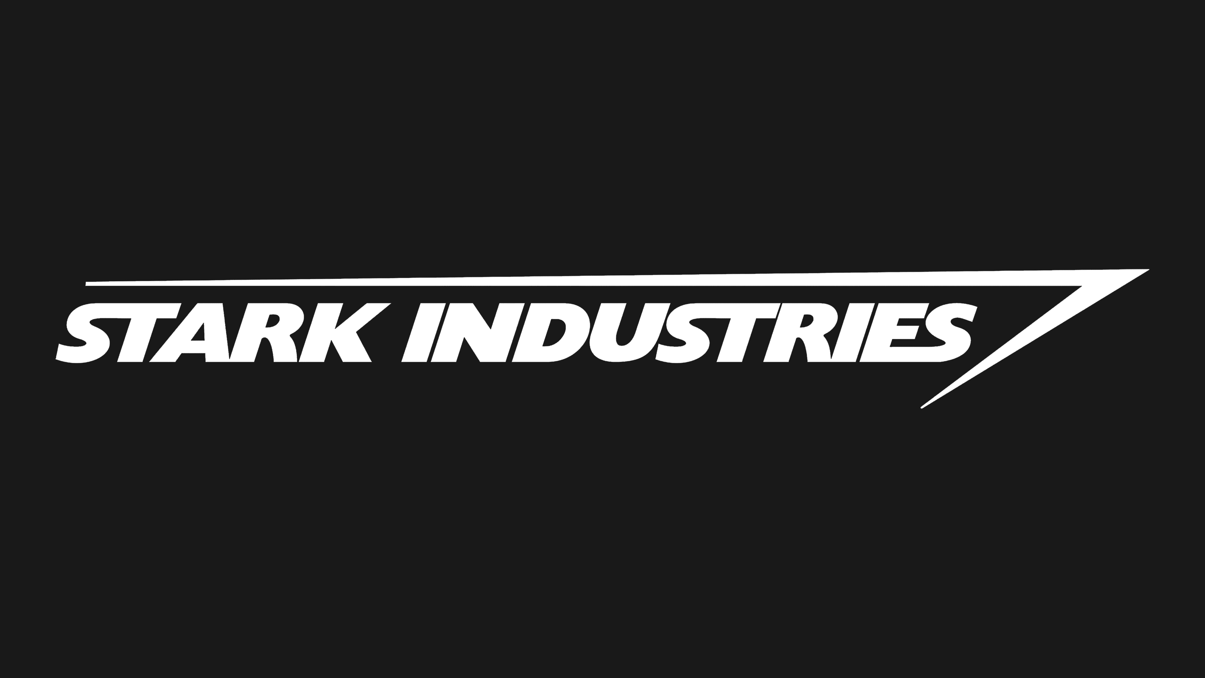
To the best of our knowledge, the “STARK INDUSTRIES” inscription style was inspired by the word mark of another company, Northrop Grumman. However, it’s not an exact font replica because designers adapted the form to fit a new concept. Much of the logo draws on Gill Sans, though there are significant differences, especially in the unbalanced “S.” Some glyphs are combined, such as “ST” and “ES.”
The fictional corporation’s name is colored in black, as are the accompanying lines. This classic palette gives the emblem a stern, contemporary, and stylish look, highlighting Stark Industries’ prominence in the fictional world.