


![]()
STEP (Spherical Tokamak for Energy Production), the UK’s leading fusion energy project, has introduced a new logo and visual identity created by Among Equals. This update reflects the project’s goal of making fusion energy a dependable power source by 2040. Backed by the Department for Energy and Net Zero and managed by the UK Atomic Energy Authority (UKAEA), STEP plays a key role in shaping the UK’s future energy landscape. The visual identity blends scientific precision with a bold, future-focused spirit.
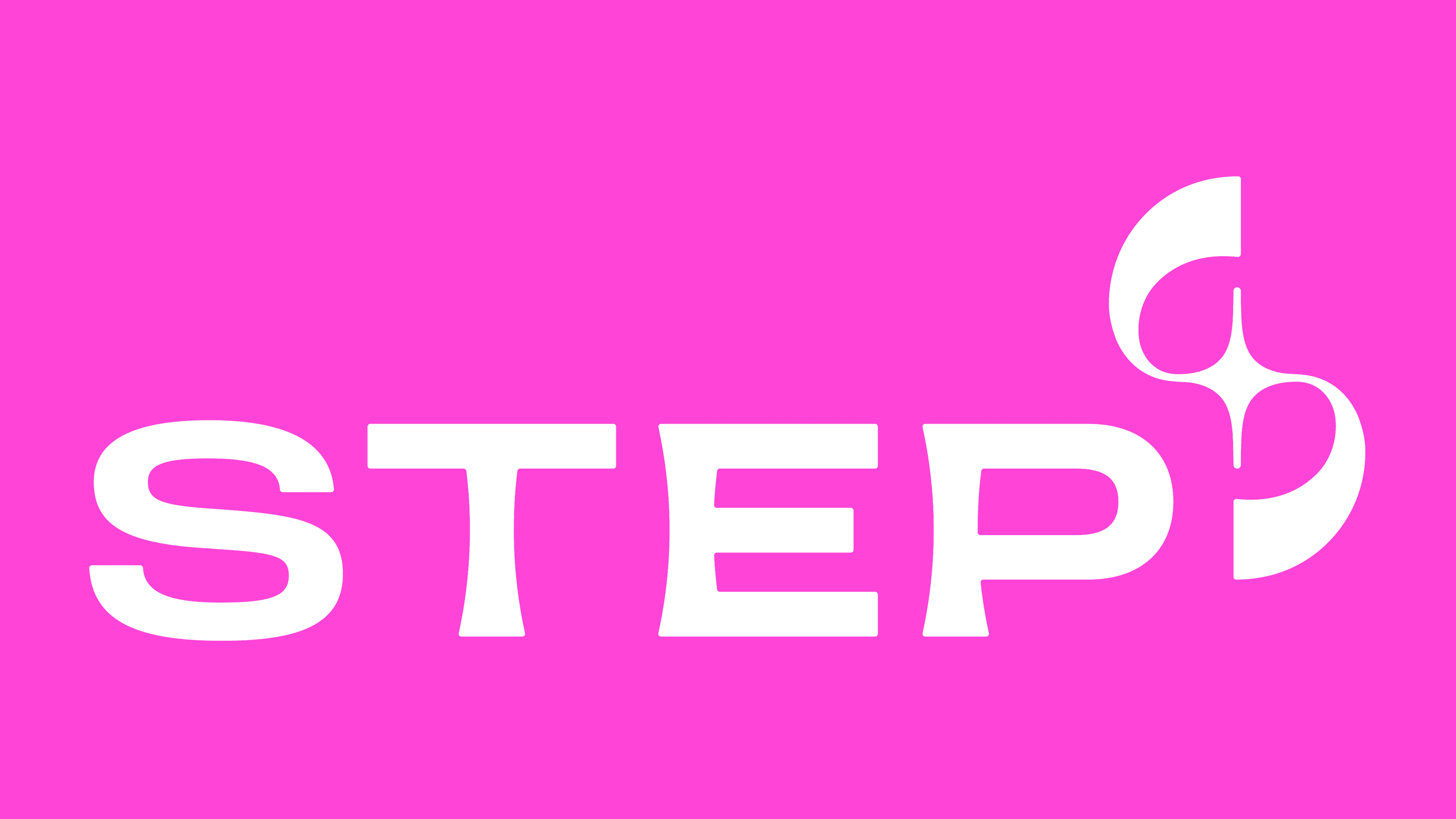
The centerpiece of the new look is the strong, all-caps wordmark paired with a unique symbol inspired by fusion energy. The custom typeface, STEP Sans, was developed with Pangram Pangram and takes cues from the design of a tokamak—the device used to create fusion energy. Its clean, geometric shapes and smooth curves reflect the structure and symmetry found in the magnetic fields of a tokamak. One detail that stands out is the letter “S,” designed with an abstract, wave-like form, echoing the movement of plasma inside fusion reactors.
The symbol next to the wordmark is an abstract nod to the tokamak and the fusion process. At its center is a star, representing the reaction at the heart of the sun—perfectly fitting for a project focused on harnessing the same type of energy. Radiating lines mimic magnetic fields, highlighting how fusion power comes to life. The mix of sharp angles and smooth curves reflects the complexity of plasma physics and the natural flow within the process. Asymmetrical curves create interesting negative spaces, adding a sense of motion that mirrors the project’s focus on scientific advancement.
Moving away from the typical tones used in the energy sector, the new palette features bright pink, lilac, and deep blue gradients. These colors evoke the glowing light of plasma within a reactor, giving the brand a fresh, futuristic vibe. The smooth shifts between shades represent the transformation during fusion, where raw energy becomes usable power. This bold approach to color sets the initiative apart from traditional energy organizations and reflects its innovative spirit.
The branding goes beyond the logo, including a collection of “mission patches” inspired by astronaut badges. Each patch represents different teams within the project, highlighting the collaborative effort driving the initiative. Designed with the same bold colors and geometric shapes, these patches are visual markers for the various groups working together toward common goals. They add a human element to the brand, celebrating the people behind the science.
While the design leans into a futuristic aesthetic, it has its quirks. The stretched letterforms make a strong impression, but the proportions—especially of the “S”—can feel slightly off-balance. The abstract monogram is interesting but might seem disjointed because of uneven spacing. Still, these imperfections give the design character, reflecting the experimental nature of fusion research.

The typography is modern and minimalist, though longer texts may have spacing and alignment issues. The energetic graphic elements bring life to the design, though using them too heavily can feel overwhelming. Even so, the bold colors and dynamic shapes evoke a sense of optimism and excitement, qualities often lacking from government-led energy initiatives.
The mix of futuristic typography, striking visuals, and vivid colors reflects fusion energy’s scientific drive and transformative potential. While some parts of the design push the boundaries of conventional branding, they fit the spirit of a project focused on reshaping the future of global energy. It’s not just about the destination—the journey, filled with discovery, experimentation, and a relentless push for progress.