The Sterling Airlines logo reflects the passion and energy the carrier approaches its business. The shades of the emblem showcase luxury and impeccable service. It demonstrates a commitment to technology and innovation for passenger convenience.
Sterling Airlines: Brand overview
Sterling Airlines, a Danish charter airline, began in 1962 with a modest fleet of propeller aircraft. In the early 1970s, Sterling adapted to the jet age, providing scheduled charter flights between Scandinavia and popular tourist destinations in Southern Europe.
In the 1990s, Sterling’s strategy changed as the airline became a low-cost carrier operating scheduled flights throughout Europe. In the following decade, Sterling, with bases in Copenhagen and Stockholm, rapidly expanded its network, adding numerous routes and new bases throughout Scandinavia. By 2008, Sterling’s network covered more than 30 destinations served by 13 Boeing airplanes.
However, the “perfect storm” of skyrocketing fuel prices and the global financial crisis 2008 severely impacted Sterling’s fortunes. In October 2008, the airline declared bankruptcy, bringing its operations to an abrupt halt and leaving tens of thousands of passengers homeless.
At its zenith, Sterling carried more than 7 million passengers a year. However, the ambitious strategy of developing a low-cost model did not survive the harsh economic conditions.
The fall of Sterling after more than four decades of operation marked the end of one of Scandinavia’s largest low-cost carriers. The event highlighted the tough challenges carriers face in Europe’s fiercely competitive low-cost airline environment.
Meaning and History
What is Sterling Airlines?
It is a budget airline based in Denmark. It operates scheduled and charter flights in Europe, offering affordable travel options to various destinations. Known for its budget fares, the company provides efficient and affordable services to leisure and business travelers. The airline’s fleet consists of Boeing 737 airplanes used for short—and medium-distance flights. Despite its popularity, the company ran into financial difficulties and ceased operations.
Old
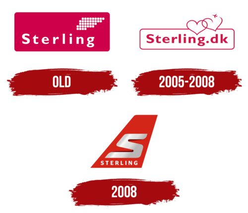
The logo designed for the first Sterling Airlines holds significant historical value. Founded by Eilif Krogager in 1962, the airline ceased operations in 1993 following bankruptcy. The emblem’s color palette vividly displays the national colors of Denmark. The main element in red resonates with the Danish flag, emphasizing the airline’s deep connection to its homeland and culture.
In the logo design, a symbolic element in the top right corner is made of white squares that resemble an airport information display. These squares are arranged to form the image of an airplane wing. This element symbolizes the company’s aspiration for great heights and passion for aviation and travel.
The word “Sterling” appears in the foreground in white uppercase letters. The font used is wide and neat, enhancing a sense of comfort and hospitality. This font style perfectly captures the essence of the charter flights offered by the company, creating a homely and comfortable atmosphere for passengers during their flight.
2005 – 2008
The Sterling Airlines logo differs from the previous version, filled with hearts reminiscent of a Valentine’s Day card. The updated design looks fairly standard: it includes part of the tail of the airplane, a large letter “S,” and the word “STERLING.” The letter “S” looks like a complex mechanical part because of its unconventional shape and is painted in a silver gradient. The cold metallic sheen contrasts with the bright red base and harmoniously complements the white color of the text below.
The intricate “S” in a metallic gradient evokes a sense of modernity and technical prowess, reflecting the airline’s commitment to innovation and quality. The red base of the logo is eye-catching and symbolizes passion or urgency, aspects often associated with air travel. The white text at the bottom adds clarity and balance to the overall design, making it eye-catching and easy to read. This combination of elements makes for a memorable and effective branding tool.
2008
The airline’s modern logo captures brilliance and elegance, reminiscent of the shimmer of metal on an airplane wing on a sunny day. The main element of the logo is the gray letter S, which sparkles as if reflecting the bright rays of the sun. The design of the letter creates the illusion of ascending due to a well-thought-out shadow that adds depth and volume.
The size of the letter S reflects the carrier’s ambitions for growth and development in the aviation industry. This symbol appears to float in the air, like an airplane following the path of ascending air currents. The bright red color used to depict the wing symbolizes speed, energy, and rapidity, all key characteristics of the airline. This shade emphasizes the company’s leadership qualities, highlighting it among competitors in the market.
The inscription “Sterling” occupies a special place in the foreground of the logo design. In a stylish font, this inscription complements the overall look of the emblem, enhancing its visual impact and recognition.


