


![]() Steven Universe Logo PNG
Steven Universe Logo PNG
The logo of Steven Universe, the popular animated series, features a star symbol, just like the one on Steven’s T-shirt. This graphic element was introduced into the story as part of the visual design. Rebecca Sugar deliberately added repetitive characters to the show to emphasize the importance of small details and to imbue them with power.
Steven Universe began with Rebecca Sugar, born on July 9, 1987, in Silver Spring, Maryland. As a student, she made comics and animations, then joined Cartoon Network after graduating from the School of Visual Arts. From 2010, she worked as a writer and storyboard artist on Adventure Time, one of Cartoon Network’s defining series of that period. In 2012, Forbes named her to its “30 Under 30” list in entertainment.
In 2012, Cartoon Network approved Sugar’s own project, making her the network’s first independent nonbinary series creator in its twenty-year history. The pilot for Steven Universe appeared online on May 21, 2013, was shown at San Diego Comic-Con, and drew early attention. On October 13, 2013, Sugar presented the series at New York Comic Con.
The show premiered on Cartoon Network on November 4, 2013, with two episodes. It followed Steven Universe, a boy living in Beach City with the Crystal Gems: Garnet, voiced by Estelle, Amethyst, and Pearl. Steven was half human and half alien, learning to use his powers. At the same time, the series built stories around family, self-acceptance, and romance that transcend gender boundaries. Its main competitors included Adventure Time and Disney Channel’s Gravity Falls.
Season two was announced on July 25, 2014, and season three on July 7, 2015. A 2016 production change divided the run into five seasons and 160 episodes. Sugar wrote lyrics and music for key scenes. The fifth season ended with Change Your Mind on January 21, 2019, followed by Steven Universe: The Movie on September 2, 2019, and Steven Universe Future, which aired from December 7, 2019, to March 27, 2020. The series won GLAAD and Peabody awards in 2019.
Meaning and History
![]()
What is Steven Universe?
Steven Universe is an animated series created by American screenwriter and storyboard artist Rebecca Rea Sugar. Children’s animated series focusing on the importance of family, love, and mutual assistance. The main character is the little boy Steven, named after Rebecca’s younger brother.
Rebecca Rea Sugar inspired the animated show. She also came up with the original design, developed the characters’ personalities, and named the series after her younger brother, partially drawing on his image of the main character. Sugar also greatly contributed to the creation of the Steven Universe logo, which features a five-pointed star and an inscription. The same star is featured on the T-shirt of the fictional boy Steven.
In an interview, Rebecca said she was inspired by Mike Mignola’s visual symbol system, the author of the Hellboy comic series. She turned to a talented artist for help when planning the concept for her new animation project. The creator of the animated series wanted advice on visual design because she admired Mike’s ability to fill the space of comics with small but very important details. It turned out that repeating the same symbol at different points in the story makes it possible to associate it with a particular character.
As a result, Sugar decided to add a yellow five-pointed star to Steven’s pink T-shirt. Why this particular sign? The author of the animated series wanted to build a mythological foundation for the story around ancient goddesses. Mignola advised her to pay attention to Ishtar, the goddess of war, love, and fertility. Her symbol is an eight-pointed star, and her animal is a lion. That is why Steven has a pet lion in the animated show, who is the main character’s guardian.
2012
![]()
This logo was used during the pre-development phase of the animated series when only its initial concept existed. He was featured in the introductory video, in which a yellow-brown inscription “STEVEN UNIVERSE” appeared against a light background. The show title spanned two lines and was in bubble type. All glyphs were capitalized but varied in size, as one of the characters relied on a “flattened” top word. The light edges and dark center made the letters appear three-dimensional.
2013 (pre-pilot)
![]()
In the pre-pilot version of the emblem, the two-level inscription became multi-colored. Red “S” and “I,” orange “T” and “V,” green “V” and “R,” two purple “N,” and yellow and blue “E” made the series name childishly colorful, which paired especially well with bubble type. At the same time, the upper line formed an arch, and the lower part was curved in the opposite direction. Between them was a scarlet medallion depicting an eight-pointed star, the goddess Ishtar’s main symbol.
2013 (pilot)
![]()
The lettering changed to yellow and gold in the show’s pilot episode. At the same time, it was slightly tilted back, achieved by adjusting the glyphs’ shape and size. The designers made both words shiny using a gradient and highlights. The black contours that outlined each letter made the silhouettes clear and voluminous.
2013 – 2019
![]()
The wordmarks designed for the series’ promo poster and pilot inspired the final Steven Universe logo. Art director Kevin Dart retained the yellow color and bubble font of the lettering but slightly changed the overall design concept. His sketches served as the basis for a version created in collaboration with other members of the creative team. Ian Jones-Quartey and Rebecca Sugar provided helpful tips, Angie Wang and Danny Hynes shaped the letters, and Tiffany Ford finished off the logo.
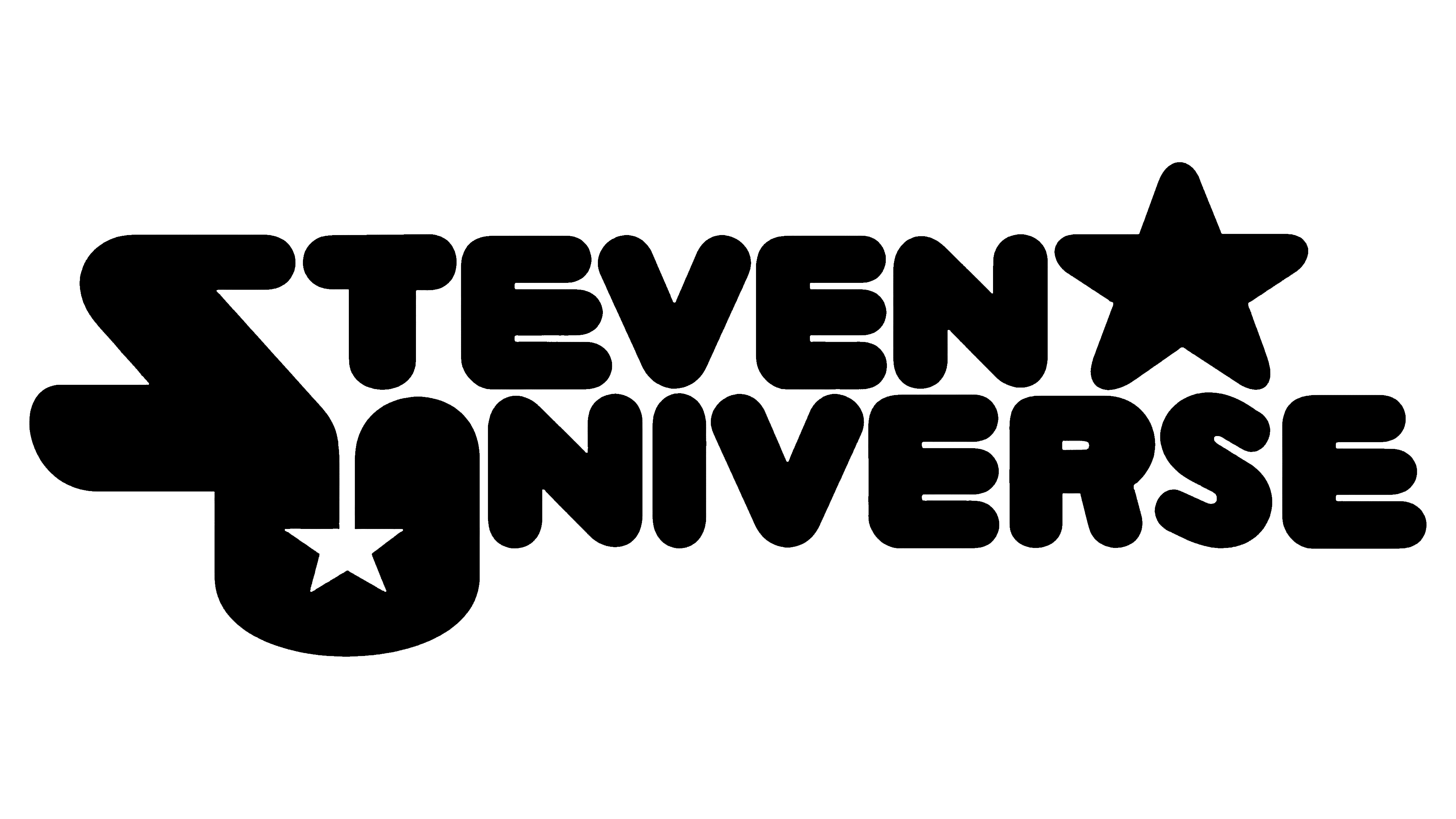
In this version, the series title is written in bold italics, with the initial letters of both words merging. Inside the “U” is a small five-pointed star painted red and blue. The same colors have wide, inscribed contours. The first line is slightly shifted to the left because another star, a large yellow-gold one, is depicted on the right.
Rebecca Sugar used the star as a universal graphic symbol unrelated to the character’s age and gender. The series creator considered this a positive symbol associated with space and good grades in elementary school. The star is also associated with the goddess Ishtar, underscoring the animated show’s mythological basis.
Font and Colors
The name Steven Universe consists of a set of individual cartoon-style glyphs. However, fan-made fonts based on the logo exist, such as Crystal Universe or the Steven Universe Font family. These fonts contain bubble glyphs with very wide elements and tiny letter gaps.
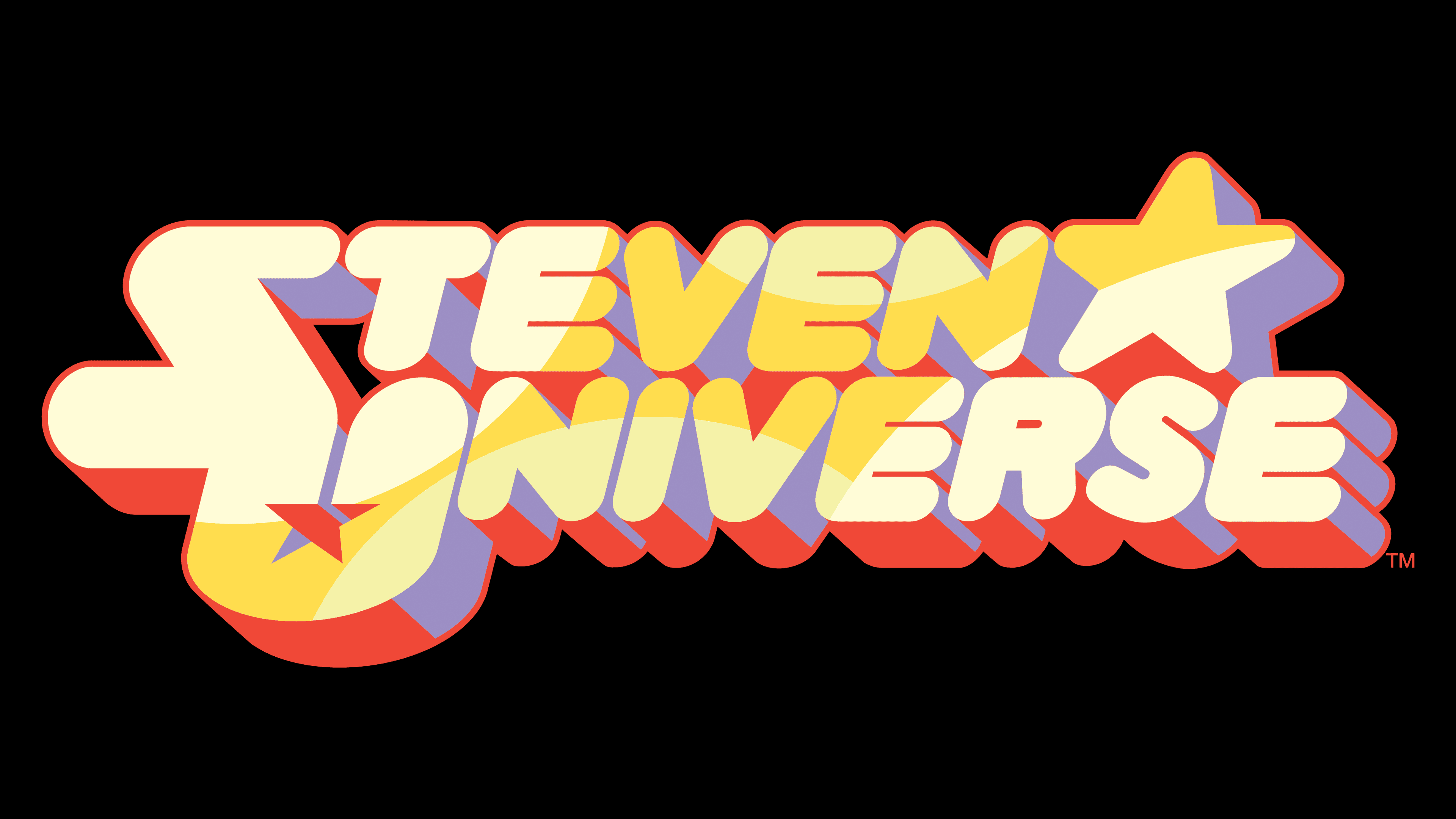
The palette consists of red, blue, and several shades of yellow. All colors are warm and bright. They are randomly scattered around the emblem and have clear boundaries without a gradient.