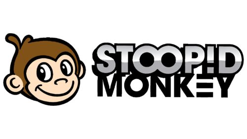
The Stoopid Monkey logo meaning lies in its name and distinct visual elements. The connected “O”s could signify a never-ending cycle of fun and humor, integral to the brand’s offerings. The exclamation mark replacing “I” adds a spark of excitement, amplifying the overall playful tone. Meanwhile, the brown backdrop establishes a clear connection with the brand’s mascot – the monkey, further grounding the brand identity in a unique and memorable way.
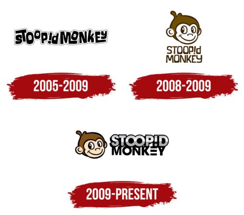
Stoopid Monkey Logo, since 2008, underwent a simplification process, retaining a lively wordmark beneath an outlined monkey head symbol. The capitalized letters of the logo were drawn in a robust sans-serif font, introducing a unique twist with “!” standing in for “I” and an infinity-like connection of the two “O”s in “Stoopid”. This silver-grey gradient lettering and icon against a dark blue backdrop brought an elegant contrast.
In 2009, a major transformation occurred. The emblem retained its distinct “!” and the double “O” linkage but underwent a massive stylistic revamp. The inscription took on a bold persona, presented in a gradient yellow hue rimmed with black. A departure from traditional lettering was made in the case of “E”, depicted with three horizontal bars. The background underwent a color change, now showcasing a brown hue, often associated with monkeys.
Stoopid Monkey: Brand overview
| Founded: | 2005 |
| Founder: | Seth Green, Matthew Senreich, John Harvatine IV, Eric Towner |
| Headquarters: | Burbank, California, U.S. |
| Website: | leagueofbuddies.com |
Since its inception in 2005, Stoopid Monkey has carved out its niche in the realm of animation and production, gaining recognition for its contributions to Adult Swim’s roster of irreverent and boundary-pushing adult cartoons.
This studio is known for its innovative approach to animation, combining wry humor with distinctive visual styles. Its creatives playfully challenge expectations, fostering a unique narrative voice that draws audiences in and keeps them coming back for more. The brand has quickly become synonymous with daring, unexpected storytelling and a bold creative vision.
Meaning and History
In terms of brand identity, the studio takes its name as a badge of honor, embracing the absurdity and fun at the heart of animation. Its logo, a caricatured monkey, mirrors this spirit of playful defiance. It not only represents the studio’s name but also its commitment to pushing boundaries and rejecting the ordinary.
As the studio continues to advance its brand, it remains dedicated to its founding ethos: a commitment to innovative, out-of-the-box animation that dares to challenge the status quo and redefine what adult cartoons can be. Through its ongoing creative endeavors, it stands as a dynamic force in the world of animation and production.
What is Stoopid Monkey Logo?
Stoopid Monkey is an animation production company based in Burbank, California. It was founded in 2005 by Seth Green, Matthew Senreich, John Harvatine IV, and Eric Towner. The company is best known for producing the Emmy-winning animated series “Robot Chicken,” which airs on Adult Swim and is renowned for its stop-motion sketch comedy. Stoopid Monkey has become a significant player in the animation industry, noted for its unique comedic style and innovative use of stop-motion animation techniques.
2005 – 2009
2008 – 2009
2009 – today
Stoopid Monkey color codes
| Bisque | Hex color: | #ffe1c2 |
|---|---|---|
| RGB: | 255 225 194 | |
| CMYK: | 0 12 24 0 | |
| Pantone: | PMS 475 C |
| Burnt Umber | Hex color: | #815217 |
|---|---|---|
| RGB: | 129 82 23 | |
| CMYK: | 0 36 82 49 | |
| Pantone: | PMS 724 C |
| Dark Gray | Hex color: | #ababae |
|---|---|---|
| RGB: | 171 171 174 | |
| CMYK: | 2 2 0 32 | |
| Pantone: | PMS Cool Gray 6 C |
| Black | Hex color: | #000000 |
|---|---|---|
| RGB: | 0 0 0 | |
| CMYK: | 0 0 0 100 | |
| Pantone: | PMS Process Black C |
