The location and trust that the pleasant shade of the emblem evokes are complemented by the idea of protection and caution. The Stripe logo is like a safe island, inviting you to take advantage of its possibilities. At the same time, the sharp elements of the letters guarantee confidentiality.
Stripe: Brand overview
| Founded: | 2009 |
| Founder: | Patrick and John Collison |
| Headquarters: | San Francisco, California, US and Dublin, Ireland |
| Website: | stripe.com |
Stripe is an international financial and technological organization that deals with payment processing, creation and distribution of e-commerce software, website protection, and mobile applications for various money transactions over the Internet. It was founded in 2010 by two brothers-entrepreneurs from Ireland – John and Patrick Collison. At first, the head office was located in Palo Alto, and then in 2012, it was transferred to San Francisco, California.
The first name of the startup is dev/payments. The actual name arose a little later, becoming the basis for the corporate identity. The company’s debut was quite successful because immediately a year later, it received a significant share of investments – two million US dollars. They came from Sequoia Capital, Peter Thiel, and Andreessen Horowitz, who in May 2011 risked supporting the financial market newcomer.
After three months of testing in beta mode, Stripe was officially launched, and in September of that year, it actively got down to work. In the spring of 2013, the service made its launch acquisition – the Kickoff app, a text-based interaction, and a task management program. After three years of existence, his professional portfolio has been expanded with the Atlas platform, specialized help for registering startups.
In 2018, the company, which provided legal entities and individuals with the opportunity to receive payments via the Internet, organized a service for issuing Visa and Mastercard credit cards. In parallel, she created functionality to combat fraudulent activities. It was named Radar.
The API-supported financial service has grown professionally every year. She introduced progressive tools, simplified interaction with complex operations, expanded services. Its arsenal even includes a retail outlet called Terminal, which offers physical credit card readers focused on Stripe.
As a result, the specialized structure expanded beyond the borders of the country. She maintains services in several countries, including Australia, Canada, Japan, Switzerland, Romania, Norway, Zealand, Mexico, Malta, Great Britain, and others. This means that her logo is widely trusted by users all over the world.
Meaning and History
This is a serious financial company that was established in 2009 by the Collison brothers – John and Patrick. She proved herself to be a great professional, so in a few years, she expanded her base by making profitable acquisitions in the field of digital technologies. The firm bought a chat and management app and an accounting platform and partnered with profitable partners. Today they include Ford Motor, Spotify, Twitter, and many others.
The business approach directly affected the visual identity of the service: it has a practical, but at the same time, bright logo that stands out among its peers. A well-chosen identity, combined with successful marketing and high professionalism, allowed Stripe to achieve an impeccable reputation. In total, she has two emblems.
What is Stripe?
Stripe is a company that provides tools for processing online payments and managing finances. It was founded in 2004 by two Irishmen, but its headquarters are located in the United States. Its clients range from early-stage startups and small online stores to established corporations.
2009 – 2016
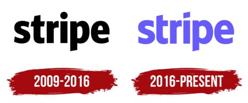
Unlike other electronic financial services, this service has no graphic elements in the logo. Its visual identity from the beginning consisted solely of the name, which confirmed the company’s seriousness. All letters are lowercase, wide, smooth, with evenly cut ends, and with slight points. The color of the emblem is black, but sometimes a turquoise version was also used.
2016 – today
The changes that took place in 2016 were minor and mainly affected color. So, the designers proposed bright lilac instead of monotonous black. He significantly revived the logo of the financial platform, gave it individuality, and made it catchy. This transformation has played into the hands of the management because, after that, affiliate programs for other companies have significantly intensified. Another transformation is related to the font – it has become simpler and lighter. This was facilitated by cutting off the left segment of the crossbar at “t,” rounding, and increasing the right side of “p.” In addition, the developers removed the dot above the “i,” replacing it with a diagonal diamond.
Stripe: Interesting Facts
Stripe was started in 2010 by Patrick and John Collison, two brothers from Ireland. It’s become a big deal in the tech world, especially online payments. Stripe makes it easier for all kinds of businesses to handle money online.
- Growth: Stripe quickly went from a new company to a major name in online payments. It’s now one of the most valuable tech companies out there.
- Worldwide Reach: Founded in the US, Stripe now operates in over 40 countries. It helps businesses accept payments online, manage money, and fight fraud.
- Products and Services: Stripe does more than process payments. It offers tools for billing, loans through Stripe Capital, fraud detection with Stripe Radar, and even helps startups set up in the US with Stripe Atlas.
- Stripe Atlas: Since 2016, this service has made it easier for startups worldwide to shop in the US and connect to financial services and investors.
- Helping Startups: Stripe is big in the startup world, not just for processing payments but also for investing in new companies and supporting their growth.
- Developer-Friendly: Stripe is known for being easy for developers. Its tools let them add payment options to apps and websites without hassle.
- Eco-Friendly: In 2019, Stripe started Stripe Climate, a program that lets businesses donate part of their earnings to develop carbon removal technology.
- Big Clients: Major online platforms like Amazon, Shopify, and Lyft use Stripe for their financial services, proving That It can handle large and complex payment systems.
- Stripe Press: Stripe shares knowledge through books about tech and economic progress.
- Always Innovating: Stripe keeps developing new things, like Stripe Terminal, for in-person payments and better tools for international transactions and currency exchange.
Stripe’s role goes beyond just making online payments simpler. Its continuous innovation supports businesses worldwide and contributes to the digital economy’s growth and effectiveness.
Font and Colors
The complex structure has a minimalistic logo. This approach to identity was chosen deliberately. This is a way to show that even the most difficult can become simple. The logo is based on the name of the company. It is located on one line and is in lowercase font. Some of the letters are designed specifically to make them stand out from the rest. For example, “t” lacks the left half of the crossbar, which makes it very similar to the adjacent “r.” At “p,” the lower part of the leg is cut obliquely. The dot above the “i” has been replaced by a square, the right corner of which is extended upward, making it look like a flying flag.
The developers proposed a hand-drawn design of letters, so there are no exact analogs of such a typeface. The symbols are mostly individual, chopped, from the Sans Serif category. They are reminiscent of FF Fago Black, a grotesque version created in 2000 by Ole Schaefer, a designer from Germany. Stripe’s signature palette consists of only one color – light purple (# 6773e6).
Stripe color codes
| Neon Blue | Hex color: | #635bff |
|---|---|---|
| RGB: | 99 91 255 | |
| CMYK: | 61 64 0 0 | |
| Pantone: | PMS 266 C |


