


 Sunrun Logo PNG
The Sunrun logo is modern and futuristic. The emblem appears to consist of separate reservoirs that first absorb energy and then release it. The sign conveys the technologies of the future.
Sunrun was founded in San Francisco in January 2007 by Stanford Business School graduates Lynn Jurich and Ed Fenster, together with Nat Kreamer. Jurich and Fenster came from venture capital and private equity, and their view of the solar market was shaped by finance rather than engineering. They saw the main barrier in cost: a home solar system in the United States could require $25,000 to $30,000 upfront.
The company built its model around “solar as a service.” Sunrun paid for the panels, installation, maintenance, and insurance. At the same time, homeowners signed long-term leases or power purchase agreements at fixed rates. Instead of paying the full cost at installation, customers paid monthly. Sunrun relied on long-term cash flow and federal tax incentives tied to renewable energy.
At first, the team worked from Fenster’s home. In June 2008, Sunrun raised $12 million from Foundation Capital during the financial crisis, later adding Accel Partners and Sequoia Capital. Until 2012, installations were handled by outside contractors, which helped the company expand faster. In 2012, Sunrun moved to direct sales and its own installation teams to gain stronger control over service quality.
With its Nasdaq IPO in August 2015, Sunrun served about 80,000 customers, mainly in California. Its shares are priced at $14 but fell below that level on the first day of trading. Competition with SolarCity continued until Tesla acquired SolarCity in 2016. In July 2020, Sunrun announced a $3.2 billion all-stock acquisition of Vivint Solar, which was completed in October. The combined company had nearly 500,000 customers and over 3 gigawatts of installed capacity. In September 2021, Mary Powell replaced Jurich as CEO, and by 2022, Sunrun reported 700,000 installed systems and 5 gigawatts of capacity.
Meaning and History
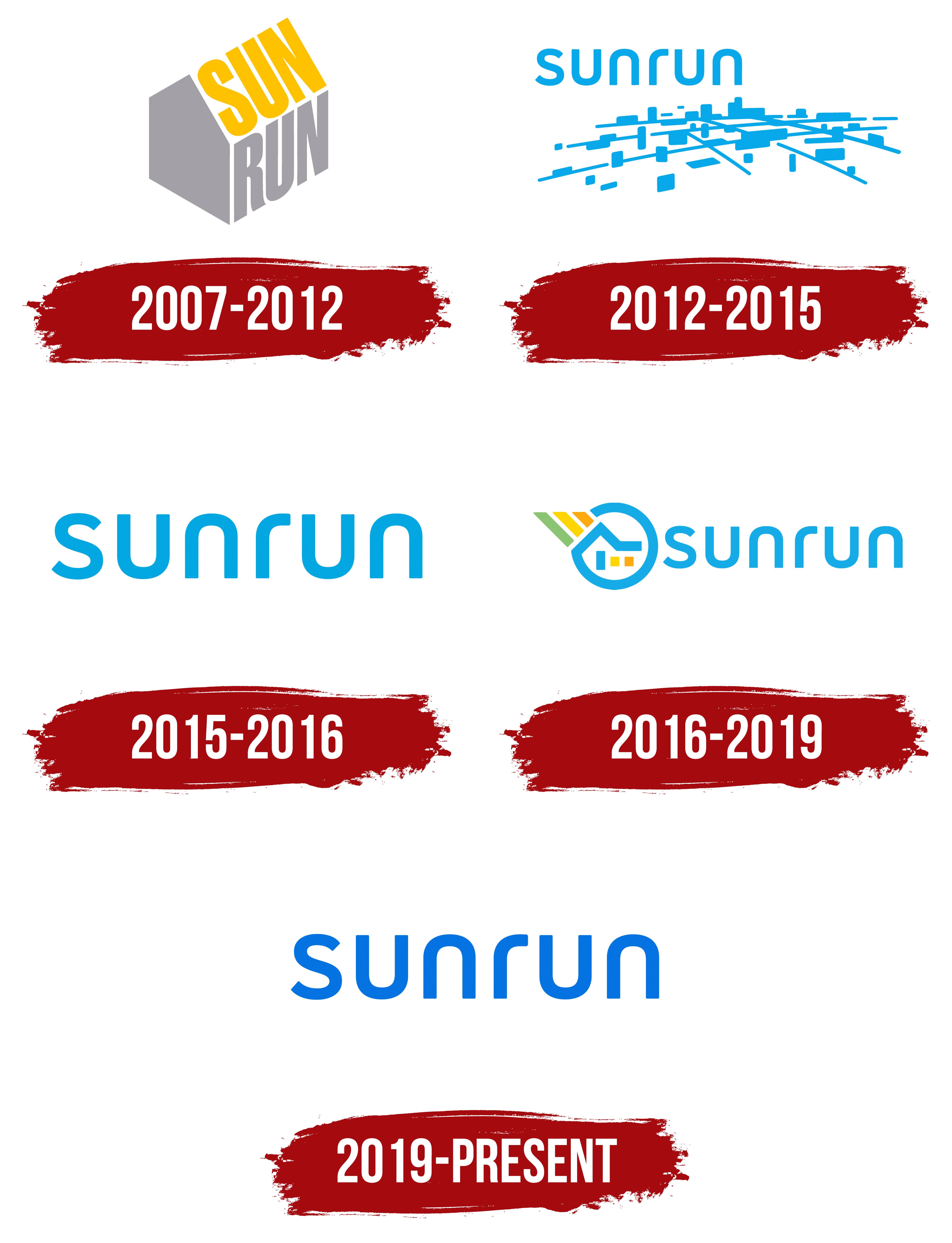
The company had several attempts to represent itself and its field of work in the logo. Each attempt revolved around the themes of home, panels, and sunlight. The images fit well with the brand identity and, combined with the name, evoked the necessary emotions and associations. However, the company opted for a simple wordmark, reflecting the manufacturer’s growth and globalization. A solid size and expansion of directions always imply a transition to a stricter and more universal visualization, and Sunrun was no exception.
What is Sunrun?
An American company that produces photovoltaic panels, batteries, and inverters for installing solar panels for domestic consumers and commercial organizations.
2007 – 2012
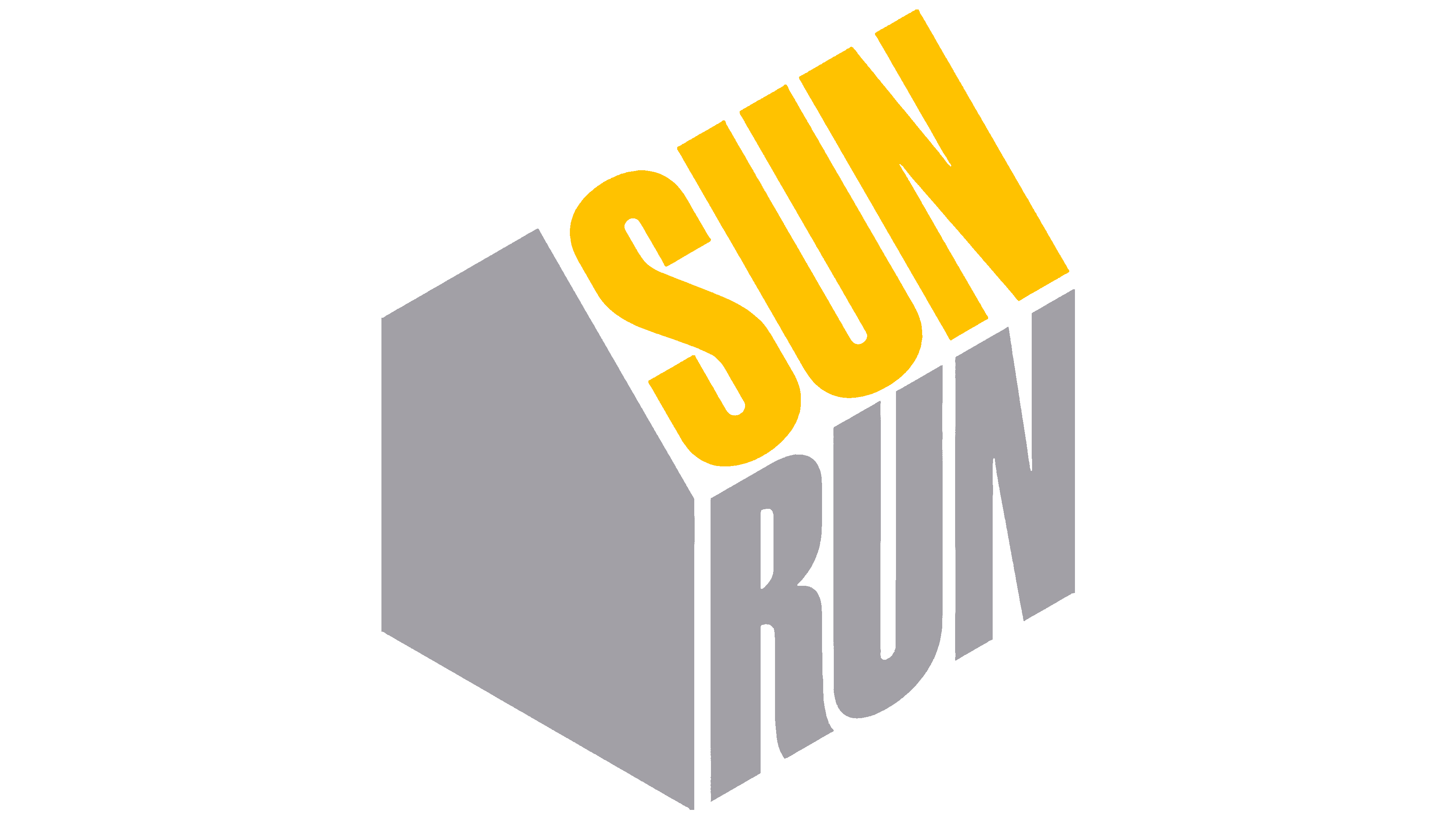
The first emblem is a schematic image of a house bearing the company’s name. In the logo, the word is divided into two parts, meaning “sun” and “run.” The manufacturer’s name was chosen to correspond with its field of activity. Sunrun means:
- Movement of the Sun. Every day, the sun rises, crosses the sky, and sets behind the horizon; during this time, the panels must capture and store its energy. The level of accumulation depends on the sun’s position in the sky at any time of day or year. The word encodes variability.
- Transformation of energy into motion. Solar energy is captured and used to power all devices in the house, including room lighting. The word symbolizes the transformation of light into energy.
The house’s symbol indicates how electricity is used in the home. The placement of the word “Sun” on the upper slope of the roof directly indicates where to attach the panels. The yellow color of the inscription enhances the feeling of connection with light and warmth.
The word “run” is written on the house wall, demonstrating the transformation of light into energy and meeting the residents’ needs.
2012 – 2015
2015 – 2016
2016 – 2019
2019 – today
In the modern interpretation of the logo, the company’s name is written in thin, flexible letters. The font demonstrates perfectly functioning systems. Each letter is like an energy cell in a panel, resembling the curves and energy storage of electricity, as well as the wires that carry it.
The capital letters suggest the predominance of alternative systems worldwide. The company serves as a guide towards eco-friendly electricity production. The future lies in technology. It also indicates the number and size of systems the company has installed since its founding.
Font and Colors
The blue in the logo represents the sky. The color tells the story of obtaining energy from above, from the sky, and highlights the eco-friendly production and modern technology involved.
The font is reminiscent of Zilap Minimalist, with curved letters and no protruding glyphs.