The Sunwing Airlines logo evokes associations with exotic resorts and sunny beach vacations aimed at attracting recreational tourists. It conveys a sense of warmth and joy, hinting at the positive experiences of passengers using the airline’s services.
Sunwing Airlines: Brand overview
Sunwing Airlines emerged in 2005 with a bold mission: to redefine air transportation by offering affordable options without sacrificing quality.
In November 2005, Sunwing Airlines hit the ground running with its inaugural flight from Toronto to Cancun, Mexico.
In its early years, Sunwing Airlines experienced rapid growth. By adding additional destinations to Mexico and the Caribbean, Sunwing Airlines opened up a world of possibilities for travelers seeking a break from the cold.
Sunwing Airlines leads the industry as a charter airline with scheduled flights and unique vacation packages.
Sunwing Airlines has a modern and diverse fleet of reliable and comfortable airplanes, such as the Boeing 737-800 and the efficient Boeing 737 MAX 8. Passengers wishing to vacation in Canada can choose from one of the airline’s main locations – Montreal-Pierre Elliott Trudeau International Airport, Toronto Pearson International Airport, or Vancouver International Airport.
The rise of Sunwing Airlines has been marked by remarkable growth and transformation, taking it from a humble startup to a renowned low-cost carrier.
Meaning and History
What is Sunwing Airlines?
Sunwing Airlines is a Canadian low-cost airline based in Toronto, Ontario, with flights to various regions in North and South America. The airline’s network of scheduled and charter flights extends from Canada and the United States to various destinations, including the United States, Mexico, the Caribbean, and Central and South America. By 2004, the company had become the second-largest tour operator in the Ontario region.
2005 – 2015
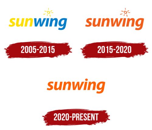
Since Sunwing Airlines was created at the initiative of a tour operator, its logo immerses you in the atmosphere of a beach vacation. It has nothing to do with business travel. It seems to urge people to drop everything and head to a resort to have a great time in the warm sun.
The sun is depicted above the letter “i” instead of a standard dot. It looks like a messy child’s drawing, hinting that the airline can make any family trip comfortable. The word “sunwing” is visually divided into two parts by different colors:
- “Sun” uses yellow, symbolizing a good mood, warm rays, and sandy beaches.
- A light blue shade for “wing” is associated with water, freshness, and the sky.
Together, they create an atmosphere of relaxing vacation, as many of Sunwing Airlines’ routes lead to resort towns in Central America, Mexico, and the sunny beaches of the Caribbean islands. The font of the inscription conveys the same impression. The light, semi-bold italic with smooth curves evokes a sense of flight and weightlessness, alluding to the planes that quickly transport passengers to their destination.
2015 – 2020
The airline experienced rapid growth and needed an updated logo to reflect its evolution. At the same time, it wanted to remain recognizable to its loyal customers and retain its authentic style that hints at a pleasant beach vacation.
The designers found a compromise: they kept the old font and the small sun above the “i” but changed the color of the emblem. Instead of the refreshing combination of blue and yellow, they used orange – an optimistic color that creates a sunny mood. It is not as aggressive as red but expressive enough to fill the logo with vibrant energy. In aviation, the orange palette reflects dynamism and high flight speeds.
The italic font with smooth curves emphasizes movement, which is key in the airline industry. The lowercase letters evoke a sense of trust and highlight the airline’s care for passenger comfort. This font catches the eye, helping Sunwing Airlines stand out against competitors.
2020 – today
With its bold orange lettering, the Sunwing logo fits the airline’s identity well, connecting Canada to sunny southern destinations. The name “sunwing” is in a bold sans-serif font, similar to Adobe’s Myriad Hebrew Bold Italic. The letters slant to the right, giving the logo a dynamic feel. The bright orange color adds a sense of optimism and cheerfulness.
The slanted letters and vibrant orange color suggest movement and energy, matching the sunny destinations served by the airline. The bold sans-serif font ensures the logo is readable and modern, making it stand out. This design is particularly effective for digital and mobile platforms.
The orange color symbolizes warmth, brightness, excitement, and adventure, resonating with travelers seeking memorable experiences. The clean, straightforward lines of the font enhance the logo’s professional appearance, making it easily readable across various mediums. The rightward slant of the letters suggests progress and a forward-moving momentum.


