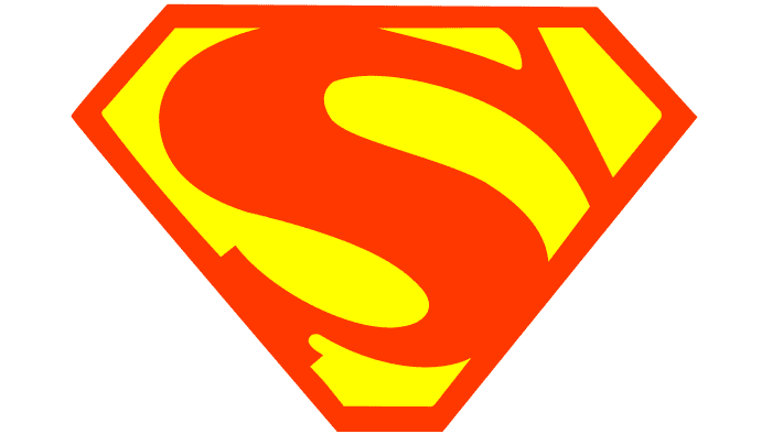
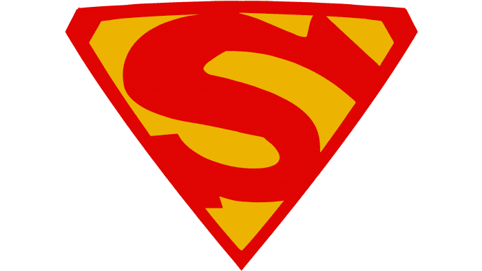
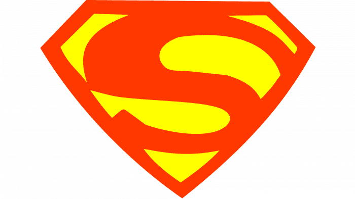
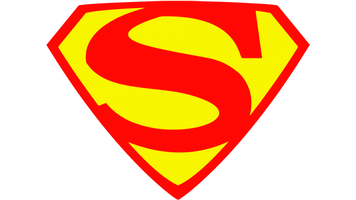
The hero’s abilities fit tightly within familiar frameworks. Superman’s logo is as energetic as the character himself. His muscles are strong, and his talent is multifaceted. The emblem indicates that Superman moves with lightning speed, bringing relief and joy to those in trouble.
Superman: Brand overview
| Founded: | 1938 |
| Founder: | DC Comics |
| Headquarters: | United States |
Meaning and History
According to the authors’ concept, the superhero wears a red-blue-yellow suit, complemented by a cape and a large chest shield in the shape of a pentagonal shield with the letter “S.” This logo became so common that it started to be used in the media industry as a symbol of Superman. It was often redrawn, changing the colors and outlines of the elements.
What is Superman?
He is a DC Comics character endowed with superpowers. He has a brilliant intellect, sharp hearing, and excellent vision. He can develop incredible speed and fly, and he does not need food, sleep, or oxygen. His body possesses strength and invincibility.
1938
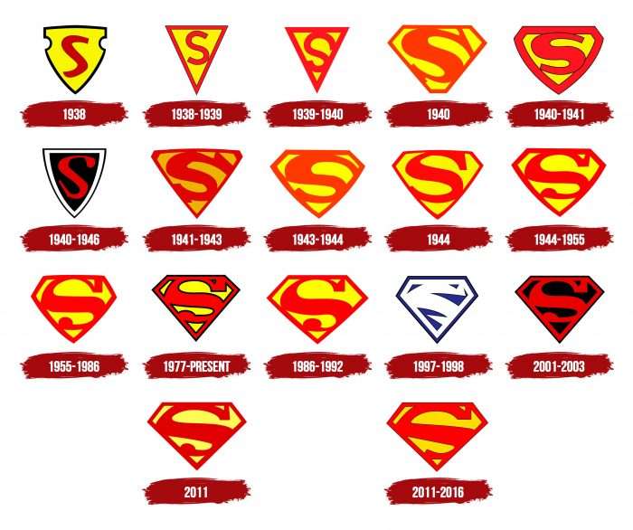
Joe Shuster designed the debut version of the logo. Readers first saw it in the June issue of Action Comics #1 of 1938, but it was only on the cover, not in the story itself. The shield’s appearance resembled a police badge.
1938 – 1939
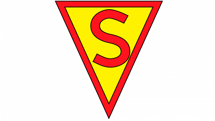
The comic used a triangular logo with the letter “S.” The inside of the shield was yellow. The frame and the letter “S” were drawn in red, but sometimes, to save time, the colorist left the stroke around the triangle yellow.
1939 – 1940
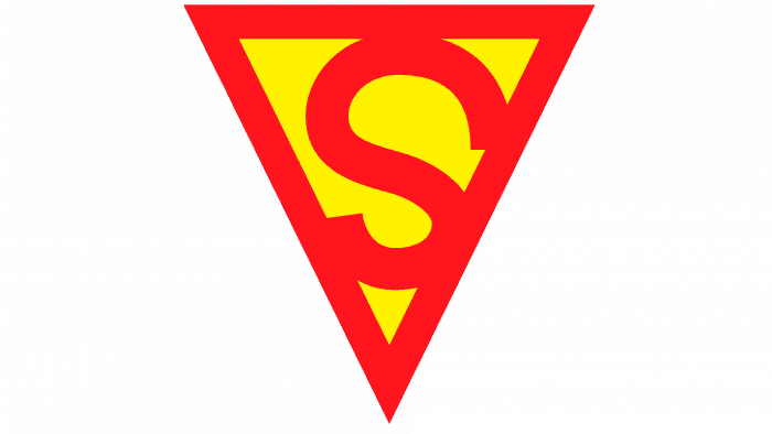
For several years, the emblem remained unchanged, except that the frame became thicker and the letter “S” acquired a new shape.
1940
In September 1940, the triangular sign briefly returned. The geometric shape became entirely yellow, and the letter “S” now had large serifs. This version is characteristic of Superman #6. In 1940, illustrator Hugh Joseph Ward proposed a logo with an orange letter and frame.
1940 – 1941
In Action Comics #26, the pentagonal emblem first appeared in the superhero’s costume.
1940 – 1946
In March 1940, a modified logo appeared: a black triangular shield with a red letter, an inner white outline, and an outer black outline. It was used in several issues of Superman #4 and graced the corner cover of Action Comics until 1946.
1941 – 1943
In Superman #9, a symbol of an inverted triangle with trimmed edges was used. The red letter “S” had large serifs.
1943 – 1944
The yellow-orange version returned but without serifs.
1944
In Superman #26, the emblem became a pentagonal shield with a rounded base. The letter and frame were red again.
1944 – 1955
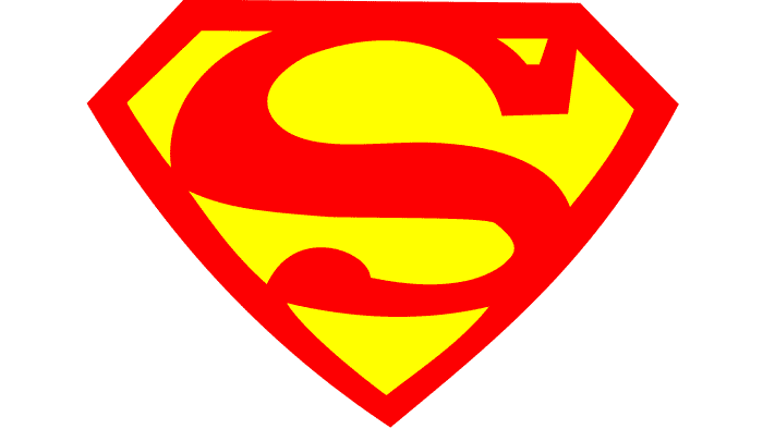
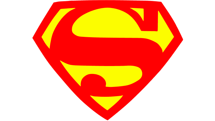
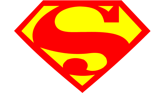
DC Comics decided to patent the character’s logo. Artist Wayne Boring, who worked on creating the superhero, changed the thickness of the rim and invented the iconic “S” design.
1955 – 1986
New illustrator Kurt Swan made the letter bigger and bolder.
1977 – today
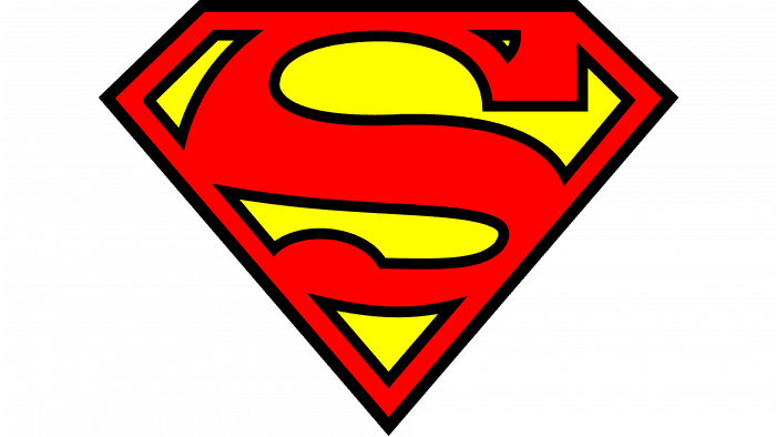
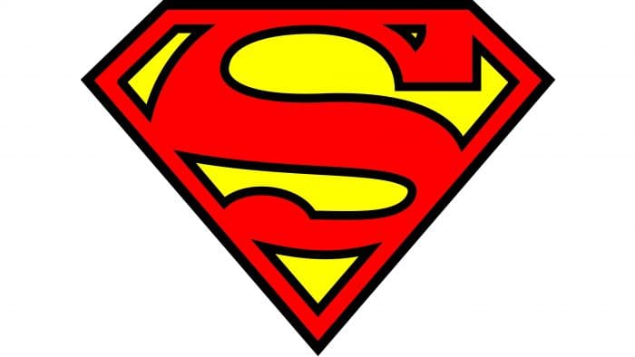
The most recognizable sign of Superman became the version with a black outline surrounding the letter “S” and a red frame. Initially, this emblem was considered secondary, but later, it started appearing in comics.
1986 – 1992
From 1986 to 1992 (from “Man of Steel” #1 to “Death of Superman”), the emblem of John Byrne was used. The designer focused on the letter “S,” making the serif triangular.
1997 – 1998
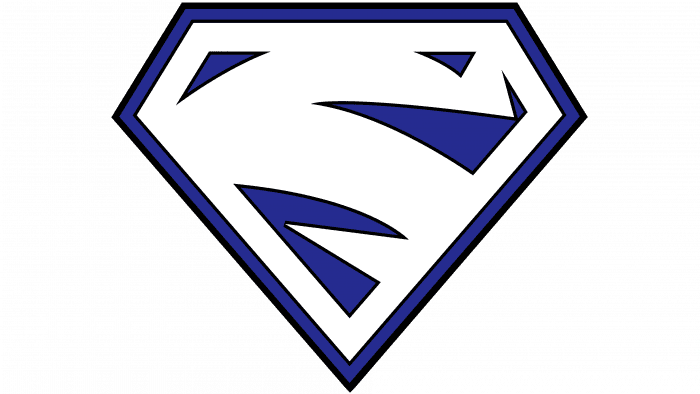
In new episodes of Superman (Vol. 2) #123, the hero’s superpowers are connected to electricity, so the letter “S” on the emblem looks like a stylized lightning bolt. Initially, there was a blue-white version, but after the main character split into two entities, a red-white version also appeared. Ron Krantz was the author of both versions.
2001 – 2003
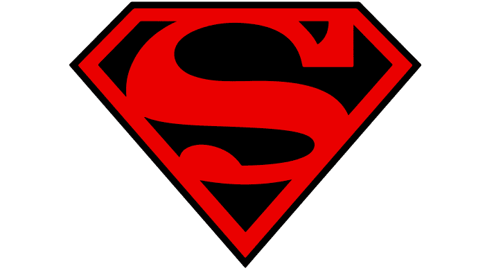
In Superman (Vol. 2) #175, the character returns to the classic look, and his sign becomes red-black.
2011
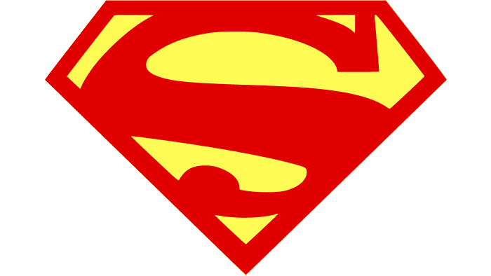
In the first four issues of Action Comics (Vol. 2) #1, a new logo appeared. It resembled the 1977 version but with different proportions and an altered palette.
2011 – 2016
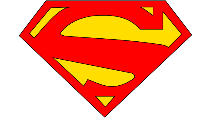
From 2011 until the New 52 era, an updated emblem with an asymmetrical letter “S” without a lower serif was used.
Superman: Interesting Facts
Superman is a famous DC Comics superhero who first appeared in comic books in 1938. Jerry Siegel wrote the stories, and Joe Shuster drew the pictures. Superman is more than just a character in stories; he symbolizes hope, doing what’s right, and standing up for justice.
- How It All Started: Superman appeared in Action Comics #1 in 1938. This comic book is special and costs a lot of money now, sometimes millions of dollars!
- The “S” Symbol: Everyone knows Superman’s “S” logo. At first, it meant Superman, but later, people said it also meant “hope” in Superman’s home planet language.
- Superman’s Other Job: When Superman isn’t saving the world, he’s Clark Kent, a reporter. This job helps him learn about problems quickly so he can solve them.
- Kryptonite: This is a green rock from Superman’s home planet, one of the only things that can weaken him. It appeared on a radio show before being added to the comic books.
- Superhero Trendsetter: Superman started the idea of superheroes in comics, creating many more superheroes.
- His Powers Changed: Superman’s abilities got cooler over time. At first, he was just super strong and could jump high. Now, he can fly, shoot heat from his eyes, and has super breath.
- TV Shows and Movies: Superman has been featured on many TV shows and movies, starting with cartoons in the 1940s. The 1978 “Superman” movie with Christopher Reeve is a classic and helped define how superhero movies are made.
- That Hair Curl: Superman’s hairstyle, especially the curl on his forehead, is pretty famous. It’s a small detail that’s just part of his look.
- A Big Deal During WWII: Superman was popular during World War II and was used to promote American values and the war effort.
- Fights Over Who Owns Superman: Many legal fights have occurred over who owns Superman’s rights. These fights show just how important and valuable Superman is.
Superman is a big deal not just because he’s a powerful superhero but because he represents the idea that anyone can be a hero if they stand up for what’s right.
Font and Colors
The Superman emblem has often been updated – sometimes due to plot twists, sometimes due to a change of artist. But the concept remained the same as it was many years ago: a shield and the first letter of the superhero’s name.
The letter “S” does not match any existing fonts, as it was specially designed for the superhero.
The classic palette of the logo includes red, black, and white colors. Versions with various shades of red existed, and one version had a blue shield.
Superman color codes
| Boston University Red | Hex color: | #c80000 |
|---|---|---|
| RGB: | 200 0 0 | |
| CMYK: | 0 100 100 22 | |
| Pantone: | PMS Bright Red C |
| Middle Yellow | Hex color: | #ffeb00 |
|---|---|---|
| RGB: | 255 235 | |
| CMYK: | 0 8 100 0 | |
| Pantone: | PMS 102 C |
| Black | Hex color: | #000000 |
|---|---|---|
| RGB: | 0 0 0 | |
| CMYK: | 0 0 0 100 | |
| Pantone: | PMS Process Black C |
FAQ
What Does the Superman Logo Mean?
Many think that the letter S on Superman’s chest is connected to his name, but this is not the case. The logo originates from the superhero’s family crest. On the planet Krypton, where he was born, this sign in the shape of the letter S symbolizes hope.
What is the Shape of the Superman Logo?
The main shape of the Superman logo is a diamond-shaped shield in the form of a faceted diamond with the letter “S” inside.
Is the Superman Logo a Diamond?
Initially, the Superman logo was in the form of a heraldic shield. In the 1940s animated series, it first acquired the shape of a diamond, which changed periodically.
Can the Superman Logo Be Used?
Using the Superman logo in its original or modified version is considered a copyright infringement. To obtain permission, it is necessary to contact the trademark owner directly.
