


![]() Survivor Logo PNG
Survivor Logo PNG
The Survivor logo is brimming with adventures and wild nature. In separate elements of the emblem, the viewer can see the season’s main features and the areas where participants live. The sign points to the heroes’ lives in a limited space.
Survivor grew out of a British television experiment before it became a major American franchise. In 1988, producer Charlie Parsons created The Castaways for Channel 4’s youth program Network 7. The segment sent a small group of British celebrities, including a soap actor, to an uninhabited island in the Indian Ocean with help from the Sri Lanka Tourist Board. It did not become a public hit, but it gave Parsons the base for a larger format.
By 1994, Parsons had turned the idea into a show about 16 contestants isolated on a remote island. Disney’s Buena Vista developed the project under the working title Survive. It offered it to ABC, but the network rejected it after months of hesitation. The format succeeded first in Europe. In September 1997, Sweden’s SVT premiered Expedition Robinson, which became the country’s top-rated show of the year.
British producer Mark Burnett, known for Eco-Challenge, noticed the Swedish version and spent years seeking the U.S. rights from Parsons. After receiving the license, Burnett reworked the format, reducing the harsher elements and focusing on social pressure, alliances, and personal conflict. On November 24, 1999, he pitched the show to CBS president Leslie Moonves, and the network approved it as it sought a ratings breakthrough.
Survivor: Borneo was filmed on Pulau Tiga near Malaysia in March and April 2000. It premiered on CBS on May 31, 2000, and ended on August 23 with Richard Hatch winning $1 million. The finale drew about 52 million viewers, while the season averaged over 28 million per episode. From Survivor: Africa in 2001, CBS moved to two seasons a year. Jeff Probst became the host, won four Emmy Awards for the show, and later joined the executive producer team.
Meaning and History
![]()
Two seasons of the show are filmed each year, and a new location is chosen for each one. By the 15-episode stretch, a separate logo is created, which fully reflects the spirit of the locale, the themes of the competitions, and the tasks. However, all emblems share a common shape, with the name centered and inscriptions forming a memorable motif, ensuring the sign’s recognition. The oval is a direct embodiment of the islands where the games take place, and the bold outline serves as a marker of separation from the rest of the world and concealment from others’ eyes. The participants are confined for the duration of the show.
What is Survivor?
An American analog of the Swedish reality show Robinson about the struggle for survival on an uninhabited island. It has been broadcast since 2000. During this time, 44 seasons have been filmed, each with 15 episodes. The duration of an episode is 43 minutes. It is among the top 10 most popular shows in the US and has been nominated for an Emmy 63 times.
season 1 2000
![]()
season 2 2001
![]()
season 3 2002
![]()
season 4 2002
![]()
season 5 2002
![]()
season 6 2003
![]()
season 7 2003
![]()
season 8 2004
![]()
season 9 2004
![]()
season 10 2005
![]()
The logo for the game’s tenth season is an oval with a wide khaki-camouflage rim. On both sides, there are images of sharks that threaten the players on the island. One of them was successfully caught by the participants. The rim features game-related slogans: “Outwit,” “Outplay,” and “Outlast.” They demonstrate the players’ primary goal: to outmaneuver their opponents.
In the center, on a yellow oval backdrop, the show’s name is written in angular white letters. It conveys the game’s meaning: to stay alive. The white color of the letters speaks to novelty, constant updating of locations, fair judging, and playing in the fresh, clean air. The green outline hints at the nature of the participants’ lives.
The inscription below indicates the location of the game: the Republic of Palau. In the background are the islands of Koror and Ulong, where the main actions took place. In the water, rocky reef islands that distinguish the location are visible. The sun is particularly prominent in the picture, as the islands experience more than 20 sunny days per month year-round, with an average daily temperature of 28 degrees Celsius.
season 11 2005
![]()
The eleventh season took place in Guatemala, which is reflected in the logo. The oval border is black, and instead of sharks, there’s an ancient depiction of green snakes, as the country has 134 species of them. The title’s backdrop is also black. It speaks to life in the jungles, the challenges of the night, and volcanic soils. There are 33 volcanoes in Guatemala, and a lot of solidified lava. The outline of the white letters of Survivor is orange, hinting at the hot tropical climate.
Below the show’s name is the name of the area where the competitions took place. The territory chosen for the game was Nakúm-Naranjo National Park. The park has surviving Mayan structures, which are also mentioned on the emblem. The buildings are depicted in the background of the sign. The snakes drawn in the logo were highly valued in the tribe’s culture.
The oval also contains the image of a mask, a prototype of the immunity idol used for voting in this season.
season 12 2006
![]()
season 13 2006
![]()
season 14 2007
season 15 2007
![]()
season 16 2008
![]()
season 17 2008
![]()
season 18 2009
![]()
season 19 2009
![]()
season 20 2010
![]()
season 21 2010
![]()
season 22 2011
![]()
season 23 2011
![]()
season 24 2012
![]()
season 25 2012
![]()
season 26 2013
![]()
season 27 2013
![]()
season 28 2014
![]()
season 29 2014
![]()
season 30 2015
![]()
season 31 2015
![]()
season 32 2016
![]()
season 33 2016
![]()
season 34 2017
![]()
season 35 2017
![]()
season 36 2018
![]()
season 37 2018
![]()
season 38 2019
![]()
season 39 2019
![]()
season 40 2020
![]()
season 41 2021
![]()
season 42 2022
![]()
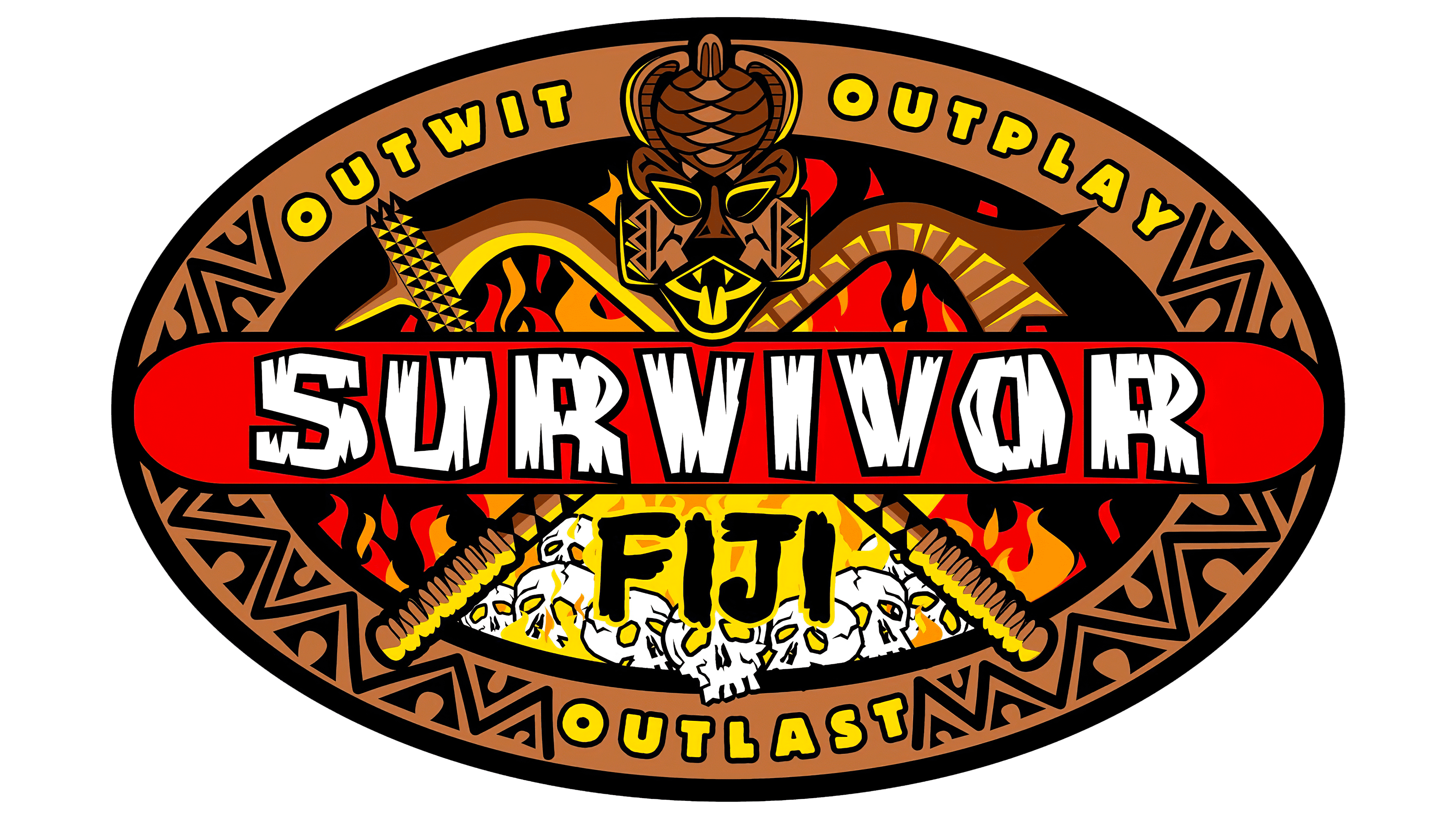
Modern franchise logos have changed slightly. They no longer have the country’s name, as Fiji has been the main location for several consecutive seasons. Instead of the location, the focus has shifted to the season number. It is indicated in large numbers at the top of the oval backdrop. The first in 2022 was episode 42.
The logo has a blue border. The shooting took place in the island nation. Therefore, the tribe’s location was surrounded by water, which is symbolized by the color blue.
In the center of the background is a labyrinth. The show’s name is written on an old board attached to the emblem, which is locked. On the other side of the board is a key. Almost all challenges involved wooden vessels, boats, chests, and sleds. Therefore, wood plays a crucial role in the season. In each game, participants solved puzzles, and whoever assembled it first got immunity. The labyrinth suggests this.
At the two ends of the emblem, you can see tongues of flame, reflecting the two tribes, their councils, and voting, which take place by torchlight.
season 43 2022
![]()
The 43rd season features a bright, vibrant logo in lettuce green. In the background are silhouettes of native men and women, into whom the participants transformed. The man holds a torch that players use to cast their votes. The woman holds a staff with a torch.
The lettuce-green wavy lines on the rim of the emblem resemble seaweed and hint at the beautiful island chains. A large octopus occupies a large portion of the emblem’s area, as there are many of them off Fiji’s coast.
The yellow letters suggest an hourglass that a player could smash to cancel the winning team’s immunity. The light shades also indicate that the show’s duration has been reduced from 39 to 26 days.
season 44 2023
![]()
The logo for the 44th season, shot in 2022, features caves and stones. The stone arch is the place where the council is held. The emblem features silhouettes of players with torches, symbolizing the elimination vote. On either side of the central blue inscription with the show’s name are two torches. The abundance of fire hints at the players’ inner fire, which must be showcased throughout the season, and signals many challenging obstacles.
The word “Survivor” is set against a blue background with a white outline. Part of the oval’s top rim is covered with palms and a stone structure. The emblem transports the viewer to the green Mamanuca Islands, where the season takes place.
Font and Colors
The logos predominantly feature natural colors: various shades of green, yellow, and blue. Red is used for accents, symbolizing competition and battle; black embodies the strength and dominance of the winner; and white is the color of beginnings and a refresh of the show format.
- Green – represents leaves, grass, energy, and the power of nature. Most of the participants’ food is plants.
- Yellow – sand, as most of the competitions are on tropical islands, and participants live on the beaches. Yellow is also the color of the sun and its warmth.
- Bluewater is necessary for drinking, cooking, and bathing.
Together, the colors mean life because, without food, warmth, and water, survival is impossible. The title font was specially designed for the show. The angularity of the letters suggests difficulties and trials, surprises, and challenging camping conditions.