


![]()
The Sustainable Entertainment Alliance, a global group of leaders from the film, TV, and streaming industries, has introduced a fresh visual identity crafted by Cotton Design. The new look reflects the Alliance’s mission to help reduce the environmental impact of the entertainment world while promoting sustainability through innovation, education, and collaboration across the industry.
At the center of the new identity is a bold logo designed to capture the spirit of teamwork and environmental responsibility. It features four bracket-like shapes that come together in the middle, reminiscent of the focusing mechanism on a film camera. The design brings together different studios and industry leaders, united by a common goal—pushing for greener practices in entertainment. The shapes create a ripple effect, hinting at the growing influence of the Alliance’s efforts worldwide.
The logo’s simplicity is key to its impact. Its geometric symmetry gives it a clean, structured look that’s easy to recognize and versatile enough to work across different platforms. The varying thickness and lengths of the radiating lines add a sense of movement, suggesting progress. The adaptability allows the logo to stand strong or fit seamlessly into complex designs.
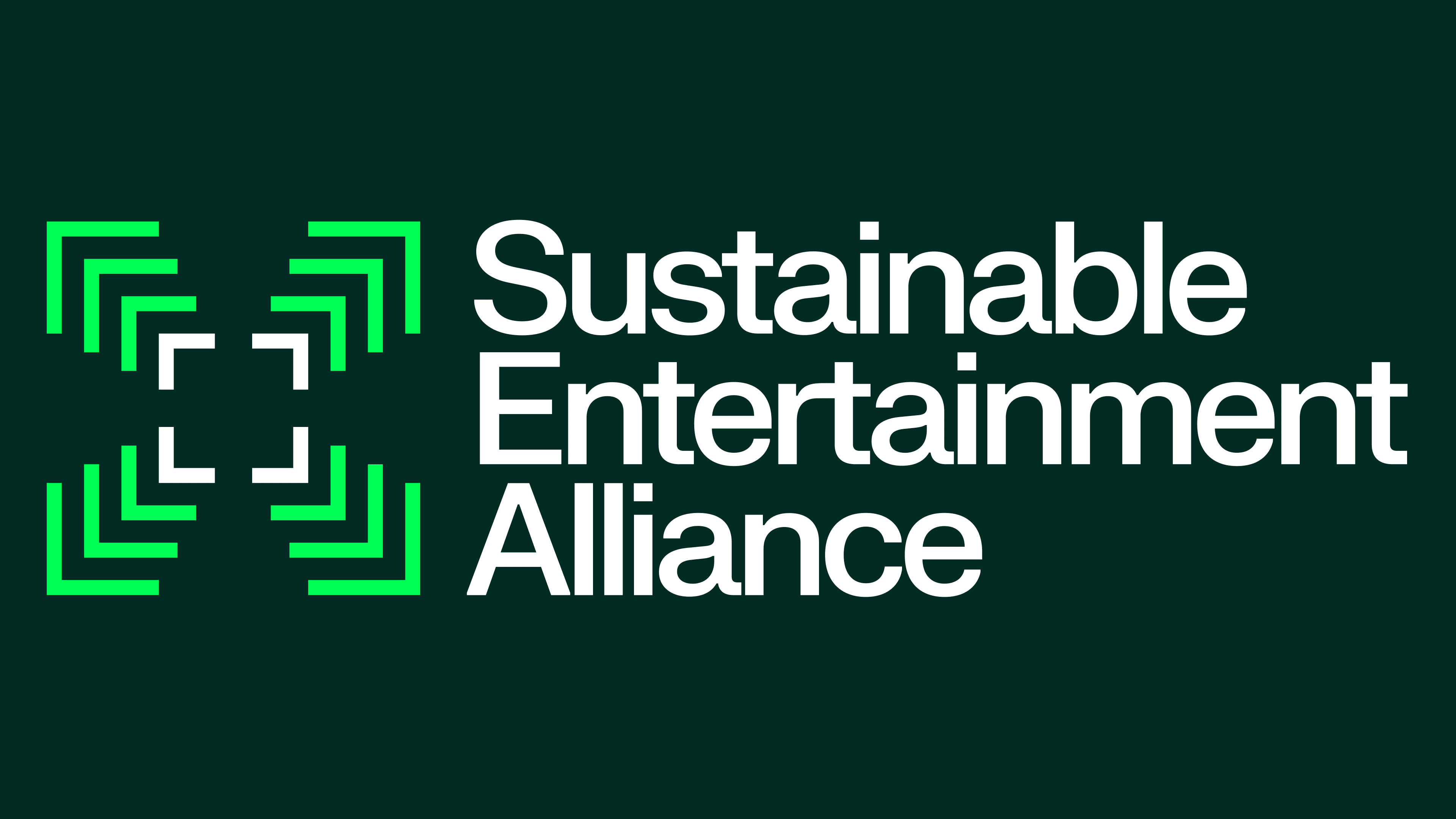
Supporting the logo is a clean, modern typeface. The words “Sustainable Entertainment Alliance” are set in FK Grotesk Neue, a contemporary sans-serif font known for its sharp lines and approachable style. The bold yet friendly feel of the typography reflects the Alliance’s role as both a leader and a sustainability partner. The text is neatly stacked into three lines, which improves readability and complements the logo’s balanced design. The mix of precise geometry and simple typography mirrors the Alliance’s focus on clarity, purpose, and modern design.
The color palette revolves around bright neon green, representing sustainability, growth, and innovation. The bold color pops against a crisp white background, creating a striking contrast that reinforces the brand’s environmental focus. While green is a go-to choice for eco-focused brands, neon shade feels fresh and modern, away from the typical earthy greens often associated with environmental causes.

A standout feature of the new identity is its dynamic pattern system, which builds on the logo’s ripple effect. The pattern isn’t just decorative—it’s flexible and can be adapted across digital platforms and print materials.
The visual system includes clear guidelines for using colors, fonts, and layouts to ensure a cohesive look across all materials. The approved color combinations offer a mix of dark, light, and vibrant tones to suit different needs. A simple grid keeps layouts organized, helping maintain a strong, consistent identity without limiting creative freedom.
Some might say the abstract logo doesn’t immediately scream “entertainment.” While symbolizing focus and collaboration, the bracket shapes don’t directly reference film or media, which could be a stretch for some viewers. But that’s part of its strength—it isn’t tied to one corner of the industry. This flexibility helps the Alliance position itself as a sustainability leader across all entertainment areas.