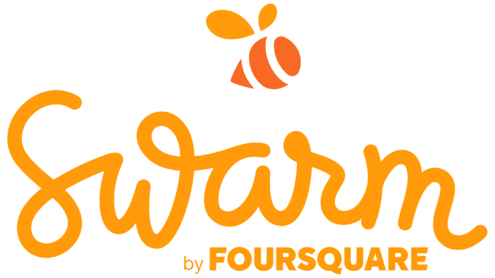
One look at the Swarm logo evokes positive emotions because it symbolizes openness, joy, and an active pastime. The developer of this mobile application positions it as the best way to share impressions of the places visited. Therefore, the emblem cannot be strict and official.
Swarm: Brand overview
| Founded: | May 5, 2014 |
| Founder: | Foursquare Labs |
| Headquarters: | United States |
| Website: | swarmapp.com |
Meaning and History
Foursquare Labs Inc. released Swarm in May 2014. Before that, she bought the domain (and Twitter and Facebook accounts) from an Internet user named Sean Taylor. He also created the initial concept of the logo in the form of an elegant inscription with curls and suggested using orange as a base color. Sean himself considers himself deceived because he did not know to whom he was selling the domain: the buyer was a third party. Besides, no one signed any contract with him.
Complaining about the Internet about the injustice, Sean received a flood of criticism. After all, he nurtured the concept of Swarm for four years (since 2010) and did not even try to implement it. And the sale of a domain with this name automatically assumed that buyers would use it for their purposes.
What is Swarm?
Swarm is a mobile application that helps users fix their location and share their impressions of the places they visited. Information is displayed on an interactive map, and unique badges are given for certain achievements (such as check-ins in slot machines, banks, or airports). The service also allows you to follow friends’ activities to know where they are now.
The word mark invented by Sean Taylor served as the primary basis for the app logo. But the Foursquare staff did a good job of improving the appearance of the inscription to make it more elegant and sophisticated. The creative team included Zack Davenport, Courtney Christopher, Mike McVicar, and Simon Endres. Red Antler handled branding.
At first, they faced a difficult task – to develop a name for the future project. And then they remembered the badges that Foursquare users received for certain achievements. Among them were rather unusual rewards: Super Swarms (for those who gather in crowds of 250 people), Super Duper Swarm (for groups of 500 people), and Epic Swarm (it was given if 1000 users met at the same time in one place). Coming up with a name for a new application, the authors relied on this idea.
The result was a wordmark with the handwritten word “Swarm.” It is complemented by “FOURSQUARE,” which looks exactly like a fragment of the Foursquare logo, created in 2014. The second word is at the top and right-aligned. Bold sans-serif letters are used for it. The designers deliberately made the two parts of the badge different to balance seemingly incompatible styles: strict and playful.
Font and Colors
In addition to the logo with the inscription, Swarm has an icon in the form of a flying bee. Her body consists of three yellow figures in the form of a triangular arrow, a crescent, and a slightly deformed ellipse. The wings look like inverted drops. A bee had similar wings on the Super Swarms, Super Duper Swarm, and Epic Swarm icons in the original Foursquare app. This suggests that the icon was inspired by old gamification elements that were used even before the advent of the modern Swarm service.
The bee symbolizes a friendly team because the application was created to bring people together. It allows users to share their location with friends and know who is where at the moment. And the bee is associated with order, diligence, and sociability.
The custom design script used in the Swarm wordmark is unparalleled. The letters are written carelessly, as if in a hurry, but still look elegant thanks to the smooth lines, loops, and rounds. At the same time, the brand name is slightly raised in the middle, like an arch. The word “FOURSQUARE” has a completely different font. For it, the developers chose a strict bold grotesque with horizontal strokes cut at an angle of “F” and “E.” It looks like Hoftype’s modified Urania Ultra or by Caros Black.
The app’s color scheme combines white and bright orange. The second shade is great for Swarm because it is associated with honey and bees. In addition, orange evokes positive emotions and symbolizes joy, sun, summer, and a good mood.
Swarm color codes
| Orange Peel | Hex color: | #ff9b0a |
|---|---|---|
| RGB: | 255 155 10 | |
| CMYK: | 0 39 96 0 | |
| Pantone: | PMS 151 C |
| Orange | Hex color: | #f86925 |
|---|---|---|
| RGB: | 248 105 37 | |
| CMYK: | 0 58 85 3 | |
| Pantone: | PMS 1585 C |
