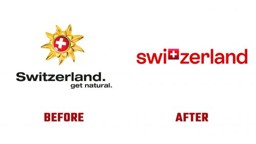
Switzerland Tourism has introduced a new logo and identity designed by How&How to strengthen its national and international appeal with a modern visual identity.
The previous logo has been replaced, featuring the “Goldblume” icon, an ornate Edelweiss flower, and the Swiss cross. The new logo more engagingly brings the Swiss cross to the forefront. It features the word “Switzerland” with the Swiss cross integrated into the “t,” making the cross a prominent part of the wordmark.
The wordmark uses a custom sans-serif typeface called ST Allegra, developed with the Geneva Type Foundry Extraset. This typeface conveys a welcoming character and breaks away from the traditional use of Helvetica in Swiss design. ST Allegra is clear, readable, and friendly, capturing the essence of Switzerland as a travel destination. The lowercase wordmark adds a playful touch, though an uppercase “S” might have provided better balance with the cross.
The color palette centers around a gradient of Swiss red tones, reminiscent of the alpine glow in Switzerland’s mountains. These reds create a memorable brand asset, adding depth and motion to the visual identity. The colors spread out in horizontal bands, emphasizing the expanse and horizon in imagery, letting Swiss worlds shine and energy pulse across the brand.
The logo and brand elements are designed to be recognizable even without the actual logo, using the color edge as a unifying layout element. The branding’s horizontal orientation allows landscapes to stand out, reinforcing the brand’s tagline: “Switzerland energizes you.”
The new identity includes a range of illustrations and icons designed to be contemporary yet reminiscent of ancient art forms. These illustrations provide a modular system where elements like a snake or a tree can adapt to various layout sizes.
In digital applications, the Swiss cross subtly shifts color when “pressed down,” adding a dynamic touch to the logo. This animation could be expanded to enhance the brand’s digital presence.
The rebranding aligns with Switzerland Tourism’s mission to develop effective marketing programs that highlight Switzerland’s strengths. The new identity blends tradition and modernity, aiming to attract both domestic and international visitors by showcasing Switzerland’s cultural heritage and natural beauty.
Switzerland’s decision to use the English wordmark “Switzerland” across all branding materials is based on a study in key markets such as Germany, France, Italy, South Korea, and the Gulf States. The English name is recognized and charismatic, enhancing global appeal. While this simplifies branding, it raises questions about inclusivity, given Switzerland’s multilingual identity.


