The Syfy logo is massive and dark. It evokes associations with fear, horror, something stronger than a human and incomprehensible to him. The emblem represents a channel with shows that tickle nerves and expand the boundaries of the Universe.
Syfy: Brand overview
| Founded: | September 24, 1992 |
| Founder: | Mitchell Rubenstein, Laurie Silvers |
| Headquarters: | United States |
| Website: | syfy.com |
Syfy is an American channel dedicated to popular science films, horror, science fiction, and paranormal phenomena. It belongs to NBC Universal. The shows are watched by more than 92 million families in the US. The channel has its own website, which won a Webby Award, a news resource, a weekly online magazine, and a gaming portal.
Meaning and History
The channel chose the analogy technique to create a visual identity. The logo’s center is an image that, in the understanding of most people interested in mysticism, is associated with the mystery of the origin of life on our planet. The name of the channel is also associated with a well-known expression for shows about the unknown and fantastic. In every emblem, the picture and the title were repeated until the direction of the channel’s work changed. This led to a series of rebranding and the emergence of a new verbal identity.
What is Syfy?
A science fiction channel supplemented with mysticism and horror. Programs are on the air from 8:30 am to 3 am. At different times, broadcasting was extended to Germany, the UK, Italy, and Russia. The channel’s headquarters are located in New York.
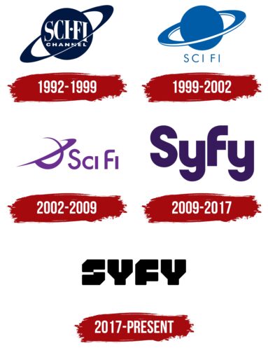
1992 – 1999
The company logo depicts Saturn with rings in a dark blue color.
This planet is considered very mystical, primarily because of the hexagonal structure found on it with very straight sides. The giant can generate heat by itself and does not need the Sun. And its rings produce electricity. The ancient peoples of the Earth worshiped this planet, calling it the “ghost of the sun” and the “first extinguished luminary.” Saturn is even associated with the Great Flood. There is an opinion that it is an alien station that greatly influences the Earth.
That’s why the channel, having chosen science fiction as its main theme, focused on Saturn when creating its logo.
In the center of the planet on the emblem is the white name on two levels: Sci Fi Channel. The abbreviation is derived from Science Fiction. The white color is a symbol of clarification. The channel will be revealing interesting facts and seeking their explanation. The channel even invests funds in the production of its own science fiction films about various mystical events that took place on Earth.
1999 – 2002
In 1998, the channel’s owners became part of Studios USA. By the 21st century, under the influence of new owners, the emblem underwent rebranding, and the channel’s name was shortened to Sci Fi. The image of Saturn on the logo lightened, demonstrating the entertaining nature of the shows and the addition of more easy-to-perceive programs.
The channel’s name is written in very thin letters below the image of the planet. The choice of thickness shows the process of reducing the amount of mystique. The reception speaks of the unknown and the unexplored, which barely touched our world, leaving a slight trace, which they try to show on Sci Fi.
2002 – 2009
In the early 2000s, the channel gradually expanded its themes and no longer focused solely on science fiction. However, the theme remained important for the owners.
The Sci Fi logo changed color to light purple. The image of Saturn became semi-transparent – just a couple of intersecting lines. Most of the planet is still in the viewers’ visible zone.
Increasing transparency points to all that is mystical and incomprehensible. Man has not yet solved a large number of mysteries. In general, the emblem shows that the channel is dedicated to phenomena that are poorly understood, the cause and explanation of which is hidden.
The name follows the image in the same thin purple lines with smooth glyphs. The streamlined symbols indicate the absence of a chase for sensations and disputes with the scientific community. The programs cover only assumptions and known facts.
2009 – 2017
In 2009, the channel’s owners – NBC Universal – changed its name because they decided to register a trademark, and the previous name is a commonly accepted abbreviation. In connection with the novelty, they also changed the emblem.
The viewer’s attention was focused on the new name so that it would be well remembered. The logo is the large purple letters Syfy. In pronunciation, they correspond to the previous name.
This is the first sign in which Saturn is not used at all. The rebranding also led to a review of the channel’s direction. The program schedule has changed significantly. Science fiction, which was associated with the planet on the emblem, was no longer relevant.
2017 – today
In honor of the 25th anniversary, a major rebranding took place. Its main goal is to return the channel to the roots that make it unique. The schedule was planned to increase the amount of science fiction, mysticism, and horror again.
The new logo has an unusual angular-square shape, bold capital letters, and a black color. According to the owners’ explanation, the emblem is meant to resemble a badge that unites and highlights all fans of the genre.
The inscription appears slightly grim and bulky but in the spirit of the channel.
Font and Colors
The black color of the modern sign embodies the theme of horror, horror, mysticism – everything frightening. Often occurring under cover of night or in secret places hidden from view. Bold glyphs of letters demonstrate the increase in the share of such broadcasts in the program.
The font of the inscription is unique and designed specifically for the channel. Rexlia Black was taken as the basis. The two halves of S barely touch, demonstrating the closeness of the real and the beyond or parallel world, the thin line between the known and unexplored. The unusual form of Y indicates chromosomes. The presence or absence of even one significantly changes the appearance of a creature and changes its capabilities. F is similar to an opened mouth.
Syfy color codes
| Black | Hex color: | #000000 |
|---|---|---|
| RGB: | 0 0 0 | |
| CMYK: | 0 0 0 100 | |
| Pantone: | PMS Process Black C |


