The TACA logo embodies aviation’s safety, reliability, and prestige ideals. Its unique shape evokes a sense of free flight, while the bright colors reflect the company’s commitment to innovative solutions. In other words, the emblem is the quintessence of elegance and professionalism.
TACA: Brand overview
Over its 75-year history, Transportes Aereos del Continente Americano (TACA) has carved out a niche as a reliable and well-known provider of aviation services. Renamed Avianca El Salvador, it proudly represents El Salvador as its flagship carrier and is one of seven nationally branded airlines within the esteemed Avianca Group.
Founded in 1931 as Transportes Aéreos Centro Americanos, TACA Airlines was initially focused on developing connections within Central America.
In 2009, TACA and Avianca merged in a grand merger that marked a seismic shift in air transportation in Latin America. By synergizing their strengths, the two airlines aimed to create an unrivaled, comprehensive, and efficient service for their valued passengers. For four years, while the transformation took place, TACA operated independently. Finally, on May 21, 2013, the climax came, ushering in a new era of air travel in Latin America.
TACA, whose history spans over 80 years, is the second longest-established airline in Central America and the Caribbean.
Meaning and History
What is TAСA?
TACA, officially known as Transportes Aereos del Continente Americano, got its start in El Salvador. The airline is deeply rooted in Central American history, providing a vital link between North and South America since its founding in 1931. Throughout its history, the airline has undergone many expansions and downsizing, most notably expanding to several destinations in the Americas.
1931 – 1936
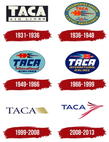
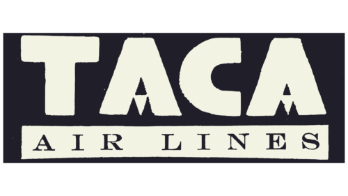
This logo appeared immediately after the company’s founding when it was known as Transportes Aéreos Centroamericanos. The designers did not use the full brand name in the emblem, shortening it to the abbreviation “TACA” for better readability and memorability.
The word is written in large gray letters inside a black rectangle. Both “A” s have an original shape: each crossbar is replaced by a small triangle pointing downward. This geometric style creates a sense of balance and stability, which is important for a new airline that wants to be associated with reliability.
The second line contains the phrase “AIR LINES.” Its font, in contrast, looks standard and elegant. The letters with long serifs add visual dynamism to the logo, hinting at the high speed of cargo and passenger delivery.
1936 – 1948
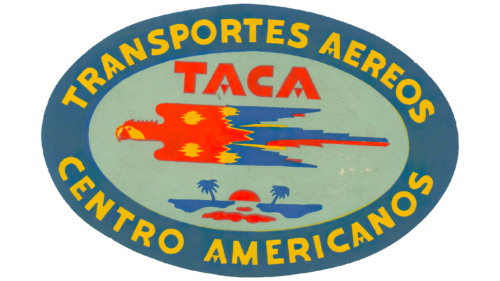
The company grew tired of using a strict monochrome emblem and radically changed its identity. The black rectangle transformed into a colorful oval with a dark blue border, inside which the then-current brand name “TRANSPORTES AÉREOS CONTINENTE CENTRO AMERICANOS” is written. The yellow color of the letters brings positivity and variety and is associated with the sun, while blue symbolizes the sky. This reflects the brand’s connection to aviation.
In the center, a macaw parrot is drawn – a symbolic depiction of an airplane. In a cultural context, it holds special significance for the Honduran airline, as this bird species is widespread in Central America. The picturesque oasis with palm trees, over which the parrot flies, represents the local landscapes of Honduras. Thus, the emblem embodies the company’s love and respect for its native country and colorful nature.
The word “TACA” is minimized, recolored in red, and placed above the bird. Its font remains unchanged, characterized by the triangles in the lower part of the “A.” The same style is used for the full brand name. This unconventional design demonstrates the carrier’s creativity and openness to new ideas.
1949 – 1966
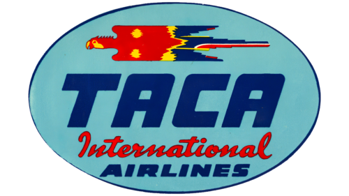
The owners of TACA from Honduras opened a franchise airline, TACA International, in El Salvador and eventually made it the primary airline. Therefore, the new logo includes the “TACA International AIRLINES” inscription, indicating the airline’s expansion beyond a single country. The rebranding reflected the expansion of services across American continents, so the new corporate style had to convey the company’s seriousness, global reach, and promising future.
The designers retained the emblem’s oval shape and the silhouette of the flying macaw inhabiting Central America. The colors remained unchanged: yellow, red, and blue. This bright combination helps attract attention to the company and conveys its unique authenticity.
The logo uses three different fonts, highlighting the brand’s multifaceted nature. The letters’ slanted shape unifies them, making the text appear dynamic. The text’s dynamism reflects the airline’s activity, striving to cover as many routes as possible.
- “TACA” features many rounded corners, symbolizing safety during flights.
- The italicized handwritten style of “International” is associated with elegance and comfort.
- The word “AIRLINES” is written in bold, massive letters with many angles, reflecting reliability and confidence.
1966 – 1999
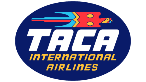
After the latest rebranding, the parrot changed direction and now flies to the right – towards new routes and achievements. The designers simplified its appearance, creating the bird’s silhouette from colorful geometric shapes with clear boundaries. This makes the emblem look more presentable and better displayed on various media. The macaw remains recognizable thanks to its red, yellow, and blue colors. Since the parrot faces the same direction as the slanted letters, it creates a cohesive composition without contradictions.
The designers recolored the oval base to dark blue and made the word “TACA” white to enhance brand recognition. The phrase “INTERNATIONAL AIRLINES” is rewritten in a new italic font, which may not be very elegant but conveys the dynamic nature of the company.
1999 – 2008
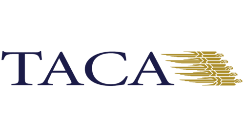
The 1999 logo returns to the roots of TACA’s visual identity when the brand name is not enclosed in a blue oval. The designers used the simplest graphic style, as minimalism became fashionable in the early 2000s, and the company wanted to enter the new millennium with a modern look.
The previous version’s flight symbol—a stylized parrot—remains. In this case, five parrots are depicted one above the other. They are formed from numerous small details with empty spaces between them. This open space adds lightness and swiftness, emphasizing the high speed of the flying airplanes, as each bird in the airline’s emblem is associated with an aircraft.
The increased number of parrots signifies the company’s aim to serve as many passengers as possible. By 1999, it had an extensive network of routes across North, Central, and South America.
The red color was replaced with gold to reduce aggression and expressiveness. In this form, the logo looks more restrained while retaining its emotional tone: it continues to be associated with a passionate love for aviation. Moreover, gold represents luxury and premium quality. It is combined with dark blue, which symbolizes strength and reliability, and in the context of aviation, represents the sky.
The new font characterizes TACA in the best possible way. The designers used a serif typeface with thin serifs to add dynamism to the inscription. The contrast in stroke thickness creates an illusion of movement despite the absence of italics. The smooth shape of the lines is associated with the comfort the company provides its customers.
2008 – 2013
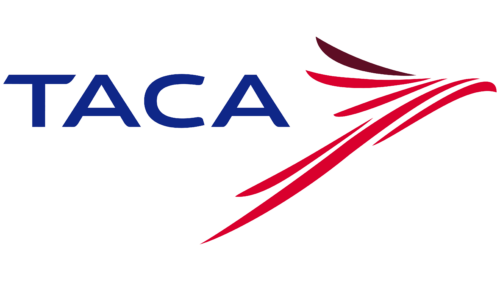
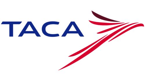
The logo of the second oldest airline in South America, which has now merged with Avianca, features a stylized bird to the right of the name. The bird has colorful plumage comprising six narrow, elongated stripes with pointed ends and smooth outlines. The airline’s name is displayed on the left formally with geometric, smooth letters and sharp serifs. The logo uses three colors: blue, dark maroon, and red.
The bright colors of the bird symbolize the airline’s dynamism and vitality. The geometric letters contrast the abstract bird, reflecting a balance between tradition and modernity. The three colors represent the airline’s versatility and ability to meet various customer needs. This contrast creates a compelling visual harmony, making the logo memorable.
The bird’s colorful plumage and six smooth-edged stripes add vibrancy and movement, suggesting forward momentum and adaptability. Each stripe’s unique placement adds complexity and depth, enhancing the visual appeal.
The formal lettering of the airline’s name, with its sharp serifs, conveys professionalism and reliability. This contrast with the abstract bird design highlights the company’s blend of rich heritage and progressive outlook. The sharp ends of the letters mirror the bird’s pointed stripes, creating a subtle visual link between the two elements.
The color scheme of blue, dark maroon, and red enhances the logo’s visual impact and represents different aspects of the airline’s identity. Blue symbolizes trust and dependability, dark maroon suggests elegance and sophistication, and red conveys energy and passion. This thoughtful use of color reinforces the airline’s multifaceted approach to service.
