Talkspace, a virtual behavioral healthcare and therapy provider founded in 2012, has introduced a new logo and identity designed by Koto. This rebranding reflects Talkspace’s growth and commitment to accessible, effective mental health care.
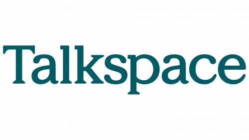
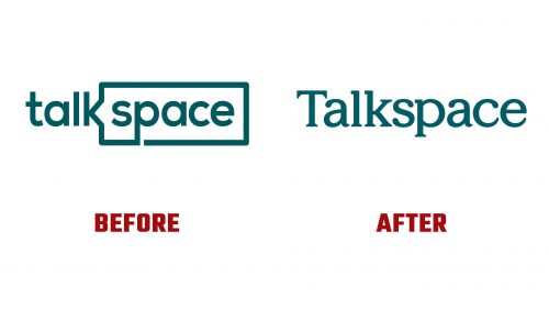
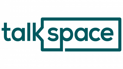
The previous logo incorporated a speech bubble into the “k,” aiming to highlight conversation. It was seen as clunky and lacking visual appeal. The new logo presents a cleaner wordmark, though it has faced criticism for its design. The wordmark combines thick slab serifs, regular serifs, ball terminals, and swooshy terminals, resulting in a somewhat inconsistent appearance. Despite this, the logo’s simplicity aligns with Talkspace’s mission to provide reliable mental health support.
A new T-shaped symbol plays a central role in the updated identity. This symbol serves as a versatile framework for content. It represents the idea of creating and finding one’s space, reflecting the adaptability and personalization of therapy. The T-shaped symbol can be seen as an apartment floor plan, allowing individuals to understand their experiences.
The new identity uses significant typography, using Exposure for headlines and Oldschool Grotesk for supporting text. Exposure, a soft serif with various weights, highlights moments of clarity and emotion. Oldschool Grotesk, a modern sans-serif with playful details, adds depth and precision. This combination enhances the brand’s messaging and visual appeal.
The color palette retains the teal from the old logo and adds bright, happy, and soothing colors. These colors create a calming and inviting atmosphere, which is essential for a mental health service provider. Vibrant and engaging illustrations, especially effective in motion, contribute to the brand’s warmth and approachability.
Koto’s rebranding of Talkspace emphasizes the concept of “Make sense of it,” positioning mental health care as a regular practice for navigating life’s challenges. The brand’s new personality, described as ‘Sense Maker,’ aims to reassure users that Talkspace is a trusted partner in managing life’s complexities. Messaging such as “Make space for a shift in perspective” and “Make space for every emotion” reinforces this, promoting Talkspace as a platform for expressing feelings and finding new perspectives.
The T-shaped symbol and refined logo are at the heart of Talkspace’s new identity. The T-shaped symbol represents therapy’s versatility and adaptability, creating room for individuals to make sense of their experiences. The wordmark, with rounded serifs and squared forms in the ascenders, visually connects with the brand symbol, embodying warmth and clarity.


