The TAM Airlines logo reflects the strength and energy of the airline, which in the past dominated domestic routes in Brazil and international flights. The emblem style emphasizes a progressive approach to the aviation industry while conveying the brand’s authentic Brazilian spirit and cultural heritage.
TAM Airlines: Brand overview
Founded in 1976, TAM Linhas Aéreas Airlines was dedicated to connecting remote regions of Brazil through reliable and customer-oriented air transportation.
In the early 1990s, TAM Airlines embarked on an ambitious expansion plan, acquiring larger aircraft to serve a wider range of destinations throughout Brazil.
A major milestone in TAM’s history was the acquisition of Transbrasil, Brazil’s largest airline, in 2001. This acquisition expanded TAM’s domestic network and facilitated the airline’s entry into international markets. Equipping the fleet with modern Airbus aircraft allowed TAM to raise the bar on passenger comfort and efficiency.
In 2012, TAM Airlines merged with LAN Airlines to form the LATAM Airlines Group, which became one of the leading players in the global aviation industry.
In 2016, TAM Airlines rebranded and became LATAM Airlines Brasil. This move aligned the airline with the larger LATAM Airlines Group, reaffirming its commitment to providing its customers with the highest standards of service and travel.
Meaning and History
What is TAM Airlines?
Headquartered in São Paulo, TAM Airlines was the largest airline in Brazil and Latin America before the takeover. The company offered scheduled flights to a number of destinations in Brazil and also operated international flights to Europe and various regions in the Americas. A key event in the company’s history was its merger with LAN, allowing it to integrate into the LATAM Airlines group.
1961 – 1976
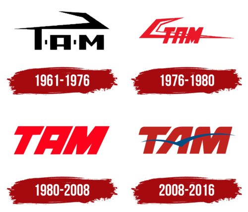
The debut logo of TAM Airlines aligns with the design trends of the 1960s when simple geometric shapes were in vogue. Even in this form, it has a strong visual impact, as the massive, even letters convey a sense of confidence, stability, and reliability. This reflects the great ambitions of the newly established company.
The restrained “TAM” lettering is in a strict font with rectangular vertical strokes. The combination of thick and thin lines makes the word dynamic despite its uniform black color. The small quadrangles separating the letters give the emblem a sense of space and freedom—just what a budding airline needs.
The top of the “T” looks like a long strip that smoothly expands and curves upwards, forming a sharp angle. This geometric element can have several meanings:
- A stylized image of an airplane wing;
- An abstract bird or aircraft.
In other words, the emblem, in a very simple and primitive manner, hints at the brand’s connection with aviation.
1976 – 1980
In 1976, designers decided to make the logo more dynamic using an italic font and bright red color. Despite the pronounced slant, the letters still look massive due to their bold weight. The uppercase letters create a sense of stability, characterizing TAM Airlines as a long-lasting and reliable carrier.
The color reflects the vivid emotions experienced by travelers. Red emphasizes swiftness, speed, and dynamism—key qualities that help the company serve passengers worldwide and maintain a punctual flight schedule.
The complex structure of triangles and trapezoids is now separated from the “T” and placed in the background. It still symbolizes a flying airplane or its wing, maintaining the emblem’s connection to the aviation industry.
1980 – 2008
Since the geometric abstraction reduced the readability of the inscription and blended it with the letters, the company decided to eliminate it and focus all its attention on its name. The designers added nothing new to the logo; it contains only the bright red word “TAM.”
This simplicity and conciseness indicate that TAM Airlines effortlessly serves passengers and ensures their comfort during flights. The red color, as before, signifies lightning-fast speed. This allegory applies to swiftly flying airplanes and the rapidly developing airline that continuously expands routes, upgrades its fleet and keeps up with new trends in the aviation industry.
2008 – 2016
The TAM logo features bold red “TAM” lettering with two blue stripes that connect on one side. The free ends of these stripes are pointed, forming a stylized bird, which replaces the crossbar of the letter “A.” The slanted font combines angular and rounded elements, creating the illusion of movement.
The red “TAM” lettering provides a strong and vivid background for the blue stripes. The combination of these colors is visually striking and conveys reliability and professionalism. The pointed ends of the blue stripes symbolize flight and add a sense of dynamism to the design. The slanted font enhances the impression of movement and energy.
The innovative replacement of the crossbar in the letter “A” with the stylized bird reinforces the theme of flight and adds depth to the logo. This detail makes the logo more than just text and shapes; it is a cohesive representation of the airline’s identity.
Overall, the design captures TAM’s essence with its pointed blue stripes, slanted font, and bold color scheme. The elements work together to create a visually appealing logo rich in symbolism and memorable in the competitive airline industry.


