Eric Netsch and Sina Mobasser – professionals in the field of mobile commerce spring 2017, realized their original idea of creating a unique application. Its name, Tapcart, very accurately disguises the brand’s very essence. The main task of the new development was to make mobile commerce, which, thanks to the Internet, has become particularly popular among shopping enthusiasts, simple and accessible to all. Today’s shoppers had the opportunity to become the owners of an unforgettable shopping experience where sellers used this platform. For five years, the project was able to evaluate and start using millions of users who helped improve the application and develop it with their wishes and comments. The brand was constantly improving and expanding the reach of the number of consumers, which required a change in the external identity, a recently introduced update of the brand.
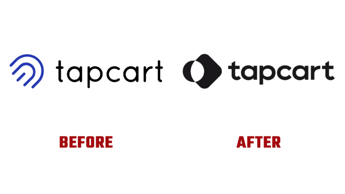
The rebranding took the brand to a whole new level. And first of all, because with it, the company was able to clearly and easily reflect its image, the company’s desire to become the undisputed leader in the field. The new identity ensured the creation of a distinctive visual voice, with which it provided a strong connection with the consumer. Past visuals contributed to the effective promotion, giving the brand the place it has reached today. But modernity demands a different approach to one’s appearance, and the positive dynamics of development have only reinforced the need to make a new transition.
The use of a modern, minimalist style made it possible to convey all the important information about the brand to the potential user in a concise but very capacious manner, emphasizing its reliability both in the conclusion of closer ties with customers and in the creation of conditions for customer retention. One of the main messages of the rebranding was to demonstrate the platform’s use for increasing attention to the app, whose functionality guarantees the user audience’s interest in a particular manufacturer’s offerings.
The new sign, which has become an accent element of the logo, symbolizes the endless development and the close relationship between the user community and the system itself, the developed platform. The use of a font in which the first and the last letter t have an attractive symmetrical truncation of the upper part, as well as the graphic design of the text block – the name, which advantageously plays off the architecture and the text features, ensures ease of reading, recognizability, and memorability of the entire graphic composition. The monochrome color palette, consisting of a strictly classic black color, enhances the visual impact on the viewer, ensuring compliance with the requirements of minimalism.
