


![]() Team Empire Logo PNG
Team Empire Logo PNG
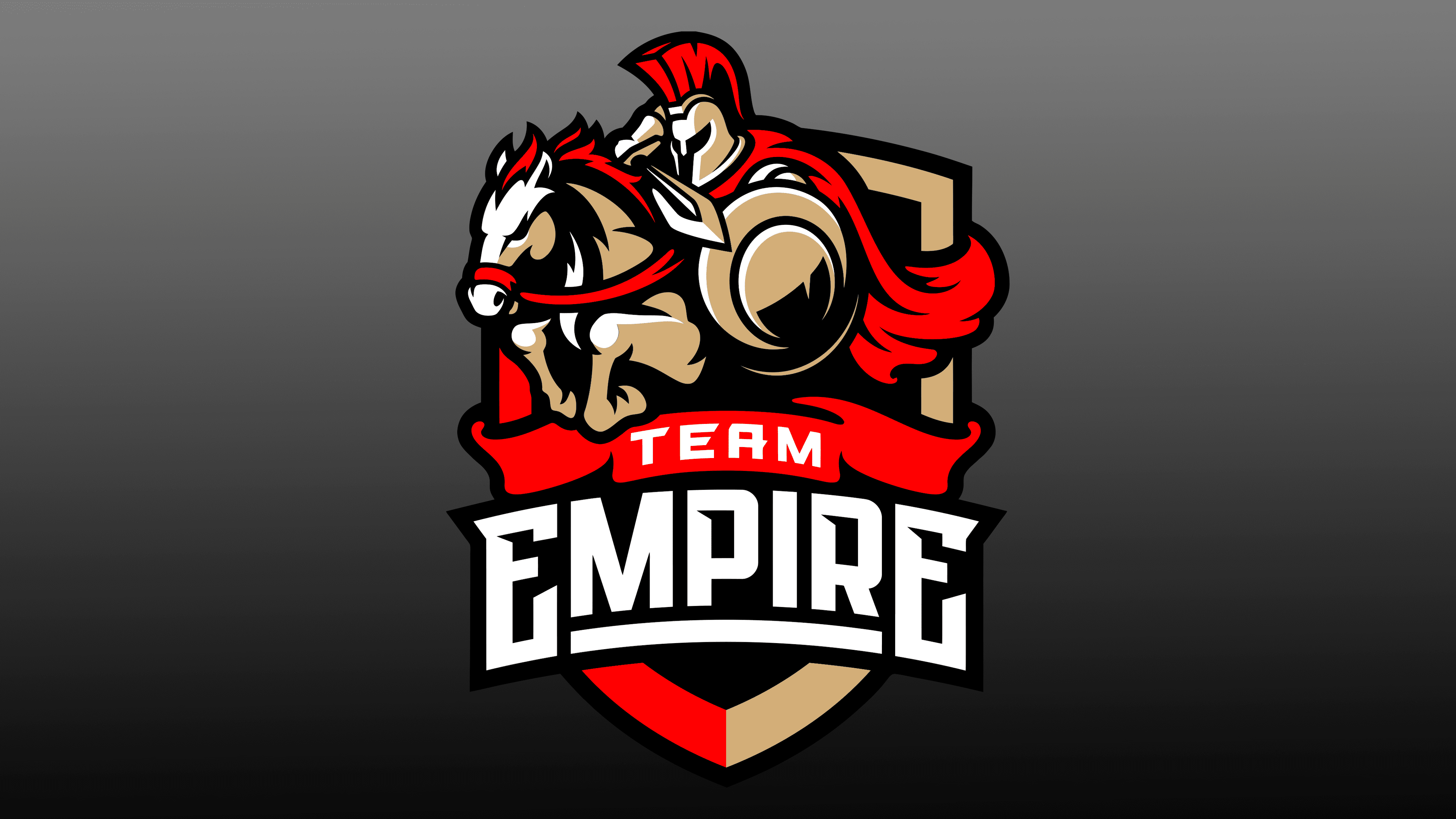
Power and pressure are visible in the Team Empire logo. A close-knit team, like one strong player, rushes to victory. The emblem reflects an ardent desire to participate in battles and a willingness to overcome any difficulties and trials.
Meaning and History
The development of cybernetics and computer games contributed to the formation of a team-oriented direction in eSports. This led to the formation of club teams, whose members gathered and united into “clans” around modern club equipment because reliable computer equipment was unavailable.
July 25, 2001, is a significant date in the history of sports development on the internet. In Russia, a decree was signed that day recognizing esports as an official form of competition. Russia was the first in the world to do it. And even though, upon its entry into force, no privileges were added for either the organizers or the players, it had a huge impact on the accelerated development of this discipline.
On this “wave,” an annual tournament, “ASUS Open,” the largest in the CIS, began to be held. Thanks to its holding, experienced players gained impressive motivation to continue, and young ones gained an opportunity to show themselves. The participants in these tournaments formed the backbone of the professional Russian team Team Empire, which first emerged in 2004.
At the end of 2016, the organization announced a completely new roster, comprising both newcomers and players from the old school. During this period, until 2017, fundamental changes occurred among the organization’s founders. Members of the constituent council of KSK “Spartak” are also included in the constituent council’s composition. As of April 19, 2017, the team was fully staffed in CS.
By this time, the main Team Empire logo had already been fully approved and can today be seen at all in-game championships where the team participates, on its portal, and in social networks.
The emblem is a shield in the background, in front of which a rider on a horse is depicted, frozen in mid-jump over a surmountable barrier, a ribbon encircling the shield bearing the first word of the team name, “Team”. The rider is dressed in the costume of a Roman legionary with a round shield and a short Roman sword in a combat position before striking a side blow to the enemy. The qualitatively rendered dynamics provide a visual sense of the composition, demonstrating both figures’ tension and readiness to act. Purposeful movement of the front part of the horse’s body with the head bent over to increase the range and power of the jump, frozen at the most critical moment at high speed, which transfers the direction of movement of the mane to the rear of the body. Tense position of the rider’s body, assembled like a spring, to enhance the impact effect, almost merging with the horse’s body, to reduce air resistance. The evolving cloak also contributes to the composition’s required visual perception, accurately conveying the cyberteam’s spirit and goals, their self-expression, and a readiness not only to reflect but also to launch a victorious attack.
Font and Colors
The logo is crafted in a spectacular combination of bright red and a soft shade of light brown, enhancing the contrast with white and black. The latter favorably emphasizes each color, focusing on the elements highlighted in red. The shield’s edging is divided into red and black in strict halves. The inside of the shield is filled with black. The rider and his armor, weapons, and horse are in a light brown shade, while the plume, fluttering cloak, the horse’s reins, and its mane are in red. Shape outlines and shadows are highlighted in black.
The name is written in white capital letters. The first word of the title is shown on the red ribbon. The second is under the ribbon on a black background in letters larger than the font size selected for the first word. Composition fonts, ribbon, and substrate are made in an arched shape, and the ends of the bend are directed to the bottom. The lower conical part of the shield protrudes under them.
High-quality workmanship ensures full compliance with the requirements of modern digital technologies, creating the necessary impact on the viewer, high perceptual clarity, and logo memorability.