Tefal: Brand overview
Tefal is a well-known French brand specializing in cookware and compact home appliances and is a prominent subsidiary of Groupe SEB. The brand was founded in 1956 by Marc Grégoire, who was instrumental in developing the non-stick coating that has become a distinctive feature of Tefal pans.
Tefal boasts an impressive range of products, with non-stick pans, pressure cookers, deep fryers, electric grills, and kettles, among its best-selling products. The company pioneered the creation of non-stick pans by ingeniously combining tetrafluoroethylene (PTFE) coating with aluminum coating under the Tefal brand name.
In addition to a wide range of cookware, Tefal produces a variety of compact kitchen appliances under brands such as Actifry, Sensio, and Express. Today, Tefal products can be found in more than 150 countries, making the brand one of the world’s dominant players in cookware.
Innovation continues to be at the heart of Tefal’s business, with a particular focus on advances such as titanium non-stick coatings, removable handles, and integrated stirring systems. Even though Groupe SEB acquired Tefal in 1968, Tefal continues to be the group’s core brand, a testament to its importance within the company.
As of 2020, Tefal’s annual revenue exceeded €1 billion. The brand’s widespread success is due, in particular, to the fact that it is supported by recognized chefs. Despite the challenges faced by new brands, Tefal’s legacy and enduring popularity are the non-stick pots and pans that have become an essential item in many households around the world.
Meaning and History
What is Tefal?
Tefal S.A.S., founded by Marc Gregoire in 1956, changed culinary practice. Headquartered in Rumilly, Haute-Savoie, France, Tefal has gained international recognition as a manufacturer of premium cookware and compact appliances. The company pioneered the non-stick cookware segment and introduced fryers with little fat or oil, which promotes healthier cooking methods.
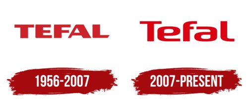
1956 – 2007
2007 – today
The red word “Tefal” is associated with the passion and enthusiasm that the manufacturer brings to the development of kitchen utensils. The color chosen embodies these vibrant emotions in the best possible way. The font softens them, as the letters have rounded edges. The simplicity and minimalism of the logo convey the professional image of the company and reflect its commitment to high-quality products.
The logo itself tells a small story. The red color evokes a burst of energy, like when cooking something amazing. The rounded letters give everything a smooth feel, like the company’s products, making it easy to cook. The logo is quite simple, but it conveys the point exactly: you can rely on these products in the kitchen.
Tefal color codes
| Maximum Red | Hex color: | #da0113 |
|---|---|---|
| RGB: | 218 1 19 | |
| CMYK: | 0 100 91 15 | |
| Pantone: | PMS Bright Red C |
