As a multinational company, the Telefonica logo helps create an aura of continuity because it has one version for all countries. The emblem since 1984 contains the name of the brand, but the design of the inscription has often changed. In 2021, the wordmark changed to bright blue and acquired a symbol in the form of the letter “T,” made up of five circles.
Telefonica: Brand overview
| Founded: | 19 April 1924 |
| Headquarters: | Madrid, Spain |
| Website: | telefonica.com |
Meaning and History
Telefonica was known as Telefónica de España, S.A. until 1998. Then the board of directors shortened its official name, removing the words “de España” from it which denoted territorial affiliation. This made it possible to make the brand universal for any country where it was presented. In addition, to adapt to foreign markets, the firm has long used the logo without the Spanish accent over the “o.” But in 2021, she returned to a version with an accent mark indicating a special pronunciation of the letter, thus paying homage to the emblem of the 1980s.
What is Telefonica?
Telefonica is one of the largest telecommunications companies in the world, as well as its flagship brand. The corporation is located in Spain and positions itself as the best supplier of high-tech communication tools. It owns the brands O2, Vivo, and Movistar, under which it provides mobile phone, wired telephony, cable TV, and Internet services.
1924 – 1984
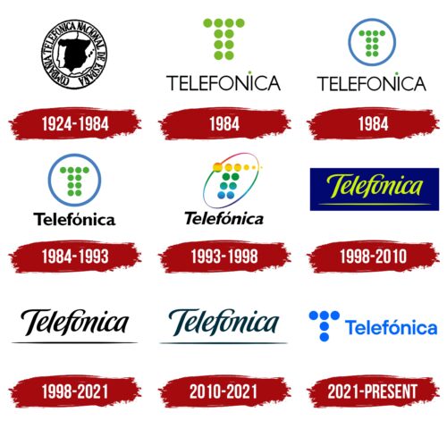
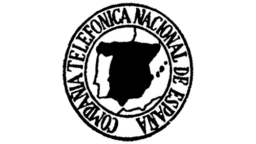
In 1924 the Compañía Telefónica Nacional de España was founded in Madrid. Its original logo contained a black figure in the shape of Spain, as well as small spots representing the Pitius and Balearic Islands. Dark lines were depicted nearby, delimiting the conditional land and water surface. The schematic map of the Iberian Peninsula was inside the white circle. That, in turn, was located in a wide ring with an inscription made in large black letters. Designers put the name of the company there.
1984
In June 1984, Taula de Disseny created a logo for a telecommunications company in the form of the letter “T,” consisting of ten green circles. At the same time, he reduced the inscription to the word “TELEFONICA” and placed it below. The designer used a modified ITC Avant Garde font to design the text – thin, vertically elongated, and sans-serif. The lack of an accent sign above the “O” was compensated by a small green dot, which was located at the top between the “N” and “I” and distracted attention.
June – July 1984
In July 1984, Taula de Disseny made minor changes to the logo. He retained the arrangement and shape of the elements but reduced the free-standing “T” and placed it inside a white circle with a blue outline. In addition, the developer slightly darkened the green color and lowered its brightness.
1984 – 1993
In November 1984, the same designer enlarged the “T” along with the blue ring and replaced the familiar modified ITC Avant Garde with a bold contrasting Gill Sans MT. To keep the inscription from appearing too massive, he translated most of the word “Telefonica” into lowercase – all letters except the first one. The dot above the “i” became standard, and a missing accent mark appeared above the “o” to match Spanish spelling.
1993 – 1998
In the early 1990s, Estudio CIAC improved the logo proposed by Taula de Disseny and added more bright colors to it. The designers slightly shifted the circles that made up the “T” to make the letter slanted. At the same time, they replenished the top row with two dots and made all the elements unevenly colored. Only two circles remained completely green. The rest had a gradient with different shades of orange, yellow, blue, or purple. The ring turned into a diagonal ellipse with an iridescent palette, to which crimson was added. The developers used an italic version of the Gill Sans MT font for the inscription.
1998 – 2021
At the end of 1998, the telecommunications company introduced a new corporate image created by the UK-based branding agency FutureBrand. And she entrusted her logo to the master of lettering, Ian Brignell. The graphic designer designed a custom handwritten font for the name Telefonica and underlined the word with a long horizontal stripe. However, he removed the accent mark.
1998 – 2010
The FutureBrand staff repainted the word in bright green and placed it on a dark blue background. This logo was used until 2010 on billboards, buildings, telephone booths, and various marketing materials.
2010 – 2021
In 2010, Interbrand and Doyle Dane Bernbach rebranded the telecommunications company. So she got a dark teal logo that looked like an exact copy of the logo created by Ian Brignell in 1998. This happened when Telefonica became a corporate brand, and other brands began to be used to position services: O2, Vivo, and Movistar.
2021 – today
On April 23, 2021, the logo was unveiled, which was developed by Telefonica’s own team with the support of Superunion. The designers returned the “T” from the circles but reduced the number of segments to five and placed the letter on the left side. The place on the right was taken by the company’s name, executed in the bold grotesque. Moreover, an accent sign appeared again above the “o,” as it was in the 1980s. The word and the free-standing “T” are colored the same shade of blue.
Font and Colors
Telefonica used to drop the accent on the “o” to match the pronunciation and spelling of most languages. But now she has returned to the Spanish grammar rules, wanting to emphasize her origins. A stylized letter “T” made of circles is used for the same purpose because it stands at the origins of the brand identity.
The main font of the logo is called TT Hoves Bold. It was created by Pavel Emelyanov and Ivan Gladkikh for TypeType and made public in 2019. It is an example of a modern sans-serif typeface with recognizable geometry. The only color of the emblem is a bright and rich shade of blue. Combined with the five-circle pattern, it creates a sense of movement and is an important legacy of Telefonica.
Telefonica color codes
| 0266ff | Hex color: | #0266ff |
|---|---|---|
| RGB: | 2 102 255 | |
| CMYK: | 99 60 0 0 | |
| Pantone: | PMS 2728 C |
