


![]() Temu Logo PNG
Temu Logo PNG
The Temu logo is very feminine and elegant. It demonstrates an understanding of women’s needs and creates a friendly atmosphere of communication and support, as each shopper on the platform can find everything she needs.
The Temu emblem is attractive, just like the online store it represents, which has seen a sharp rise in sales. Budget-friendly retail prices and a wide range of products played a decisive role in the brand’s quick growth after its launch. A bright thematic emblem also contributed to this success.
Launched in September 2022 by PDD Holdings, the brains behind the Chinese shopping sensation Pinduoduo, Temu entered the e-commerce arena as a fresh platform. Temu’s inception was influenced by Pinduoduo’s groundbreaking approach to social e-commerce, which integrates social networks into group buying for discounted deals. The vision behind Temu’s launch was to adapt Pinduoduo’s successful business model to the American market, offering competitive pricing.
In July 2022, PDD Holdings established Temu as a new entity targeting the US e-commerce market. The platform officially became operational on September 15th, 2022.
Temu positions itself as a cost-effective alternative to established online marketplaces like Amazon and Walmart. The platform’s unique selling proposition lies in its significant discounts across categories, especially when users purchase in bulk or through collaborative team-buying initiatives.
Though still in its nascent stage, Temu aims to carve out a niche as a social shopping platform in the US, distinguished by its aggressive pricing strategies enabled by collective buying power.
As the end of 2022 approaches, Temu continues its operations, albeit in its initial growth phase. With just three months on the market, it is backed by Pinduoduo’s expertise and resources and aims to make a mark in the competitive American e-commerce landscape.
Meaning and History
![]()
Temu is a shopping service. Its pages offer men’s and sports clothing, automotive goods, and tools. However, the marketplace’s logo appeals exclusively to women. This audience choice is linked to women’s status in China, where they often manage the budget and make purchases. Interestingly, according to statistics, men and women visit the marketplace equally in America and Europe, and the logo’s feminine appearance does not “repel” the stronger sex.
What is Temu?
This rapidly growing e-commerce website directly connects customers with manufacturers and wholesalers, offering a wide range of products at affordable prices. This online platform offers a variety of items to suit every taste and need, from electronics and home goods to cosmetics and fashion. The business strategy leverages an international supply network to source products cost-effectively and passes the savings on to customers. The site is well-known for its dynamic pricing, regular sales, and gamified shopping experience, featuring interactive elements such as shopping challenges and daily check-ins that reward users with credits and discounts. It aims to make overseas shopping accessible and enjoyable for budget-conscious customers. The company has developed a user-friendly mobile app and website to achieve this. The company’s focus on social sharing and aggressive marketing strategy has helped it gain viral popularity, particularly among young consumers seeking affordable yet stylish products.
2022 – today
![]()
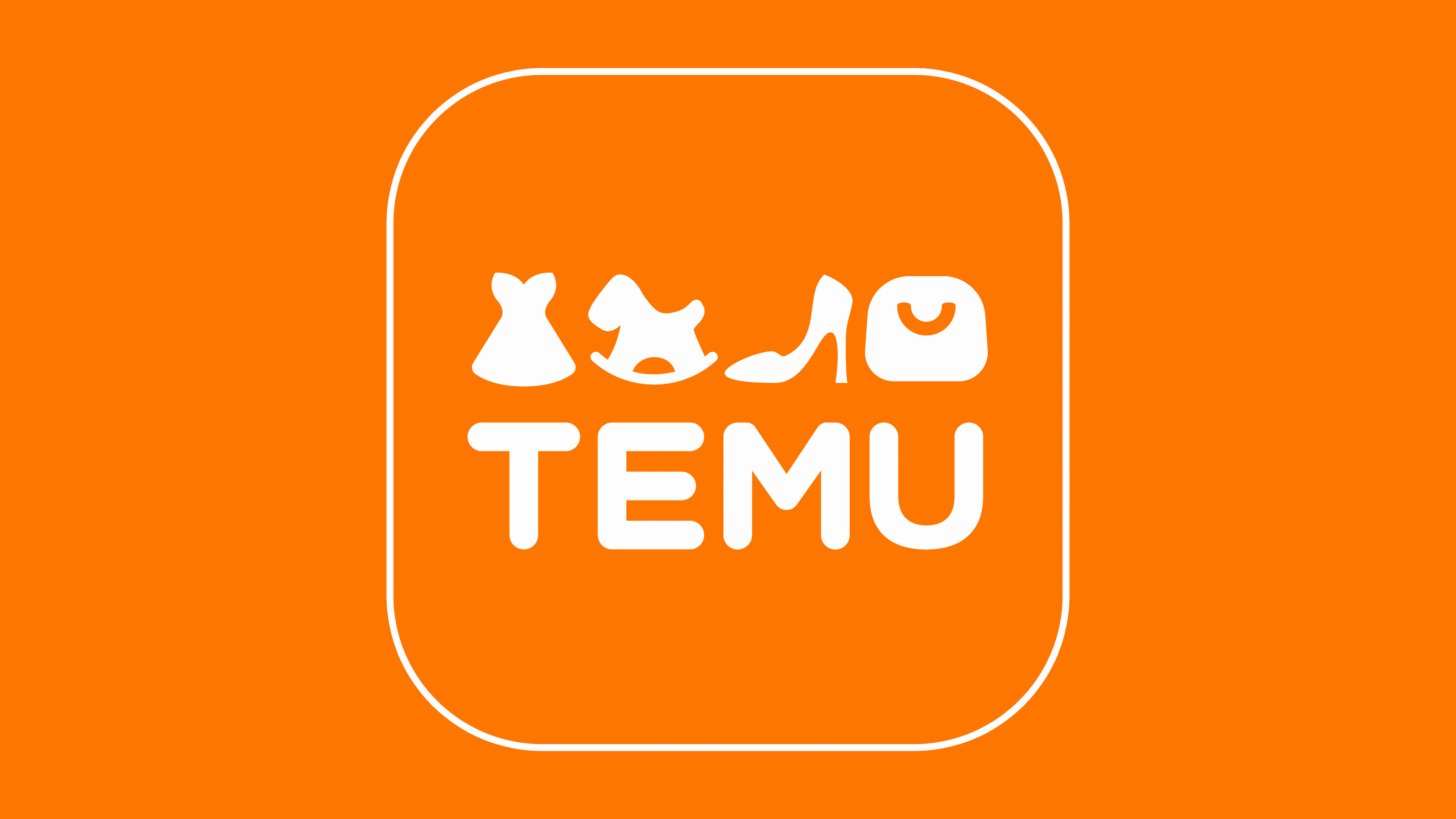
Thanks to active advertising, the Temu logo became known worldwide in just one year. The store’s emblem is a square with rounded corners, matching the look of an iOS and Android app icon.
The soft lines create a sense of friendliness and communicability, inviting one to join the community.
On the orange background, a white inscription reads the marketplace’s name. It is executed in uppercase font. Each letter corresponds to an image of a product, elements of which resemble the symbol in shape.
- The letter T is paired with a dress whose flared skirt matches the width of the letter’s top bar.
- E is placed together with a rocking horse. The toy’s intricate silhouette resembles three horizontal bars.
- M is paired with a woman’s high-heeled shoe. The sharp heel echoes M’s right leg.
- Above U is a lady’s shopping bag. Its shape and handle repeat the letter’s silhouette.
The inscription appeals to those who perceive lines and words more easily. The drawings affect emotional shoppers who are captivated by images. The pairing of figures subconsciously forms the impression that everyone will find their purchase on the platform.
The choice of images speaks of various goods, including clothing, footwear, toys, and accessories.
Symbol

To ensure the visual identity perfectly fulfills the marketing function and supports the prosperity of the new business for the Chinese company PDD Holdings, designers used a bright color. They chose a warm orange for several significant reasons:
- It’s eye-catching and immediately stands out from a dull, monotonous palette.
- Orange is close to the natural sunlight of a hot summer day.
- It is not red, which has become overly familiar to consumers and is associated with aggression or blood.
After weighing all the pros and cons, the Temu logo adopted a pleasant orange color, soft, gentle, tangerine-like, representing both winter (the New Year holidays with aromatic citrus fruits) and summer (the gentle sun, silky beach sand, and a beautiful tan). White contrasts with it because they visually harmonize without clashing or irritating the eye. White symbolizes honesty, sincerity, purity, and openness, making it a perfect choice for a trading platform.
An additional advantage is the playful style and symbolic assortment that meticulously depict various product types. Naturally, there are far more products on the online platform, but in this case, the main categories are shown so potential customers can get a general sense. Thus, the emblem displays four everyday items:
- Dress (clothing);
- Rocking horse (toys);
- High-heeled shoes (footwear);
- Handbag (accessories).
They are drawn as open silhouettes, making them look like cutouts on an orange background, which catches the eye. Beneath them, four letters are arranged synchronously, one under each item. This represents the name of the trading web platform, styled in a curvilinear design. Although the capital letters are straight, all their edges are rounded, making them resemble inflated glyphs in a childlike style. This kind of design attracts visitors because it inspires trust.
The inscription, made in bold font, contrasts beautifully with the orange color, as it is also white, like the symbols above it. The result is an amazing visual image filled with energy, joy, and anticipation of something pleasant. This means the Temu logo is not only modern but also customer-oriented, as evidenced by the online retail store’s high popularity.
Font and Colors
Orange dominates the logo. It’s a joyful and warm shade. It promises a friendly interface, attentive service, and a wide range of products that satisfy every customer. The color emphasizes fun and fashion, complementing the ad’s main message, which the marketplace pays bloggers and influencers generously for.
The white elements of the emblem symbolize novelty, the sellers’ honesty, and the quality of the goods.
The font of the inscription is smooth and simple. Rounded glyphs leave a pleasant visual impression. They speak of harmony and comfort.