


![]() Tennessee Titans Logo PNG
Tennessee Titans Logo PNG
The bright, recognizable logo of the Tennessee Titans represents a professional American football club based in Nashville, founded in 1959. The emblem symbolizes belonging to the state, a close connection between its name’s origin and the myths of Ancient Greece, and the carrying of the light of victory.
The Tennessee Titans are a professional American football team. Since 1970, following the merger of the AFL and NFL, the club has been part of the National Football League and represents the AFC South Division. The team was founded in the 1960s and is based in Nashville, Tennessee.
The franchise emerged as an AFL member in Houston, Texas, and was called the “Houston Oilers.” The team remained there until 1996, when it relocated to Tennessee and changed its name. Initially, it was the Tennessee Oilers, and a year later, it became its current name. Nashville became the club’s final location.
The club’s original owner was Kenneth Stanley Bud Adams. He is the lifelong leader of the “Titans” and the founder of the American Football League. After his death (in 2013), the team was transferred to KSA Industries.
The franchise’s first name change was associated with its move from Houston, when it was renamed the Tennessee Oilers. The second change was driven by a revision of the image and the creation of a more harmonious, thoughtful persona. The fans’ desire prompted this step. The main shareholder listened to them and timed the name change to the opening of a new stadium. This allowed him to demonstrate the club’s close connection with Nashville. This event is dated to 1998.
Adams appointed an advisory committee to search for and finalize a name. He tasked it with finding a bright option reflecting strength, courage, leadership, and other heroic qualities. After two seasons, on December 22, 1998, he announced that the team would be called the “Titans” the following year. The choice was made from Tornadoes, Copperheads, South Stars, and Wranglers.
According to the club owner, this option fully met his criteria: it is tied to the place and embodies masculinity. Indeed, the match with the city’s image was perfect: Nashville residents call it the Athens of the South for its classical architecture, a full-scale replica of the Parthenon, and many universities.
Meaning and History
![]()
The evolution of the Tennessee Titans’ logos directly reflects the team’s history and local features. All because their creators strived to emphasize the attachment to the locality, which serves as a springboard for a sports career. The franchise has seven graphic symbols, each in the official colors: silver-gray, red, white, Titans blue, and dark blue.
What is Tennessee Titans?
The Tennessee Titans are a professional sports team formerly known as the Tennessee Oilers, and before that, the Houston Oilers. It is one of four members of the AFC South. Its headquarters and home stadium are located in Nashville, Tennessee.
1960 – 1961
![]()
The debut logo concept is built around the oil business. The first version depicts a player in sports gear and a wide-brimmed hat instead of a helmet. He is dressed in cowboy boots with spurs. In his right hand, he holds a light brown ball. The team’s name, “OILERS,” is written in white letters on a sweatshirt, set against a large “GO” that encourages forward movement. An oil company is visible in the background of the emblem.
1961 – 1968
![]()
This version is based on the previous logo; it features the same elements, but the differences are in the details. For example, the rugged football player now wears a miner’s helmet instead of a hat and jeans instead of tracksuits. The figure is scaled up and appears larger than in the previous logo. The color palette changed drastically: gold disappeared, gray appeared, and dark blue became light.
1969 – 1971
![]()
In 1969, a completely new graphic was used. The work helmet turned into a sports helmet – a well-recognized image on the player’s head, made in monochrome, without unnecessary details. The only “decoration” is an oil rig, depicted in the same style: strict lines, clear geometry, and wide stripes.
1972 – 1979
![]()
During this period, the team received a different colored emblem with a modified tower shape: in this version, it is elongated and narrows upward. All black lines of the player’s head and helmet became blue. The drilling rig was painted red and white with a blue border.
1980 – 1996
![]()
The logo introduced in 1980 is very concise: it depicts only an oil rig. All other elements are removed. The drilling structure is painted blue, with a white background visible through it. It has two outlining lines, white and red, which run along the outer contour. The team liked the minimalist graphics, so the sign lasted a long time.
1997 – 1998
![]()
This period marks the final 18 years of the tower emblem’s use, even after the franchise moved to Tennessee. The minor changes: dusty colors appeared on the logo, making the colors muted.
1999 – today
![]()
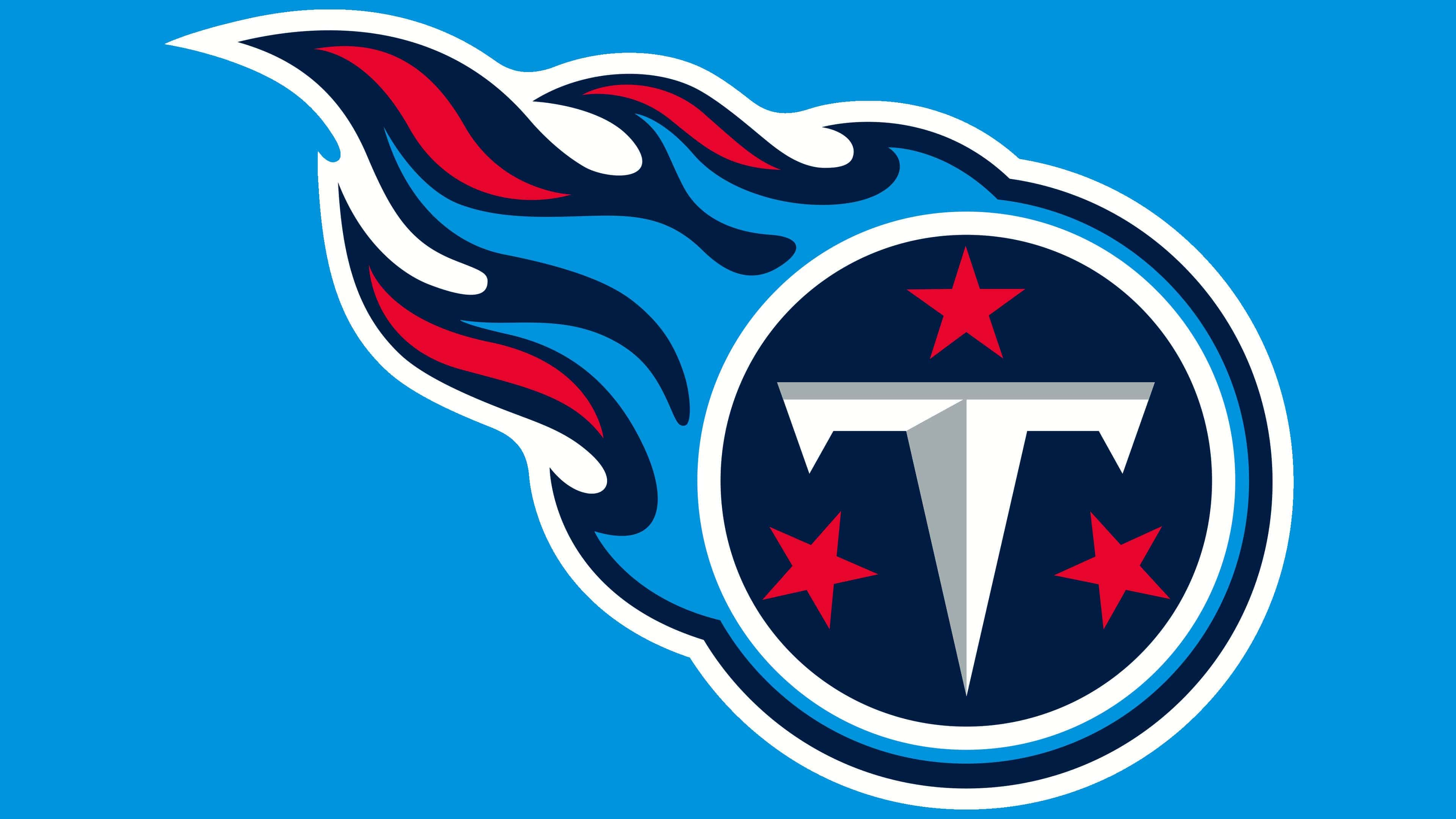
In 1999, the team adopted a new name, necessitating a rebranding that altered its symbolism. The artists presented a completely redesigned design. In their concept, the logo contains the sun (a white circle), three stars (as on the state flag of Tennessee), and a stylized letter “T” (the first letter of the club’s name). A flame trails behind the ball, like from a comet or solar flare. Due to the shadows, the letter appears three-dimensional. The logo uses white, metallic, red, dark blue, light blue, and blue.
Font and Colors
The visual identity of the Tennessee Titans is built on the city’s historical and cultural heritage. The club’s logo reflects the characteristics of the local industry, namely the oil business. The concept dates back to 1960, when the team introduced its first logo with a football player against the backdrop of oil rigs.
In developing the chosen idea, the designers adapted the emblem to the present day. The current version seems simpler in its plot and graphics, but at the same time, it is much more complex in meaning. According to the author’s idea, the letter “T” is a stylized oil rig, the circle with rings is the solar disk, and the three five-pointed stars refer to the flag of Tennessee.
The logo developers used a custom font for the letter T, with no analogs. At the same time, an important part of the letter’s design is its color: the combination of white and silver-gray achieves a 3D effect. This combination also makes the letter “T” stand out against the dark blue circle, with a light blue flame stretching to the left, resembling a comet’s tail. Another official color of the football team, red, is present near the letter, depicting three five-pointed stars and flames.
FAQ
What does the emblem of the Tennessee Titans mean?
The round element of the emblem symbolizes the sun, the three red five-pointed stars represent the Tennessee flag, and the letter “T” stands for “Titans.” The fiery trail stretching behind demonstrates the importance of fire in the myths of Ancient Greece, from which the team’s name originated.
Did the Tennessee Titans change their logo?
No, the Tennessee Titans have not changed their logo since 1999, when the team was finally renamed.
How is the Tennessee Titans logo connected to Greek mythology?
The fiery tail behind the circle expresses the logo’s connection to the myths of Ancient Greece. Fire, as it is known, holds special significance in ancient Greek mythology.
Why is Tennessee called the Titans?
The city of Nashville, where the team is based, earned the nickname “The Athens of the South.” To reflect this connection to Ancient Greece, the local football franchise was named the Titans.