


![]() Terraria Logo PNG
Terraria Logo PNG
The Terraria logo is fabulous and magical. Transfers to the arcade world, demonstrating its nature and the type of game and graphics to the user. The emblem invites you to become an explorer and gatherer, trying yourself in the role of Robinson Crusoe.
Terraria began in January 2011, when programmer and game designer Andrew “Redigit” Spinks started building a two-dimensional sandbox from his home in Floyds Knobs, Indiana. Before that, he was known in a small circle as the lead developer of Super Mario Bros. X. He was joined by artist Finn Brice, assistant Jeremy Gerrett, composer Scott Lloyd Shelly, and Whitney “Cenx” Spinks, who worked on design and community relations.
The game was made with Microsoft XNA and C#. After a beta version leaked online, Re-Logic released Terraria earlier than planned. It appeared on Steam for Windows on May 16, 2011, and sold 200,000 copies in its first week. Comparisons with Minecraft by Mojang Studios followed, though Terraria placed more weight on combat, progression, bosses, and item systems.
Update 1.1 arrived in December 2011, adding monsters, bosses, companions, items, lighting changes, and world-generation improvements. In February 2012, Spinks announced the end of active development, but Engine Software and 505 Games handled console ports. The Xbox 360 and PlayStation 3 versions were released in 2013, while Codeglue handled the iOS and Android ports.
Spinks returned to PC development in 2013, and update 1.3, released in July 2015, added enough content to renew Steam’s interest. Terraria: Otherworld was later canceled in 2018. Journey’s End, update 1.4, launched on May 16, 2020, when sales had passed 30 million copies. In 2021, a blocked Google account led Spinks to cancel the Stadia port. By October 2024, Terraria had sold over 60 million copies, including about 33 million on PC, with no paid expansions or microtransactions.
Meaning and History
![]()
The game’s logos are very consistent. Even if you change the version, the old emblem continues to be used alongside the new one. It’s all about a good idea for a sign that simply doesn’t make sense to change radically.
What is Terraria?
A super-popular survival-arcade game developed by the private American studio Re-Logic. Over 50 million copies have been sold in nine years. Allows the player to create their world from scratch.
2011 – today
![]()
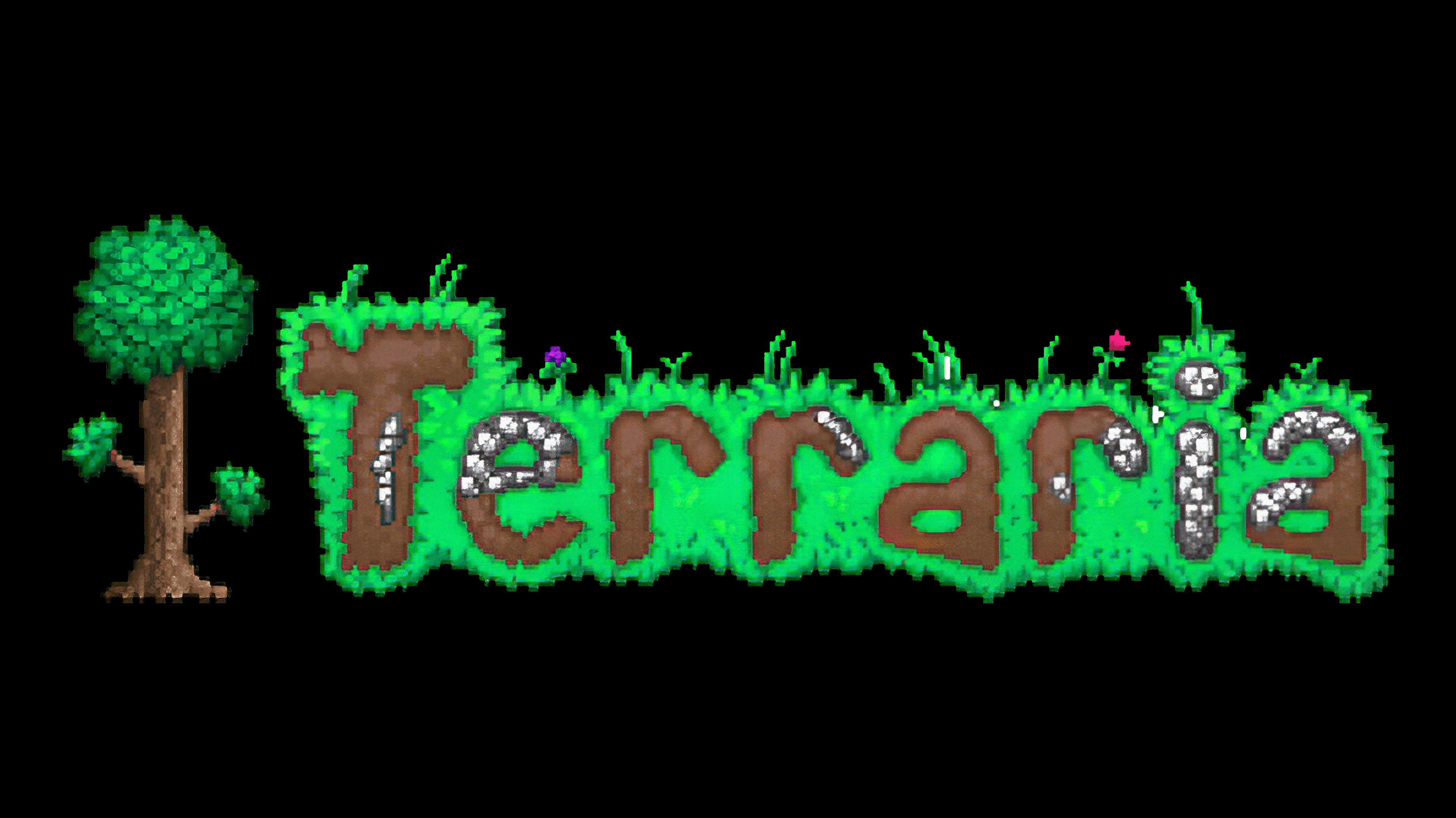
The emblem is part of the playing field: the name is on the green grass background, and in front of it is a tree. The image conveys the device of the world. Terraria has a lot of greenery. The player walks on a green surface. This is what the logo’s background reflects. For greater realism, blades of grass and flowers have been added to the upper surface. The background repeats the outlines of the inscription surrounding it.
Tunnels form all name letters dug into the ground. Most of the playing field is occupied by soil extending down from the top green cover. It contains stones, ore, and other “treasures” that the player can dig up using a hoe. In doing so, he creates underground tunnels. The letters represent these passages. And for greater similarity, stone elements are added to some of them.
The tree before the name is a maple. It fully reflects the trees in the game world. The participant can use it to extract timber. It is a symbol of good luck, prosperity, growth, and development. Two additional lower branches seem to invite you to climb up.
Depending on the world and weather the user has chosen, the logo’s color and details change. For example, a tree loses its leaves in winter, and in the desert, they are replaced by cacti, etc.
2020 – today
![]()
By the game’s ninth anniversary, a major update, 1.4, titled Terraria Journey’s End, was released. The developers reported that this is the last version and that there will be no further versions. Along with the rewriting of many details and the appearance of the golf mode, the logo has also been slightly tweaked.
Its update is minor, completely preserving the previous version’s image. The main difference is in size. The emblem brightened, grew larger, and increased in contrast, while the grass cover became fluffier.
Font and Colors

The main colors of the logos are green and brown. They represent grass and earth.
- Green is pleasing and soothing. Shows that life is flourishing in the arcade. It predicts a long future with many new versions.
- Brown conveys the program’s and code’s stability and reliability. It is the color of the wealth the game brings to its creators and users.
The font is authentic and bold with jagged edges. The letters are reminiscent of the player’s basic tools. Rs look like hoes, and Ts look like an ax or pickaxe.