 TF2 (Team Fortress 2) Logo PNG
The designed TF2 logo is a stylized image of a sight. It looks like a modified radiation sign, but without a circle in the middle. The emblem is complemented by white “TEAM FORTRESS 2” lettering with wide brown outlines around each letter.
Team Fortress 2 traces back to 1996, when students Robin Walker and John Cook released Team Fortress, a free Quake mod built around team combat and nine character classes. The mod gained a strong audience, and in 1998, Valve Corporation hired Walker and Cook, then announced a full sequel under the working title Team Fortress 2: Brotherhood of Arms.
To keep players engaged during development, Valve released Team Fortress Classic in 1999 as a Half-Life engine port of the original. TF2 itself changed direction several times. Early versions leaned toward a realistic military shooter with a real-time commander directing the squad. Still, the hierarchy was dropped, and the visual style moved away from photorealistic war design.
In July 2006, Valve showed a new trailer at an Electronic Arts press conference, revealing the final stylized look inspired by 1960s spy films. Beta testing began on September 17, 2007, for players who pre-ordered The Orange Box. On October 10, 2007, TF2 launched for Windows and Xbox 360 as part of The Orange Box, which included Half-Life 2, Portal, and two expansions. A PlayStation 3 version followed on November 22.
TF2 later became a standalone Windows release on April 9, 2008, with macOS support in June 2010 and Linux in February 2013. The Meet the Team shorts, released from 2007 to 2012, helped define the nine classes beyond gameplay. In September 2010, the Mann-Conomy update added paid items through the Mann Co. Store. On June 23, 2011, the Uber Update made TF2 free-to-play, added new weapons, and introduced Meet the Medic. In 2012, Pyromania introduced Source Filmmaker, while Scream Fortress and Smissmas became annual events.
Meaning and History
What is TF2?
TF2 is an acronym for Team Fortress 2. Valve Corporation released this 2007 game after nine years of development. The multiplayer shooter attracts more than 100,000 people daily and is one of the most popular products on Steam. It is based on Half-Life and Quake mods, where gameplay centers on the confrontation between two teams.
Valve’s Team Fortress (pre-release)
Team Fortress 2: Brotherhood of Arms (pre-release)
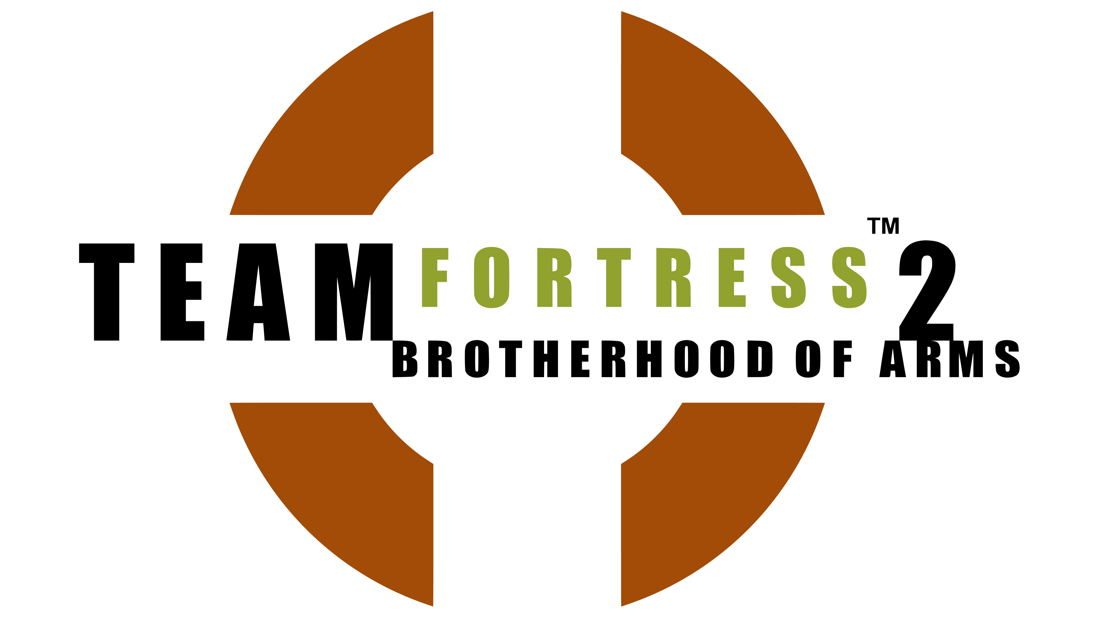
2007 – today
The logo has not changed since the game’s release: it looks the same as it did in 2007. It was based on two experimental emblems created before the official release of Team Fortress 2.
It is assumed that Valve Corporation is the author of the current TF2 logo, as it was involved in all stages of the shooter’s development. The most memorable element of the identity is a symbol in the form of a stylized sight. It consists of four curved trapezoidal fragments arranged in a circle. Each of them is painted in different shades of brown with a gradient. White stripes separate the constituent parts (at the edges) and a medium-sized circle (in the center).
The game’s full name is written in large white letters, set in the bold sans-serif typeface. Wide brown shadows follow the outline of each glyph. They are shifted down to the right, creating the illusion of three-dimensionality. Between the words “TEAM” and “FORTRESS,” more precisely, right on the letters “M” and “F,” another improvised sight is depicted. It has the same configuration as the main sign but is reduced several times and repainted black without a gradient.
Since TF2’s gameplay revolves around weapons, the shooter’s main distinguishing feature is its scope. However, it does not have a classic look; it resembles a heavily distorted radiation symbol. Negative white space between four colorful shapes forms the central circle and lines.
Font and Colors
The “Team Fortress 2” name on the logo is in a font similar to Compacta Bold. It slightly resembles the Impact that Valve used for the logo of the Team Fortress Classic video game. All letters are white and capitalized, with an orange outline and a brown gradient surrounding them. The large symbol shown below has the same palette. But the four fragments of the mini-sight are completely black.