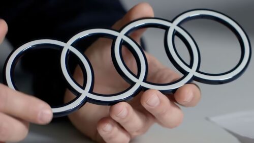
In mid-November 2022, the famous auto giant amazed the world with a new car and a modern logo. Surprisingly, the Q8 e-tron model he debuted pairs perfectly with the 2D badge. The 2D design has become a sign that the company is attentive to fashion trends in identity. One of them is simplicity. Therefore, the manufacturer tried to embody it in a figured element to decorate the hood of a branded car adequately.
Even though the Audi logo has not changed much since its inception, it still remains responsive to the trends of the times. The sign has repeatedly adapted to different styles, retaining the original face. So this time: the legendary symbol has recognizable outlines but a modernized design, in some ways even revolutionary.
The developers tried to make the emblem look equally chic in a print magazine, on a computer display, on a billboard, on a smartphone screen, and a car body. André Georgi, the designer, told this. The flat look of the classic rings gives the logo a more modern look, although their geometry is almost identical to previous versions. This time they came out graphic, harmonious, and impressive.
The new logo has a black background. It is an excellent base because it contrasts distinctly with the white rings. The dark frame enhances their “radiance” so they can be seen better at night and catch the eye even from a distance. However, the impetus for the sign change was not the desire to improve the visual identity for the sake of beauty. The German car manufacturer was driven by the desire to diversify the number of customer contact points. Therefore, he wanted to modernize the rings on all products.
The only thing missing from the new emblem is the chrome effect. He is completely absent. And in addition to the four rings, an inscription with a unique font called Audi Type is attached. It will be used in future models.


