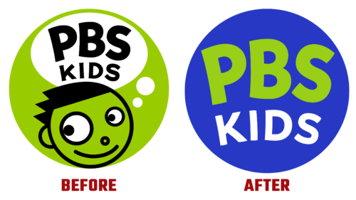
Educational TV channel No. 1 for children announced its intention to get rid of the talisman named Dash at the end of June 2022, and on July 19, it implemented its plan. The updated emblem is designed with many factors in mind: the psychology of today’s kids, the needs of families, digital technologies, scalability, and brand awareness. The authors relied on the fact that it is already well known among the target audience, so they made the sign simple, universal, and understandable.
Now the lime green boy is missing from it because, logically, he has grown over the years of the educational media platform. Now its place is taken by the PBS Kids text logo. There are no children or animals in it. It is based on an advanced graphics package that the channel’s management began implementing last year. A bright palette characterizes the current version. It is dominated by cheerful colors, clear visual effects, and large bold letters. All this signals safe, useful, and interesting content.
At the same time, the PBS Kids logo retained its original shape – a circle with a solid fill. However, it is now a bright blue, almost cobalt blue. The branded green inscription on it looks very attractive and even intriguing. And the standard white balances them. It adds visual balance to the two flashy colors and brings calmness to the iconography of the iconic sign.
The letters are evenly distributed over the surface of the circle. They are massive, wide, large capital. Both parts of the name are aligned both right and left, for which the word “Kids” is slightly reduced. So the designers showed the hospitality of the channel and its willingness to adapt to the needs of its age audience. As Sara DeWitt (CEO and Senior Vice President) noted, the new logo represents a modern take on a TV channel that is trusted and loved.


