


![]() PBS Kids Logo PNG
PBS Kids Logo PNG
The PBS Kids logo showcases a block of programming filled with childhood. This is a specific list of useful and safe content united by a single thread. Curiosity, knowledge, and development lie behind the emblem.
Meaning and History
![]()
PBS Kids was launched in 1993 as an initiative of the Ready to Learn project, designed to facilitate access to educational programs for children from low-income families. In 1994, the authors combined the programs into a PTV block and added a new P-Pals badge. It collected animated characters in PBS network logos, representing educational materials from PTV Park’s fantasy world.
In 1999, the Public Broadcasting Service reopened PBS Kids, which included several broadcast and video programs under a common brand. The programs were intended for children aged 3 to 8. The children’s channel worked in this format for six years. Then, in 2000, Bookworm Bunch was added to a Saturday morning block. In 2004, PBS Kids Go! Programs appeared to be aimed at children in senior school.
In 2005, the network closed, giving way to commercial cable and satellite channels. For a long time, the children’s TV service existed separately and was part of a package of various streaming players. Its final relaunch took place in the winter of 2017 across multiple platforms. Every major update brought its own logo, five in total.
What is PBS Kids?
It is the American brand of children’s television programs broadcast by the Public Broadcasting Service and the television channel of the same name. The program first appeared in 1994, and in 2017, it became a round-the-clock channel. Her website was later launched.
1993 – 1999
![]()
The PBS Kids debut logo was animated and appeared alongside the channel’s opening. It was developed by the studio WGBH-TV, with designers Chris Pullman and Gene Mackles. The logo was based on the 1984 test channel Ready To Learn, which operated in eleven test markets. It consisted of three stylized heads in different colors decorated with patterns.
The image represented anthropomorphic creatures with arms and legs. They were called P-Pals and were set against a neutral white background. Their colors constantly changed in the animated version, stopping in blue, orange, and green. The little people danced and sang, “This is P-B-S!” And then froze when a barking red dog appeared at the bottom edge of the screen. At this time, the extreme head said, “Woo-hoo-hoo!” And the baseball cap flew off it. In the lower corner was the PBS channel’s name. It was painted black. Since 1997, the designation E/I has appeared on the logo as a balloon. In this form, the emblem existed until 1999.
![]()
In parallel, a static, printed version was used. It was also based on three heads only in a monochrome palette. The first head was black, the second was white, and the last was black. Only the first was visible, while the rest were depicted in negative space and acted as the background for the extreme. On the right side, a large “PBS for Kids” sign was painted in different colors (red, green, and blue). The letters were “bouncing,” so they went beyond the straight line. Designers supplemented them with wide rectangular serifs.
1994 – 1999
![]()
In the summer of 1994, the children’s channel was renamed PTV. But this measure was not a radical rebranding, since the logo featuring the P-Pals heads was used until 1999. The P-Head version was based on another PBS emblem from 1971. The new logo featured a blue head facing left (in previous versions, the head faced right). Next to it was the letter “T,” composed of miniature red balls and a black-and-white “V” within a vertical green rectangle.
1998 – 1999
![]()
PBS Kids emerged as a concept in early 1997 and was part of a renaming process that was underway during ongoing research and experimentation. This emblem has been used in promotional videos, splash screens, and animated FableVision. It had a large red circle with three heads, like the 1993 PBS for Kids logo. Below was a wide yellow half-arc directed upwards. It contained the channel’s actual name, followed by an exclamation mark. The acronym “PBS” was white; the word “Kids” was red. The font used is Lubalin Graph Demi. Big Blue Dot designed her.
1999 – 2013
![]()
On the day of the premiere of Dragon Tales, the P-Pals’ (three multicolored heads) image was completely abandoned, and the TV channel’s new name was approved: PBS Kids. At the same time, mascots appeared on it, Dash and Dot. The logos were designed by Lee Hunt Associates, which included Richard McGuire, designer for The New Yorker, and Bob Shea. At first, the identity animation was produced by King Camera and Passion Pictures, but in 2000, Primal Screen released updated versions of the television logo.
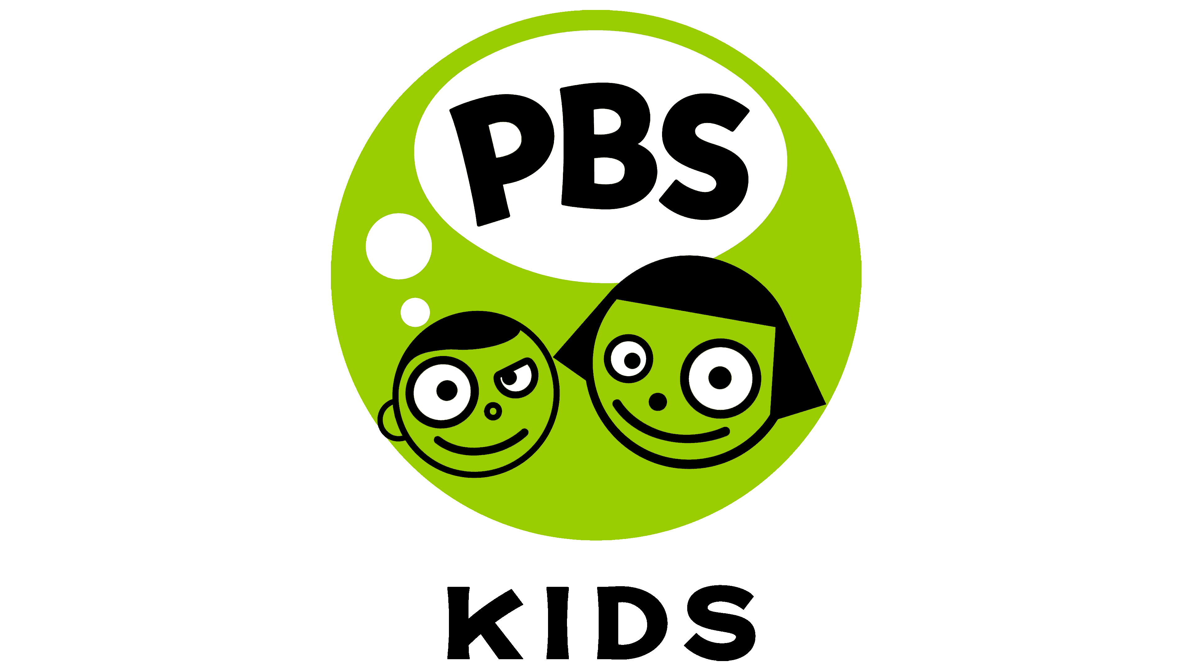
The round logo featured two smiling faces, one a boy and the other a girl. They had different hairstyles, but otherwise everything looked the same: round eyes (one large, the other small), a dot-shaped nose, and a half-arc extending upward, indicating a closed mouth. From the heads emerged small white circles, forming a speech cloud with “PBS” written in black grotesque. Beneath the green balloons was the word “Kids” in a sleek, capsized typeface.
2008 – 2022
![]()
In 2008, the emblem underwent a minor change. The designers enlarged the balloon and the dialog bubble to accommodate the “Kids” caption. As a result, the name of the children’s network became integral. The developers also tweaked the color to light olive. In 2013, the company dropped the Dot badge, leaving only the Dash variant. But in the programs, the deleted version is still used alongside the new characters Dee and Del. The main creators of the PBS Kids’ on-air image were Primal Screen Studios, Interface Media Group, and Karptoons.
![]()
The children’s channel’s identity underwent a long and serious redesign, after which it received the most harmonious logo. Development moved from multi-structured forms to simple, singular ones. Therefore, instead of three faces in the profile, one is used and placed in full face. It is cheerful and smiling, which corresponds to the mood of the children’s audience.
Two typefaces were used in the logo at different times: Lubalin Graph Demi and PBS KIDS Headline. In the early versions, the signature palette consisted of red, blue, and green; in the later versions, it was yellow, white, black, and olive green.

2022 – today
![]()
The new PBS Kids logo drew mixed reactions among viewers: while some see it as an embodiment of fresh ideas, others consider it another “victim” of minimalism. It was presented on the last day of June 2022 and debuted on television on July 19. A green boy named Dash has disappeared for the first time in 23 years. Now, the emblem contains only the TV channel’s name, divided into two arched lines. The letters “PBS” are large and green. The word “KIDS” is almost half the size of the abbreviation and is painted white. The base, as before, is round, but now it is bright blue.
This results from collaborating with PBS Kids’ designers and the American company Lippincott. Even though the logo was presented just now, work has been ongoing since 2019. First, the experts found out whether it was possible to eliminate the Dash mascot and how the audience would react to such a change. After interviewing 33 US families, the staff found that children do not view the boy’s face in the emblem as mandatory and are not at all attached to the child’s character. It turned out that the target audience recognizes the TV channel’s logo by its typography, even among those who cannot yet read.
So, the designers began to take an unexpected direction: the logo of the children’s channel with a “non-childish” design. Of course, there is nothing adult in him, but there is also no funny boy. From a functional point of view, this made the emblem universal, as it must now adapt not only to widescreen TVs but also to the small screens of mobile devices. Therefore, the inscription became larger and more legible.
Font and Colors
When Lippincott found that viewers would recognize PBS Kids by its typography, they decided to focus on that aspect. As a result, the TV channel’s name became the sole element of the logo, with the round base the only other element. To improve its readability, the designers enlarged the letters. In doing so, they retained the original bold font known as the PBS KIDS Headline. Art studio Chank Company created it specifically for the children’s TV channel.
The rebranding also touched on the color scheme. The green circle has turned blue for greater contrast; the inscription stands out well against such a background. The first word, “PBS,” on the other hand, is recolored in lime green. The emblem’s designers made the second line white to balance the bright colors.
FAQ
Why did PBS KIDS change their logo?
The brand updated its logo to remain fresh and relevant as digital media evolves. They introduced a new logo to keep up with current trends and appeal to young viewers and their parents.
The update aims to ensure the brand looks consistent across all media platforms. Because kids use different devices, a consistent look helps people recognize and feel brand loyalty. The new logo is more fun and attractive, with bright colors and a simple design that will catch the attention of both children and adults.
What does PBS KIDS stand for?
This is the children’s programming section of the Public Broadcasting Service (PBS) in the United States, intended for children ages 2 to 8. The project aims to provide educational content through TV shows, online platforms, and multimedia applications to support early learning.
The brand’s content helps children develop important life skills such as literacy, math, and social-emotional skills in a fun and engaging way. It is known for its high-quality content that parents trust, featuring stories, colorful animation, and interactive elements that attract young viewers. The brand offers digital content, including streaming videos, games, and activities on its website and app, making learning accessible to children anytime.
Who designed the PBS KIDS logo?
Chris Pullman and Gene Maccles designed the original logo. Richard McGuire, known for his work at The New Yorker, and Bob Shea did the latest update. Chank Co. created the fonts for this logo. This team effort combined unique styles and skills to create a logo that looks good and fits well with the brand’s focus on educating young viewers. The new design retains the fun and lively feel of the original while adding a modern twist that reflects the brand’s goals.
What happened to the PBS Kids logo?
The logo changed significantly in 2014 when the character Dash was removed from the main logo. After Dash was removed, Dee and Del, introduced as Dash’s younger siblings, began appearing in some of the brand’s shows. Although Dash was no longer in the main logo, the character appeared in separate animated segments. This update was an attempt to keep the brand attractive and relevant to younger viewers.
What is the PBS Kids slogan?
The slogan “PBS KIDS. Be More Inspired” reflects the brand’s aim to motivate young viewers through educational content. The phrase “A small miracle goes a long way” emphasizes the power of curiosity and learning. Both slogans are intended to show how educational television can promote children’s creativity and knowledge, making learning memorable and enjoyable.
How do you make the PBS Kids logo?
To create a PBS Kids logo, use basic art supplies such as pencils and paints, or choose digital graphic design software. Start by reviewing existing logo versions to get the right design and colors. If you need help, there are plenty of tutorials online, including YouTube videos. These tutorials provide clear step-by-step instructions on freehand drawing and digital creation techniques. This way, anyone can create a logo regardless of their artistic skills and preferred medium.