The Flash logo is sturdy, unbendable, and gleaming. Its metallic base signifies the extraordinary abilities of the character. The emblem is full of energy that surrounds the superhero-like an aura. The symbol is like a bullet speeding past at an enormous velocity.
The Flash: Brand overview
| Founded: | October 7, 2014 – present |
| Founder: | Greg Berlanti, Andrew Kreisberg, Geoff Johns |
| Headquarters: | United States |
The Flash is a series dedicated to the DC Comics hero. It aired on The CW Television Network. Nine seasons of 184 episodes were filmed. Each episode lasts 42 minutes. It tells about investigator Barry Allen, who, after an accident with an explosion, gains extraordinary power and uses it to fight criminals.
Meaning and History
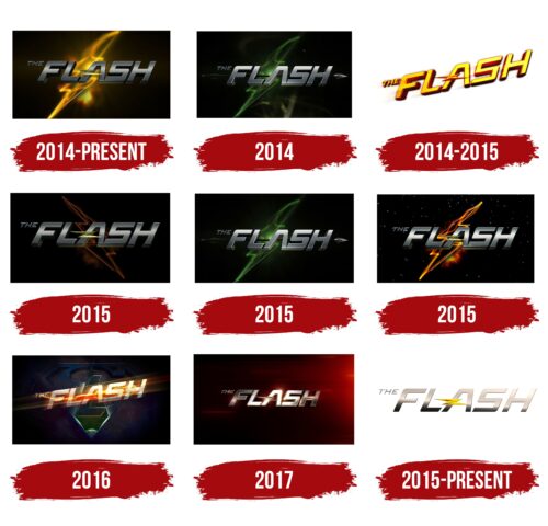
The Flash has a multitude of various logos associated with the existence of Arrowverse, leading to the release of crossovers when the main character appears in the series of other Universe characters, and they in his. Separate emblems are created for each such episode. The number of logo versions increased due to the development of the multiverse idea, where the hero can meet doubles from other Earth versions.
What is The Flash?
This is the name of the series and its main character. It was introduced in 2014. About 5 million viewers watched the first episode, making the project the owner of the most popular premiere. Since then, the episode has been viewed 13 million times on various sources. The series is so beloved that DVDs and Blu-Rays with episodes that did not air were released.
2014 – today
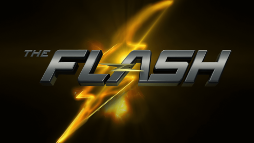
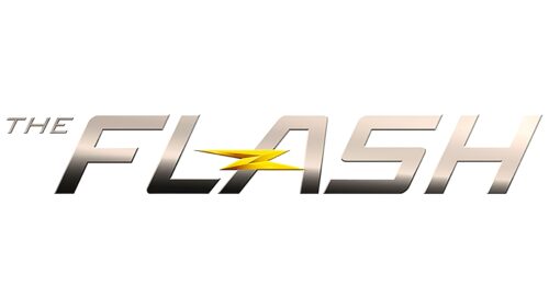
The show’s logo is a volumetric grey inscription, as if made of metal. Instead of the crossbar of the letter ‘A’ are two streaks of lightning, symbolizing the trail left by a rapidly moving object. This alludes to the main ability of the hero – to move faster than the speed of light.
In fact, the name ‘Flash’ has been borne by four characters. The series is dedicated to the second – Barry Allen, as it was he who emerged during the height of comic book popularity (the Silver Age) and was part of the Justice League.
In the background of the inscription is a spreading lightning, which tells us about:
- The lightning that struck the character during the explosion of the particle accelerator. It is thanks to this lightning that he gained his abilities.
- Flash himself, who is running. The drawing vaguely resembles the silhouette of the superhero in motion. During movement in the movie, he left behind a trail of particles.
The blur of the lightning also speaks to the superhero’s ability to cause particle oscillation.
The metallic letters look very strong, as Flash has a special bone and muscle structure that allows him to withstand high loads.
2014
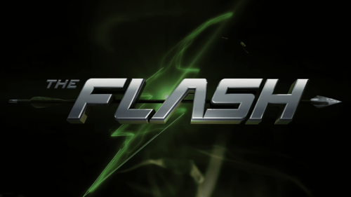
At first, in 2014, the pilot episode of the series appeared. Its logo was slightly different from what was used in the first season. As the movie originally intersected with the already-released and popular series about Green Arrow. The same creators, writers, and directors worked on both projects.
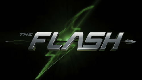
The emblem was the same metallic inscription. However, the spreading of lightning was done in green, uniting the story with the character of Green Arrow. In the background, under the title, was an arrow.
2014 – 2015
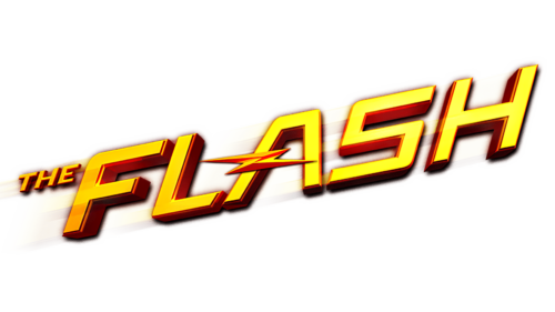
In 2014, a full first season of the series was ordered. It ran from October 2014 to May 2015. Its emblem was a metallic inscription with the hero’s name, made of gold with red sides, instead of the crossbar in ‘A’ – a lightning bolt.
The rise of the word from the bottom up speaks to the development of the plot, which eventually grew into nine seasons. Gold and red color are shades of the hero’s trail. And the lightning bolt is directly associated with the character’s name.
2015
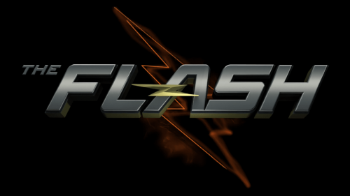
In the second season of the series, a multiverse is introduced in which the superhero’s double – Flash of Earth-2 exists. He also had an emblem. On it is the usual metallic inscription, in the background of which are red outlines of lightning. The main feature of the zigzag is a tilt in the opposite direction, reminiscent of a reflection in a mirror. In this interpretation, lightning perfectly conveys the idea of the second Flash.
2015
In 2015, the second crossover between Flash and Arrow, called Heroes Join Forces, was released. For it, the previous logo with a green glow and an image of an arrow was used, but with a cleaner dark background.
2015
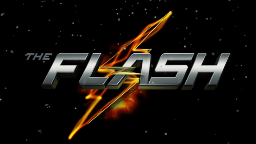
A fiery variation of the emblem is placed on a black starry background. Flash’s zigzag is very visible due to the more distinct yellow outlines. The lighting is pierced by energy cobwebs, and in the background, a flash of light is visible. The theme echoes the stories of travels in the multiverse.
2016
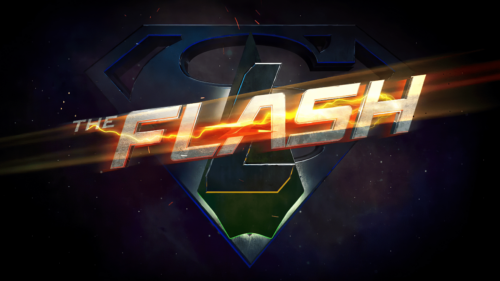
In 2016, another crossover between the series titled Invasion! was released. It again featured Arrow and Flash along with Medusa. The episodes spanned across four series, including DC’s Legends of Tomorrow.
The combined logo incorporates elements of all three heroes layered upon each other. The S from the superheroine, Arrow’s arrowhead, the L from Legends, and the golden metallic inscription with lightning from Flash. Flash’s sign is the brightest and is bathed in the light trail left by his flight across the screen.
2017
In the third season, the logo changes slightly. The usually dark image background acquires a red gradient as if the inscription is approaching a glowing planet or fire. In the middle is the hero’s name in bright metal. Light falls on the word, causing the letters to shine from its rays. The idea of Speed Force, a cosmic force propelling space forward, is present in the series’ plot. Flash ends up in it at the end of the season. The glow on the emblem reflects the Speed Force. It’s also possible that the bright light represents the future in which the events occur. The red hue suggests a murder happening behind the scenes, which the superhero strives to prevent.
2015 – today
Starting from the second season, the logo has changed and remained consistent. The character’s name is written neatly. Traces of gold can be discerned in the letters with gradients. Overall, the emblem simultaneously speaks of The Flash’s strength and speed. The alignment of the inscription grounds the runner, as he can’t fly, contrary to what seemed to be in the first season’s logo.
Font and Colors
Yellow, red, and metallic are the franchise’s main colors.
- Yellow represents lightning. Its strike gave Barry power from the particle accelerator.
- Red is energy. The hero moves and thinks so fast that the human eye can only see a red trail in his path.
- Metallic indicates the character’s super endurance and resilience. It protects from friction damage. His molecules are unique. Their vibration can demolish buildings, guide Flash through walls, and cause earthquakes.
The black background, on which all logos are placed, was chosen for the beautiful contrast with the energy depiction. It signifies the concealment of abilities from human eyes and events taking place under cover of night.
The font of the inscription is simple and smooth, as a streamlined flow is needed for fast movement.
The Flash color codes
| Almond | Hex color: | #ead8cb |
|---|---|---|
| RGB: | 234 216 203 | |
| CMYK: | 0 8 13 8 | |
| Pantone: | PMS 482 C |
| Eerie Black | Hex color: | #161514 |
|---|---|---|
| RGB: | 22 21 20 | |
| CMYK: | 0 5 9 91 | |
| Pantone: | PMS Black 6 C |
| Ginger | Hex color: | #b16200 |
|---|---|---|
| RGB: | 177 98 0 | |
| CMYK: | 0 45 100 31 | |
| Pantone: | PMS 717 C |
| Icterine | Hex color: | #fff94e |
|---|---|---|
| RGB: | 255 249 78 | |
| CMYK: | 0 2 69 0 | |
| Pantone: | PMS 395 C |
