The Raffles London at The OWO, an elite hotel based on Class II architectural monument in London, previously owned by the military, is nearing completion. The facility is located in the very center of the British capital on the world-famous street of historical value – Whitehall. This location of the new hotel and its intended purpose posed a very difficult task for the corporate identity designers – the consulting company Greenspace. It had to provide unity and harmony with the historically important environment. The majesty of the architectural ensemble itself, its antiquity, as well as the history in which it served as part of the palace, as a military institution, and as an office demanded a different look at the ways of reflecting a new essence for it – luxury, absolute comfort, and hospitality.
Understanding the need to observe the maximum authenticity of the historical heritage in design and naming became the main task of the entire Greenspace team participating in this project. It took a deep immersion into history, the study of a large number of archival materials. In the old letters that were sent from the old military department, the abbreviation OWO was ubiquitous. It was decided to take it as a basis.
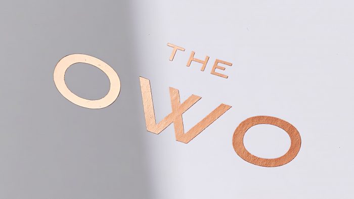
The name turned out to be very effective in its sound and its graphic design. I was attracted by the absolute symmetry in a single combination of letters. It was decided to write in the font that was used at the beginning of the 20th century. After studying a large number of different types of grotesque typefaces that were made at that time in British foundries, including Stevenson Blake from Sheffield, it became clear that in the original design, such a font would not be able to match the style of the building, the spirit of modernity, and the requirements of modern digital resources. It was necessary to create a new original font, which would be close to the old one in its visual characteristics. Colophon Foundry was involved in its development, creating a new font family – Grotesque 1906, which reflected the ideas of a modern elite hotel, which is the heir and part of great world history.
To apply the logo with the text THE OWO, it was decided to apply a different color palette, depending on the location – gold, pure white on a black background, and vice versa, which gave it aristocracy and severity, even some stiffness characteristic of every Englishman.


