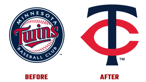
At the end of this year, the Minnesota Twins unveiled a new logo for their next MLB games. She accepted it on the eve of the next season to demonstrate increased sportsmanship and an improved image. So the club intends to revive its glory.
The main emblem consists of intertwined letters – an abbreviation of the phrase “Twin Cities” (in honor of the tandem of Minneapolis and Saint Paul). Despite the official name, the franchise uses this variant. Moreover, it cannot be said that one of the two glyphs is predominant in the monogram: they both dominate it, and both are in the foreground. It’s just that “T” is vertical, and “C” is horizontal. To better distinguish the signs, the designers painted them in dark blue and red colors.
The lower letter is stylized as the thymus bone, which is believed to symbolize good luck and happiness. She has a narrow protruding part directed to the left side, and she herself is flattened and elongated. The glyph sticking up has an arched cap with the ends down. The leg “T” goes through the center “C.” Now the team has abandoned the words “Minnesota Baseball Club,” settling on a short version. Such an emblem looks minimalistic because it does not contain many details.
Thus, the team is “reborn,” gaining strength to play games adequately: it intends to win the AL Central in the coming year. In the meantime, during the off-season, the franchise is taking various steps to strengthen the spirit of the athletes and expand the circle of fans.


