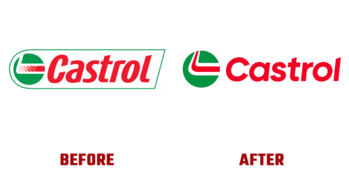
At the beginning of this spring, Castrol adopted a new visual identity. This decision was due to the intention to create unprecedented opportunities for growth and success, but also to the decision to intensify investments for the future. This is what Nicola Buck, Director of Marketing, said.
The CEO Michelle Jou added that in this way, Castrol becomes a brand that inspires its customers, meets their needs, and supports them in any endeavor. She also said that the logo change is not just a cosmetic measure but a strategic step toward long-term success. Work on the logo was entrusted to the branding and design agency Landor & Fitch.
But the main purpose of the fuel brand renewal is to meet customers’ expectations. To do this, the developer previously studied the opinion of stakeholders, industry experts, and consumers and analyzed everything in detail. The conclusions he obtained embodied a bright, practical, and modern emblem which focuses on the strengths of the company. To evoke a positive response from clients, the design agency:
- kept the basic colors associated with the brand;
- introduced a lot of dynamics and energy;
- added lots of flowing lines and roundings;
- separated graphic elements from the text.
The sound harmoniously complements the forward motion as Castrol has moved to a new sonic identity. Thus, the visuals are on the same wavelength as it, evoking a sense of acceleration and forward thrust. This is shown by the three white and red lines that turn sharply to the right and the company name in a grotesque font in a fiery spectrum.


