The original corporate design sets the Castrol logo apart from the competition. It conveys impeccable product quality, high demand, and naturalness. Bright accents quickly attract attention and show the activity of the company. The mark also reflects the movement that branded oils and lubricants bring.
Castrol: Brand overview
| Founded: | 9 March 1899 |
| Founder: | Charles Wakefield |
| Headquarters: | UK and USA |
| Website: | castrol.com |
Meaning and History
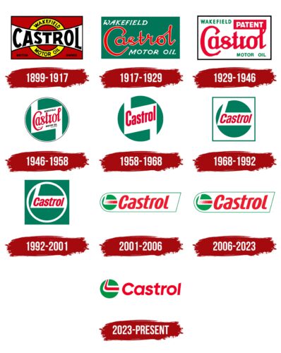
For more than a hundred years of Castrol’s operation in the company’s target audience market, nine variants of the logo have been presented. With the exception of the first logo, introduced in 1899, all subsequent redesigns were done in the same style, which greatly increased the brand’s visual recognition.
What is Castrol?
This is one of the most famous companies globally that specializes in the production of engine oil. Products manufactured by this brand are available to car owners in more than 100 countries worldwide.
1899 – 1917
The Castrol brand has a history that goes back to the end of the 19th century, namely the Wakefield Oil Company. Charles Cheers Wakefield created her.
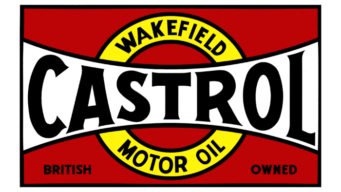
The logo at this stage was a red rectangle with several elements inside. There was a thick white horizontal line in the center with “Castrol” written in classic bold sans-serif. All black letters were capitalized. Also, if you look closely, you can see that they are arched. Around this horizontal line was a yellow circle with two black outlines. The company’s name was written on top and bottom, namely “Wakefield” and “Motor Oil.” This element was also done in a classic font, but the lines in the words are much thinner.
1917 – 1929
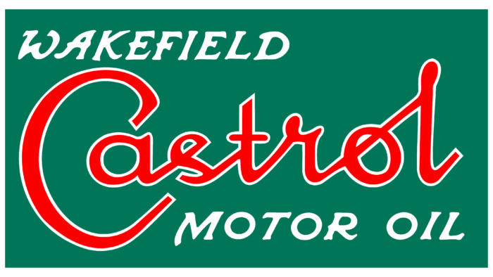
The first redesign took place 18 years after the company was founded. It was at this stage that the familiar red-green color palette appeared. The main title, namely “Castrol,” was handwritten and looked extremely convincing. As in the previous version, the words “Wakefield” and “Motor Oil” were present at the top and bottom. They were made in a classic sans-serif typeface. All letters in these inscriptions were white.
1929 – 1946
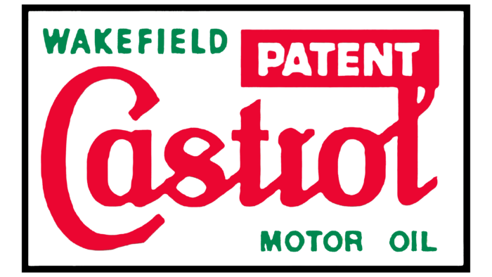
The main change in the new “Castrol” redesign is to update the background, which is now white. The main inscription was also made in a cursive style but less explicit. Diagonal lines when connecting symbols look modern and convincing. Due to the change in background color, additional inscriptions were no longer white but green. Also, an additional red rectangle appeared in the upper right corner, inside of which “Patent” was written in white letters.
1946 – 1958
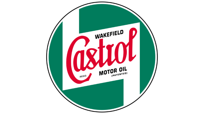
At this point, the logo’s shape changed from a rectangle to a green circle with a black outline. Inside it was a white rectangle from which, in the upper left corner and the lower right, additional vertical lines emanated. In the center of the rectangle was “Castrol,” written in red letters. The italic style, however, remained identical. Above and below the title were the words “Wakefield” and “Motor Oil” written in black letters. All the words on the emblem were written diagonally upwards.
1958 – 1968
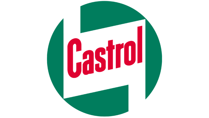
The green circle and rectangle with additional elements remained unchanged. In this case, the black outline was removed, and only one word remained in the center of the rectangle, namely “Castrol.” Moreover, it was written in a classic bold sans-serif font. Consequently, the company moved away from using cursive styles and italics.
1968 – 1992
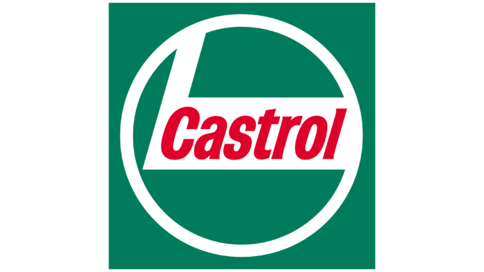
The background for the green circle is a white square with a green outline. The rectangle now had only one vertical line in the upper left corner. The points on the circle that was in contact with the rectangle had no outline. If we talk about the inscription itself, then again, italics appeared in it.
1992 – 2001
After another redesign, the green color began to take up even more space on the Castrol logo. Now the green circle with a white outline was inside the green square. The verbal inscription remained identical to the previous version.
2001 – 2006
There was an unusual background for the logo and emblem of the company. It looks like a rectangle with a large rounding on the left side. There was there a green circle with a white rectangle inside. However, red dots now appear on the horizontal line where “Castrol” used to be. The closer they were to the right side, the more united they became. On the right was a red inscription with a slightly changed font. For example, the vertical line in the letter “a” was missing.
2006 – 2023
In the latest redesign to date, minimal changes have been made. For example, the circle’s color became brighter, as did the red inscription. Moreover, it stretched to the entire length of the background.
2023 – today
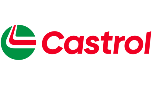
In late February 2023, Castrol updated its visual identity, including its logo, which became more straightforward and minimalist while maintaining the overall composition. The team at Landor & Fitch retained the primary elements: a green circle divided into two parts by differently colored stripes and a red cursive inscription. Only details such as line shape, font, and proportions changed.
- First, the thin green frame that made the old logo resemble a tag was removed. Its removal is due to the desire for minimalism, improving the logo’s readability, and making it clean and concise.
- Second, the red stripe in the green circle became whole and no longer disintegrated into quadrilateral pixels. This created a modern and clean image. Some consumers criticized this step, as the blurred squares in the past represented a stylized checkered flag – an essential symbol for a company associated with motorsports.
- Third, the red line now extends upwards and forms a “boomerang,” resembling a receding road. The curve dividing the green circle into two parts became smoother. All of this infuses the emblem with energy and dynamism.
- Fourth, the font of the word “Castrol” remained italic but became more standard. This change improved the inscription’s readability. Designers used the Gilroy grotesque as a basis and slightly modified the letters – in particular, they added a cut at the top of the “l” to match a similar cut on the “t.”
Landor & Fitch’s employees simplified the logo to display better on small-screen devices, but they retained Castrol’s iconic colors: white, green, and bright red.
Font and Colors
During the company’s operation in the market for the sale of engine oil, several fonts were used for the logo. The peculiarity was the use of cursive and cursive styles. Now the company has a legible and unique logo. Rounded corners and the main emphasis on the brand name attract the attention of potential buyers.
After the first redesign of the logo, the company concluded that its traditional palette would be red-green-white. It looks modern and confident, forcing car owners to consider Castrol for purchase seriously. Green is associated with life and ambition, while red indicates the passion and ambition of the project.
Castrol color codes
| Pigment Red | Hex color: | #ed1b2d |
|---|---|---|
| RGB: | 237 27 46 | |
| CMYK: | 0 89 81 7 | |
| Pantone: | PMS Bright Red C |
| Shamrock Green | Hex color: | #009a4e |
|---|---|---|
| RGB: | 0 154 78 | |
| CMYK: | 100 0 49 40 | |
| Pantone: | PMS 3405 C |
