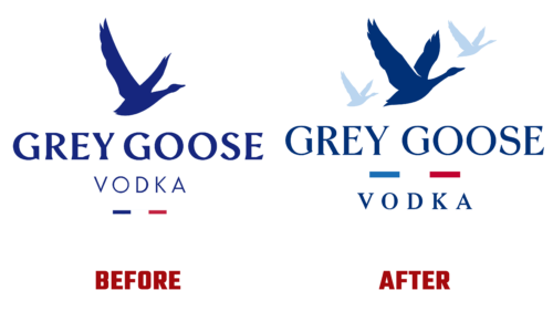
In November 2022, Gray Goose decided to take a big step – to change its corporate identity so that it becomes global, innovative, and at the same time, understandable to most consumers. Development was entrusted to Intertype Studio. The main approach that guided her: the current world of luxury has changed beyond recognition. Consequently, the design team needed to combine corporate classics with current trends skillfully.
The specialists started by redrawing the emblem from scratch so that the brand could maintain a trusting relationship with the target segment of customers. This is an excellent guarantee for the future, as the freshly renewed sign will serve as a spectacular label for branded alcohol and will not lose its relevance for a long time. Designers have added flexibility, confidence, cult, and modernity to it. During the implementation of the project, the entire visual asset was revised.
- The previous identity was focused on the celebration of personality. However, priorities have shifted because good alcoholic drinks require the good company to enjoy branded alcohol together and enjoy life together. The emphasis is on unification, on the “flock.” As a result, two more geese appeared in the emblem – a smaller one. They surrounded a large bird and flew with it in the same direction.
- The Gray Goose logo palette has also been updated. The signature blue color received incredible depth. He personifies hope in achieving cherished goals, firmness of spirit, and confidence in the future. Shades of the gray frame it perfectly, adding brightness and emphasizing the product’s natural taste. They are like frost on a sweaty bottle, which seems to have just been taken out of the freezer.
- The custom-designed font brings out the brand’s character of flowing elegance. It reflects the goose flock’s natural flight and the wings’ measured movement. This aesthetic is applied to all glyphs. Fluidity, variability, and sliding style are different from the letters from the previous logo. Dalton Maag did the typography. A talented specialist in the field of lettering, Ginger Monkey, was also involved in the process.
As a result, the vodka brand got a cool logo that is equally well perceived on a large and small scale.


