Vodka produced by Bacardi gives connoisseurs wings and allows them to rise to heaven, forgetting about problems and hardships. The Gray Goose logo is filled with the idea of flight and lightness. According to the emblem, the drink is soft to drink thanks to a special recipe and various additives.
Grey Goose: Brand overview
| Founded: | 1997 |
| Founder: | Bacardi |
| Headquarters: | France |
| Website: | greygoose.com |
Gray Goose is a French premium vodka brand developed by American businessman Sidney Frank. She appeared in the 1990s but later passed to Bacardi, to which she was sold in 2004. François Thibault from the city of Cognac, who is professionally engaged in alcohol, improved the recipe of the alcoholic drink. As a result, the product is presented on the market in several variations: with the aroma of lemon, cherry, cinnamon, orange, vanilla, melon, and caramel. The company no longer plans to expand the flavor range to not deviate from the original. The year of the creation of this variety of vodka is 1997.
Sidney Frank, the founder and CEO of SFIC (Sidney Frank Importing Co.) presented a unique project in the late 1990s. His concept was to create a luxury vodka for the American market. To this end, the company entered into a partnership agreement with the famous master of cognac production François Thibault. Using all his knowledge of cognacs, he applied them to vodka.
France as the point of production of Gray Goose for US consumers was chosen specifically. This European country has strong culinary roots, so its alcoholic product stands out from the rest. The water that serves as the basis is taken from natural sources. Local farms supply wheat intended for distillation. Limestone is used as a filter. As a result, just a year after the appearance of vodka, the Beverage Testing Institute recognized it as the most delicious in the world.
This was followed by a move to the US as Bacardi acquired the brand to distribute its products in the US market. This event took place in 2004. At that time, over one and a half million cases of vodka were sold, which made Gray Goose the most sought-after premium brand. The alcohol is bottled in original smoked glass bottles depicting a French goose in flight.
Meaning and History
Created by a French master distiller for the American market, the high-end vodka brand made a name in the 1990s when it introduced the flying goose logo. This sign adorned the label of an alcoholic drink but did not stay long: the designers modified the design, giving it a luxurious personality.
In 2019, London-based company Ragged Edge tampered with the Gray Goose logo, making the bird more expressive and the typeface crisp and modern. A few years later, the staff of Intertype Studio enhanced the visual lightness with additional thin lines and “gave” the goose a flock so that it did not seem so lonely.
Premium packaging and a progressive brand image appeal to consumers who love the combination of luxury and minimalism. Therefore, the Gray Goose logo’s evolution has never exceeded the established framework: almost all versions seem simple but elegant.
1997 – 2013
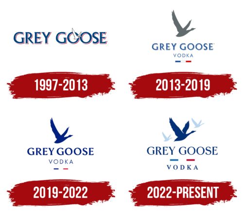
The debut logo was a set of black letters with unique serifs that widened at the ends. The name of the alcohol brand was written in capital letters on a white background. The signs were massive and bold, so the thin outline of a solitary goose was visible in the “O” area. Each letter in the phrase “Grey Goose” had a thin light gray stripe complemented by subtle shadows that created a three-dimensional effect.
2013 – 2019
In 2013, the developers modernized the logo: they expanded the space between the letters, repainted the inscription in blue, enlarged the silhouette of the goose, and raised it a little higher. In addition, new elements were introduced on the Gray Goose emblem. For example, the word “Vodka” (it was located exactly in the center) and a small stripe consisting of three segments in the color of the national flag of France. The designers also made the bird gray to make it stand out against the light background.
2019 – 2022
Branding agency Ragged Edge from London participated in creating the new emblem. The designers made it modern by removing the side stripes on the letters and removing the shadows. Thus, we got a simple but stylish inscription that meets the requirements of the time, as it is visible on any media. In addition, they changed the font a little, choosing a graceful style, and separated the goose from the text by moving it higher. Now the drawn bluebird looks like an independent icon.
2022 – today
Intertype Studio is behind the new Gray Goose logo. The designers have fixed an old bug where geese rarely fly alone. It was decided to finish drawing two more birds so that the goose had a flock. Parallels are drawn here with friendly company, which is the reason for drinking vodka.
Before creating the emblem, the agency staff developed a concept called “The big idea.” Its fundamental principle was the feeling of lightness and movement. Therefore, the artists changed the silhouette of the goose, adding a dividing line between the wings and enhancing the wavy shape of the feathers. Such seemingly minor details filled the image with dynamics. To make the two additional birds look harmonious, the designers made them small and light gray. Because of this, it seems they are flying in the distance and fading behind the clouds.
Visual lightness is also conveyed in the rounded letters, which repeat the smooth movement of the wings. Intertype Studio modified the existing font with the help of independent company Dalton Maag and British design studio Ginger Monkey. The latter is known for developing lettering for alcohol brands.
The French vodka brand now has two official fonts: Gray Goose Natural Book and Gray Goose Natural Light. The logo uses the first of them – bolder. It creates a feeling of smoothness, fluidity, and softness. The color palette has also been changed: the designers chose deep shades of blue (#16267E) and navy blue (#001446), complementing them with burgundy, white and silver gray.
Font and Colors
French vodka has always featured a flying goose on its label despite the redesign. In the early versions, it was painted white; in later versions, it was gray. Around the middle of the history of the logo, it began to link to the country of production of the alcoholic beverage because it was supplied far beyond the borders of France. We are talking about the lower strip, divided into three color segments in the tone of the state tricolor.
The typeface used in the Gray Goose logo is called Albertus Roman. This is an Art Deco typeface with glyph serifs. The author is the designer Berthold Wolpe, who created it for the London branch of Monotype and named it after the German theologian-philosopher Albertus Magnus.
The corporate palette of the emblem of the alcohol brand is unchanged: it consists of soothing shades. Even the red in it looks discreet and restrained. The current color scheme includes blue and white. Early versions were dominated by black and grey.
Grey Goose color codes
| Resolution Blue | Hex color: | #16267e |
|---|---|---|
| RGB: | 22 38 126 | |
| CMYK: | 83 70 0 51 | |
| Pantone: | PMS 2747 C |
| Cardinal | Hex color: | #c32241 |
|---|---|---|
| RGB: | 195 34 65 | |
| CMYK: | 0 83 67 24 | |
| Pantone: | PMS 192 C |
