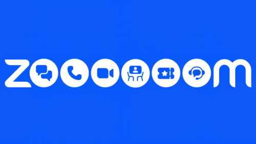
On September 12, Zoom announced three changes to its Zoom Chat app at once. First, she renamed it Zoom Team Chat. Secondly, expanded functionality. Thirdly, we modernized the logo. Now all three innovations harmoniously complement each other because they correspond to the current concept of the software brand.
The redesign resulted in a detailed multi-O logo similar to Google’s. But still, there are significant differences between them because it conveys the breadth of possibilities that the application now offers. When it was just a way to conduct videoconferencing, it was enough for the old emblem, which fully reflected the spectrum of its action. However, now the developers have significantly expanded the functions, trying to create a full-fledged service for office tasks. The impetus for rebranding was given, oddly enough, by the COVID-19 pandemic, when remote work became more active.
Now the visual identity of Zoom Chat is fully consistent. The logo consists of a list of new features that the developers have endowed the application with. From now on, it is not just a communication tool for video conferencing but a versatile tool for exchanging information by voice and video, a fast way to transfer files, an interactive whiteboard, team communication, multilateral integration, rooms, and more. This is conveyed in the images of the handset, the video camera, the chairs at the demo screen, and the dialogue bubbles. They are placed in the center of the white circles that symbolize “O.”
That is, the new Zoom Team Chat logo reflects the company’s improved and expanded offerings. With it, it demonstrates its readiness to become a universal key to improving user productivity. And the changed name allows it to reflect better on how to use the chat tools properly.
CMO Janine Pelosi said the logo shows the ease of team consolidation and the ease of keeping track of work information. Especially for this, the designers smoothed the corners and added “Z” and “M” smooth curves, thanks to which the inscription evokes a feeling of trust, confidence, and calmness. All elements are located in a horizontal rectangle of bright blue.


