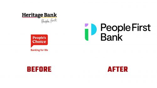
Heritage Bank and People’s Choice Credit Union, two major Australian member-owned financial institutions, have merged to form People First Bank. This new bank serves 730,000 customers, employs 2,000 people, and manages $23.3 billion in assets. The rebranding, focused on the ethos “Banking for you, better for all,” aims to highlight mutuality and community values.
The People First Bank merger represents the original institutions’ combined strength and community spirit. The brand purpose, “Banking for you, better for all,” reflects the mission to serve individual members and positively impact the community. This approach targets various segments of the Australian population by addressing their financial needs and aspirations.
A key element of the rebranding is the new logo, which combines the letters “P” and the number “1” to symbolize the bank’s people-first approach and leadership in mutual banking. The logo uses three unique shapes that form a cohesive symbol, representing mutuality and community strength. The simple geometric shapes ensure the logo is easily recognizable and memorable.
The typography is clean and modern, aligning with the bank’s goal of being approachable and transparent. The typeface exudes simplicity and clarity, making communications easy for a diverse audience to understand. This choice supports the bank’s brand personality, described as empathetic, straightforward, and uplifting.
The color palette is vibrant and professional, featuring bold, soothing colors that convey trust, reliability, and optimism. These colors create a welcoming atmosphere for customers and are versatile enough to be used across digital platforms and physical branches, ensuring a consistent brand experience.
People First Bank’s tone of voice is human, direct, and uplifting. It aims to communicate in a way that is approachable and empowering. The messaging emphasizes clarity and positivity, maintaining a sense of courage and innovation. By addressing the needs and aspirations of its members, the bank seeks to build strong, trust-based relationships.
The new brand identity is being introduced to members of the merging banks and will roll out over the coming months. This phased approach ensures a smooth transition and keeps stakeholders informed and engaged with the new brand. The implementation includes updating signage, digital platforms, marketing materials, and customer communications to reflect the new identity.


