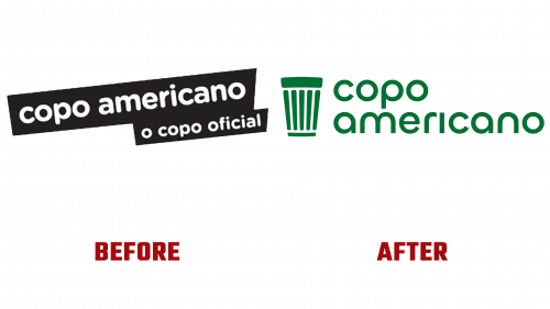
The Copo Americano, or “American Cup,” has been synonymous with Brazilian culture since its inception in 1947. More than just a functional drinking glass, it represents the spirit of Brazil, finding its place in restaurants, bars, and even prestigious galleries like the MoMA in New York. With over 6 billion units produced, its legacy as the perfect vessel for beer and coffee is well-established. The Copo Americano logo’s new design was unveiled recently, breathing fresh life into this iconic brand while honoring its rich history.
At a glance, the previous Copo Americano logo appeared dated with its rounded sans serif typeface and CMYK-inspired color scheme. However, the new design marks a subtle but significant transformation. Retaining a lowercase approach, it introduces a retro-style geometric sans serif that blends modernity with a nod to the glass’s 75-year-long heritage.
Though the changes may seem minimal, they successfully infuse a touch of the modern era without losing the timeless appeal. While not highly distinctive, the updated logo feels confidently understated—an appropriate choice for an item as renowned as the Copo Americano.
An intriguing aspect of the redesign is the new icon, a bold inversion of the previous design that encapsulates the legendary glass’s silhouette. While some might misconstrue it as an American trash can, Brazilians will likely find this new representation endearing, resonating with their deep connection to this beloved symbol.
Another standout feature of the rebranding is the vivid embodiment of Brazilian flair. The Copo Americano’s revitalized identity boasts vibrant colors, striking typography, engaging graphics, and imagery that exude Brazil’s lively spirit. The design seamlessly connects various elements, from the cohesive ribbed texture across the product range to the main icon’s complementary illustration.
Despite its conceptual strength, some aspects, such as the sunburst radial graphics inspired by the glass’s reflections, have met with mixed reactions. These graphics sometimes overshadow the bolder type, diverting attention from the core design. The repeated background glass pattern and pleasant rolling animation add an aesthetically pleasing nuance to the overall look.
The Copo Americano logo’s new design signifies a considered evolution that preserves the essence of a beloved national symbol. The rebrand elevates the Copo Americano from a functional object to a lifestyle emblem by intertwining its storied past with a contemporary edge. This tasteful reimagining is a fitting salute to a simple glass that has celebrated Brazilian culture across generations. As Brazilians continue to savor their morning coffee or unwind with a cold beer, they can do so with a glass that not only quenches their thirst but also proudly reflects their rich heritage.


